- Home >
- Stock Photos >
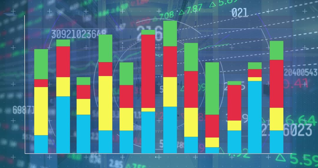
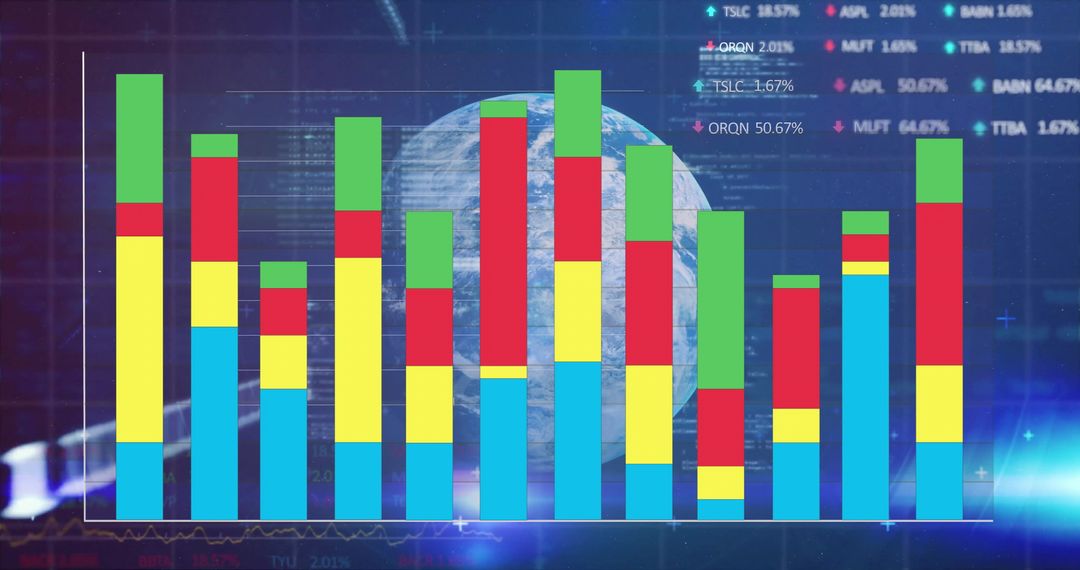
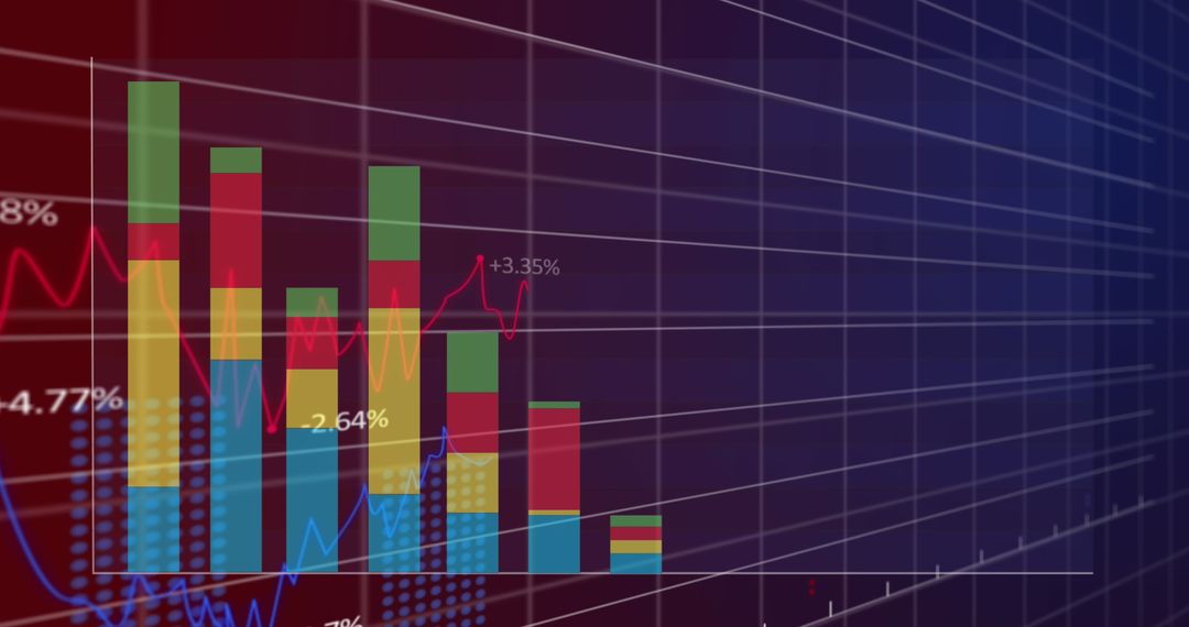
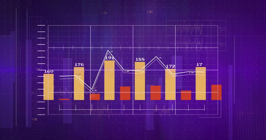
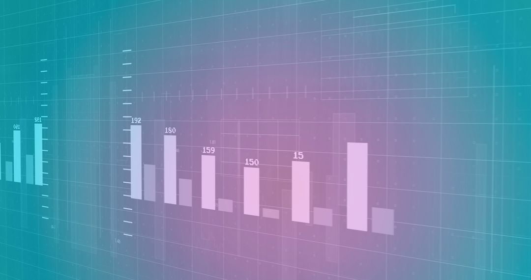
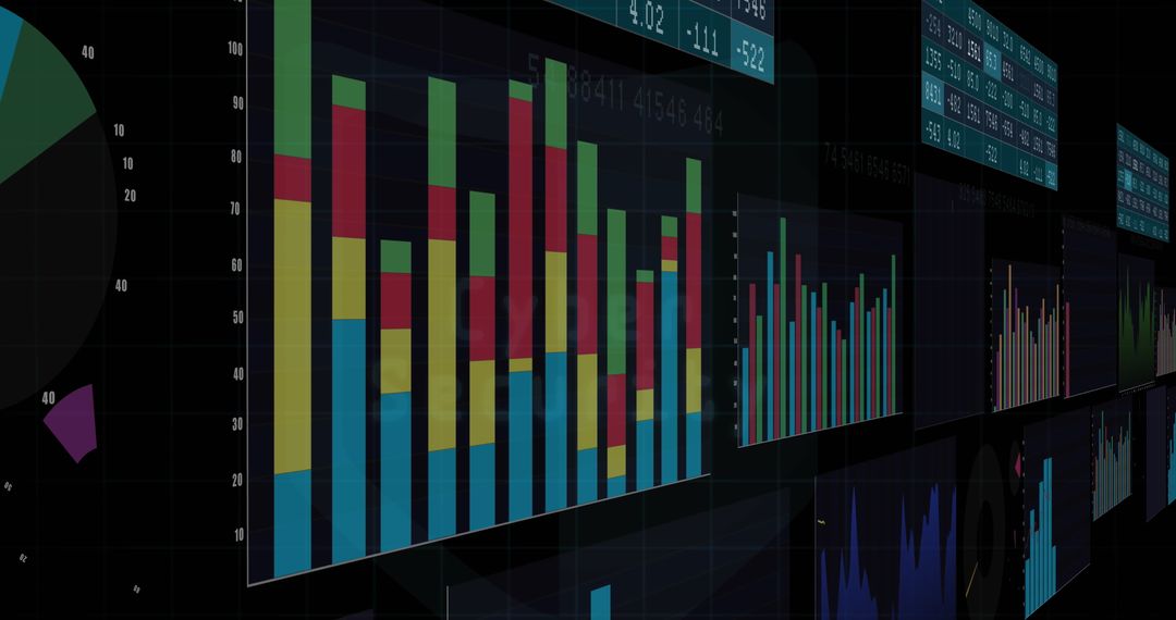
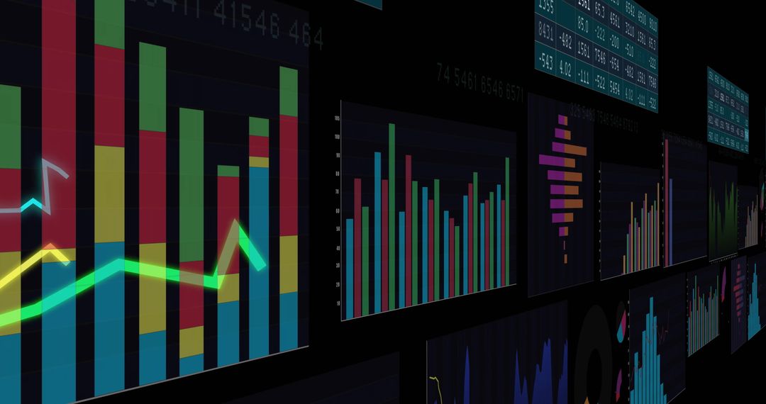
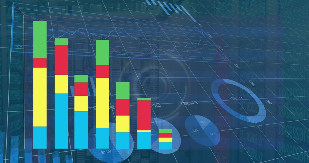
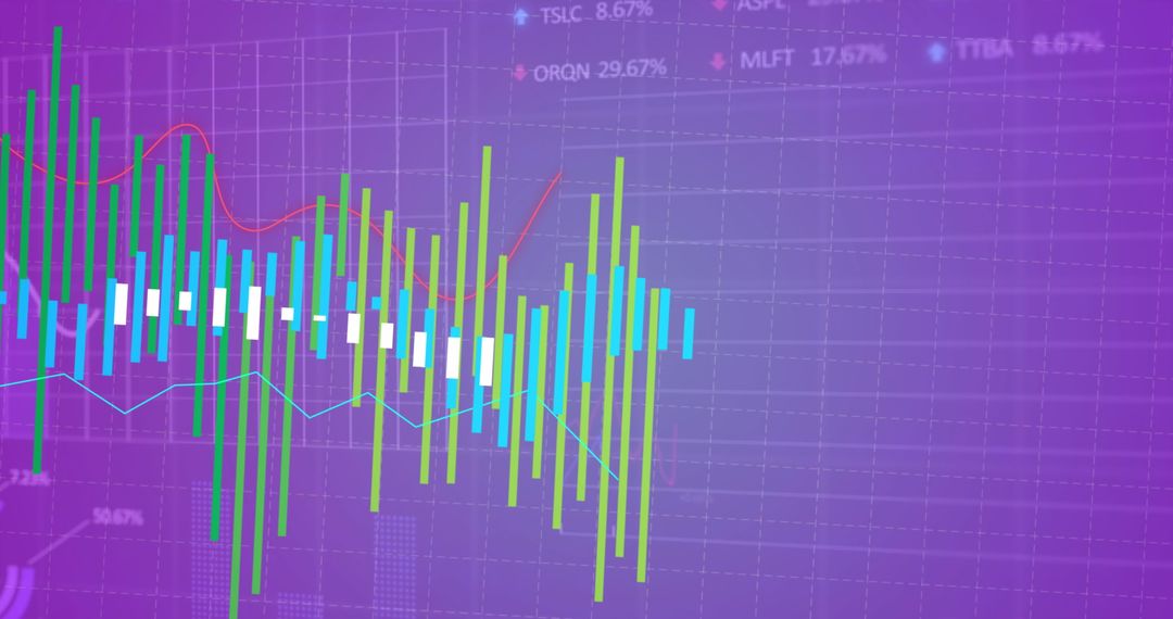
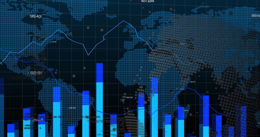
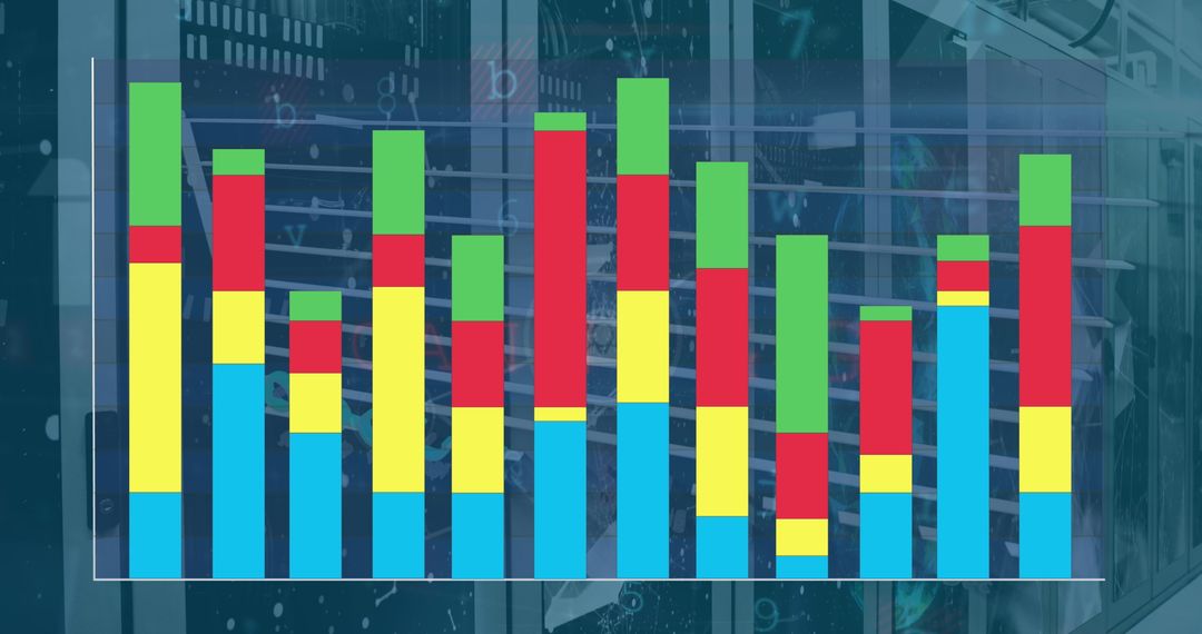
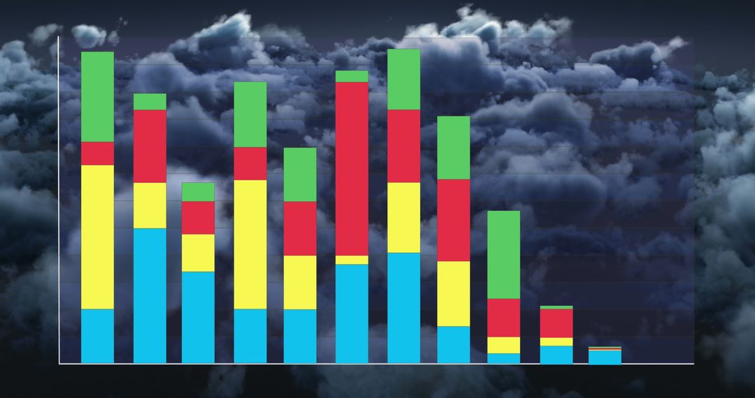
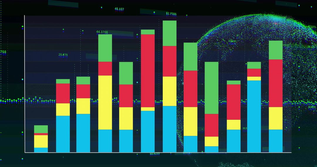
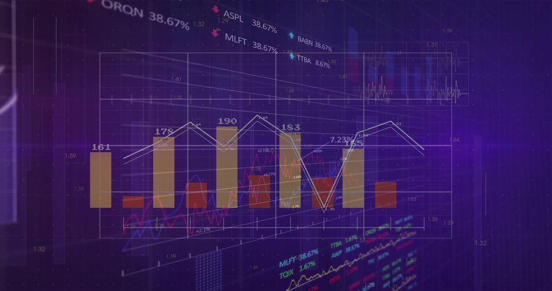
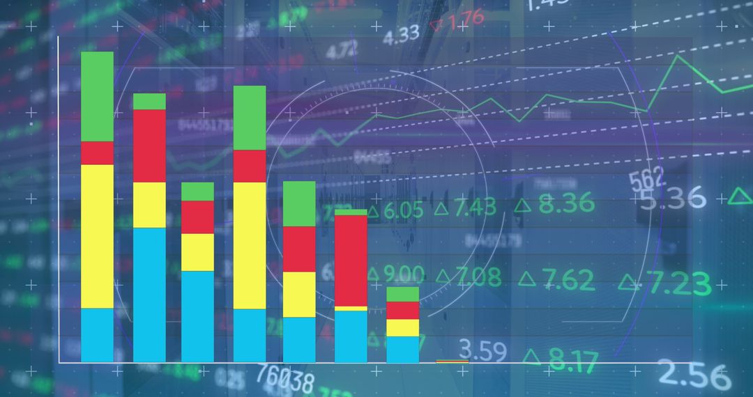
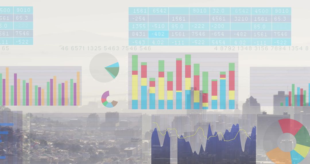
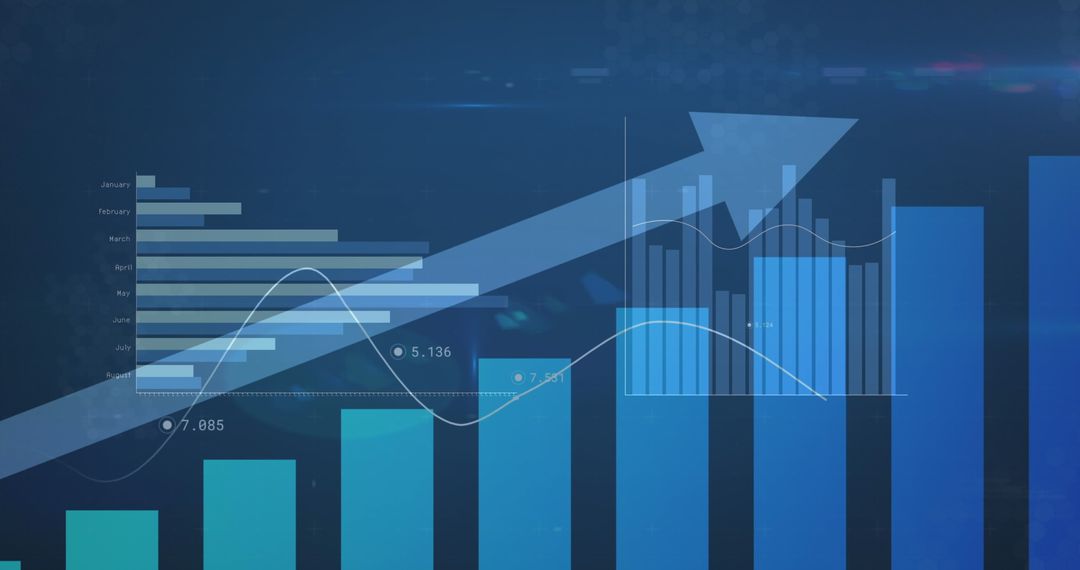
- Colorful Bar Graph Illustrating Data Analysis Trends
Colorful Bar Graph Illustrating Data Analysis Trends Image
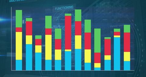
This vibrant graph visually represents data analysis trends with layered colorful bars. Useful for presentations about business intelligence, statistical analysis, or digital technology. Ideal for illustrating complex data structures, enhancing visual components in reports, and supporting teaching materials in academic settings.
Powered by 


0
downloads
downloads
Tags:
More
Credit Photo
If you would like to credit the Photo, here are some ways you can do so
Text Link
photo Link
<span class="text-link">
<span>
<a target="_blank" href=https://pikwizard.com/photo/colorful-bar-graph-illustrating-data-analysis-trends/4bf15509aa6cf906f24620464c483697/>PikWizard</a>
</span>
</span>
<span class="image-link">
<span
style="margin: 0 0 20px 0; display: inline-block; vertical-align: middle; width: 100%;"
>
<a
target="_blank"
href="https://pikwizard.com/photo/colorful-bar-graph-illustrating-data-analysis-trends/4bf15509aa6cf906f24620464c483697/"
style="text-decoration: none; font-size: 10px; margin: 0;"
>
<img src="https://pikwizard.com/pw/medium/4bf15509aa6cf906f24620464c483697.jpg" style="margin: 0; width: 100%;" alt="" />
<p style="font-size: 12px; margin: 0;">PikWizard</p>
</a>
</span>
</span>
Free (free of charge)
Free for personal and commercial use.
Author: Awesome Content
Similar Free Stock Images

Premium


Premium


Premium


Premium


Premium


Premium


Premium


Premium


Premium


Premium


Premium


Premium


Premium


Premium


Premium


Premium

Premium


Premium


Premium


Premium

Premium


Premium


Premium


Premium