1. Home > 
  2. Blog  >  
  3. Design Trends in Stock Imagery: What’s Hot for 2025-2026
Every year, stock imagery changes just enough to make last year’s stuff look outdated. You notice it when you’re scrolling through designs —suddenly those soft pastels and flat mockups that felt fresh in 2022 now look a little tired.

I’ve been digging through stock sites lately (especially Pikwizard,which has become my go-to), and a few trends keep showing up. Some of them are subtle; others are pretty loud. Here’s what seems to be defining stock photos, PNGs, and templates in 2025-2026 — at least from what I’ve seen in the wild.

Less “perfect,” more human

For years, brands chased this hyper-polished, minimal aesthetic — spotless desks, symmetrical plants, people smiling straight into the camera. But lately, that vibe feels cold. Now, images that look a bit more real — slightly messy lighting, real faces, imperfect moments — are the ones that stand out.

You can see it in how brands shoot their content too. Stock sites like Pikwizard are catching on, offering collections that look like they came from an actual shoot, not a corporate studio.

Bold color is back (thankfully)

I’m glad to see this one. After a few years of beige and sage-green everything, people are bringing color back into their visuals. Bright reds, deep blues, high-contrast tones — they pop again.

When I’m putting together templates or ads, I look for stock photos with some energy. If you’re pulling from Pikwizard, check out their newer collections — there’s a lot more punch to them now.

Flat lays, but make them feel lived-in

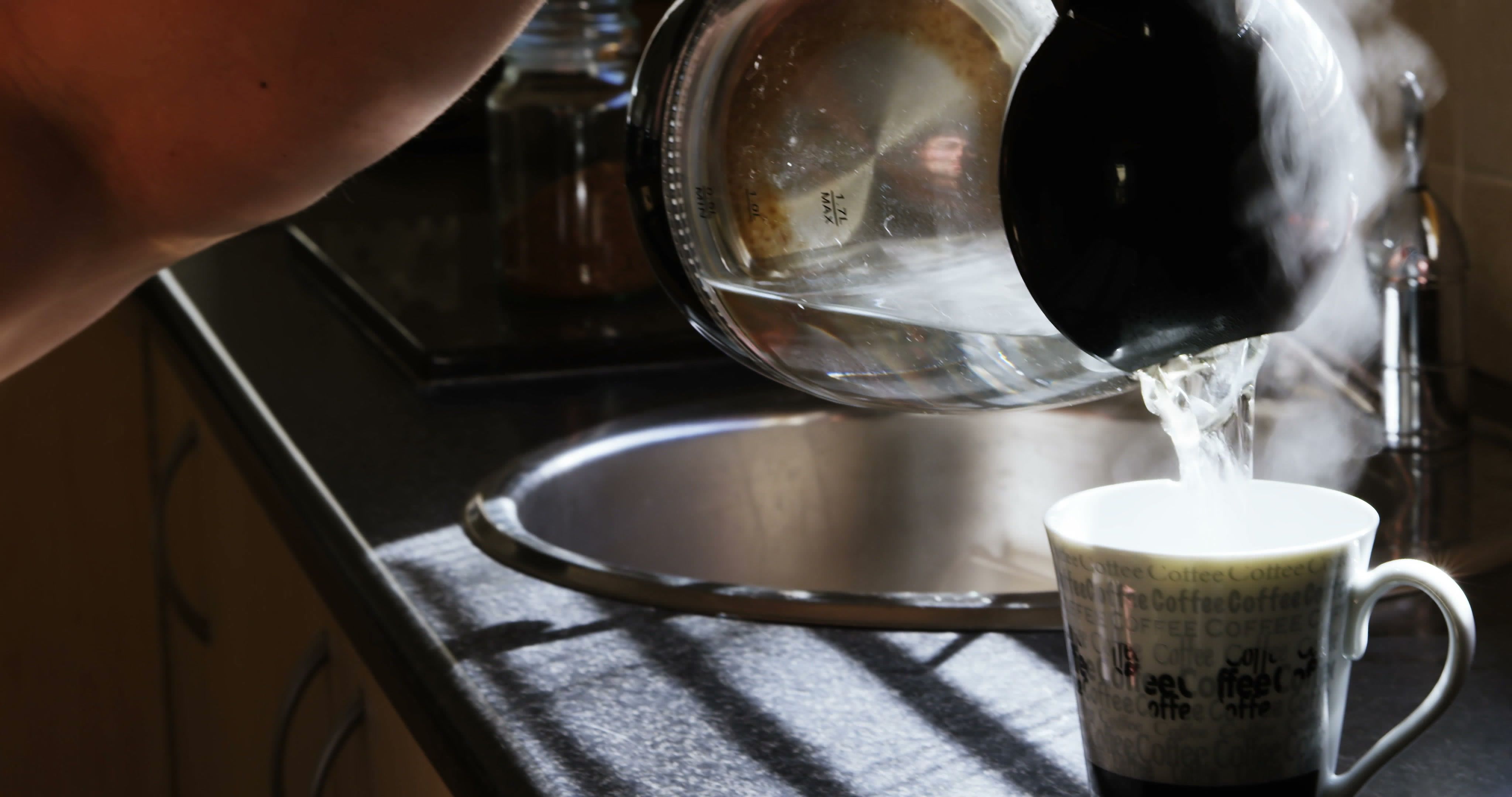
Flat lays have been around forever, but the style has shifted. The overly staged ones (the kind that look like they were made for a catalog) are fading. Now it’s more casual — a half-finished coffee, a phone with a cracked case, paper with a few wrinkles. Real life sneaks in.

If you’re using PNGs or templates, mix in some of that realism.

Pikwizard has some nice everyday-object PNGs that blend really well with lifestyle content.

Sustainability is showing up in visuals too

You can feel the eco influence everywhere — more green tones, natural textures, recycled-paper aesthetics. Even digital templates are mimicking “organic” looks. It’s less about nature for decoration and more about showing values.

It’s subtle, but it’s definitely a shift.

Real representation, not tokenism

This one’s long overdue. Stock imagery is finally catching up to real life — people of all ages, skin tones, body types, and backgrounds. It’s not perfect yet, but it’s getting there.

I’ve noticed Pikwizard doing this especially well. Their newer photos don’t feel staged; they feel like people just being themselves. That makes a huge difference when you’re trying to make authentic-looking content.

A bit of collage and texture creeping back in

Designers are mixing photos, illustrations, and cutout PNGs again — that slightly chaotic, DIY look that’s more expressive than polished. It’s a fun shift. 

The big theme for 2025-2026? Authenticity. The visuals that work now are the ones that feel something — real, bold, human, and not too perfect.

If you’re hunting for fresh stock photos or templates, check out Pikwizard. It’s got a good mix of clean shots, bold colors, and natural-looking people — basically everything that fits this new wave.

Use what’s trending, but make it yours. The best designs don’t just follow trends — they make people stop scrolling for a second.

Mark Thompson