
- Home >
- Stock Photos >
- Analyzing Financial Data with Bar and Line Plot on Digital Dashboard
Analyzing Financial Data with Bar and Line Plot on Digital Dashboard Image
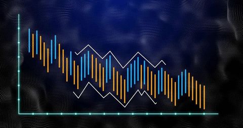
This digital dashboard showcasing bar and line charts represents statistical analysis and visual storytelling in finance. The juxtaposition of yellow and blue bars with a white line on a teal and black background illustrates complex data trends. Ideal for presentations on market performance, financial projections, data science, and business strategy, this concept highlights key insights beneficial for decision making and storytelling in the financial technology sector.
Powered by 


0
downloads
downloads
Tags:
More
Credit Photo
If you would like to credit the Photo, here are some ways you can do so
Text Link
photo Link
<span class="text-link">
<span>
<a target="_blank" href=https://pikwizard.com/photo/analyzing-financial-data-with-bar-and-line-plot-on-digital-dashboard/79f24fd8b3779f7329af148e8add212b/>PikWizard</a>
</span>
</span>
<span class="image-link">
<span
style="margin: 0 0 20px 0; display: inline-block; vertical-align: middle; width: 100%;"
>
<a
target="_blank"
href="https://pikwizard.com/photo/analyzing-financial-data-with-bar-and-line-plot-on-digital-dashboard/79f24fd8b3779f7329af148e8add212b/"
style="text-decoration: none; font-size: 10px; margin: 0;"
>
<img src="https://pikwizard.com/pw/medium/79f24fd8b3779f7329af148e8add212b.jpg" style="margin: 0; width: 100%;" alt="" />
<p style="font-size: 12px; margin: 0;">PikWizard</p>
</a>
</span>
</span>
Free (free of charge)
Free for personal and commercial use.
Author: Awesome Content