- Home >
- Stock Photos >
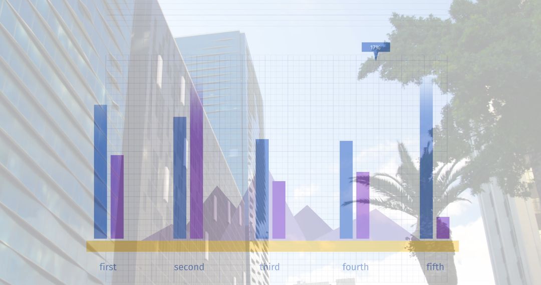
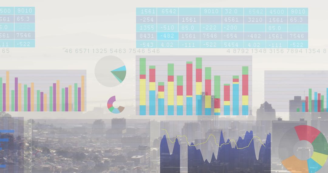
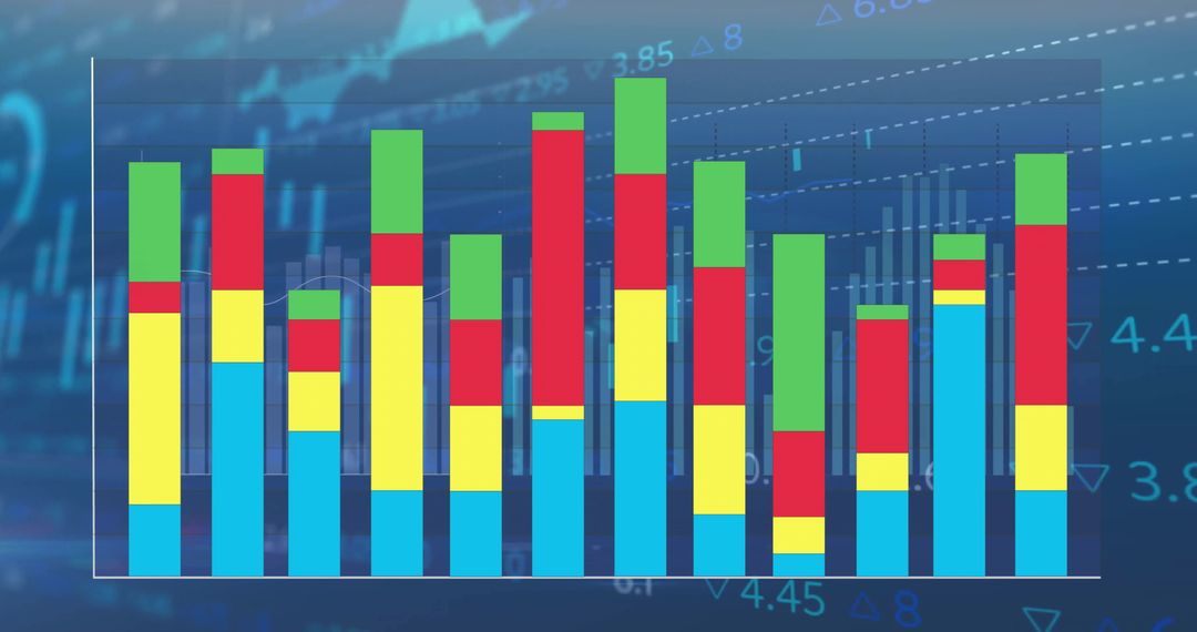
- Colorful Data Visualization Bar Graph Analytics Concept
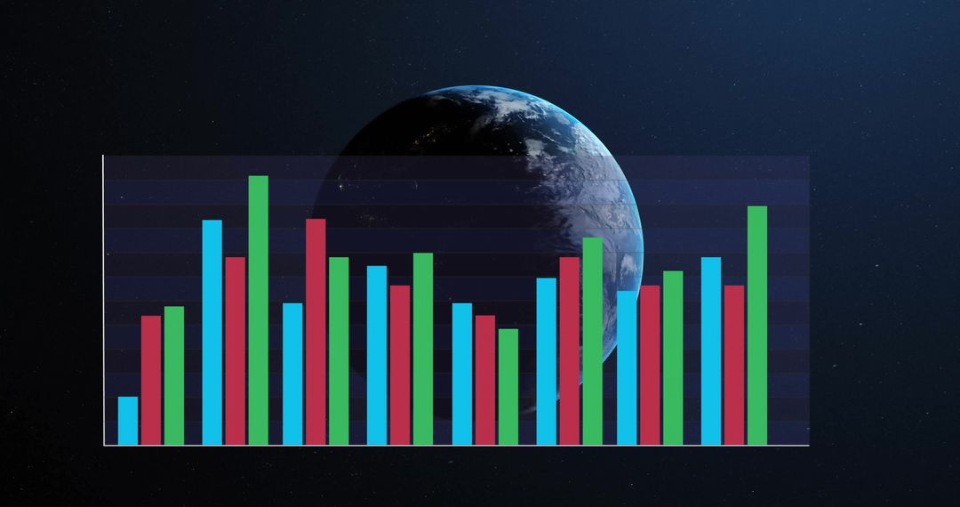
Colorful Data Visualization Bar Graph Analytics Concept Image
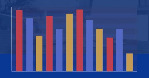
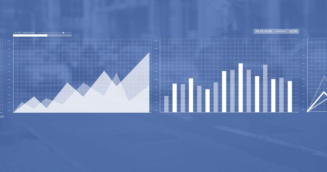
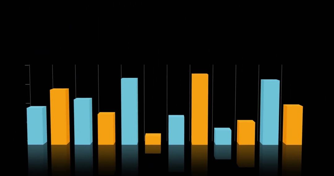
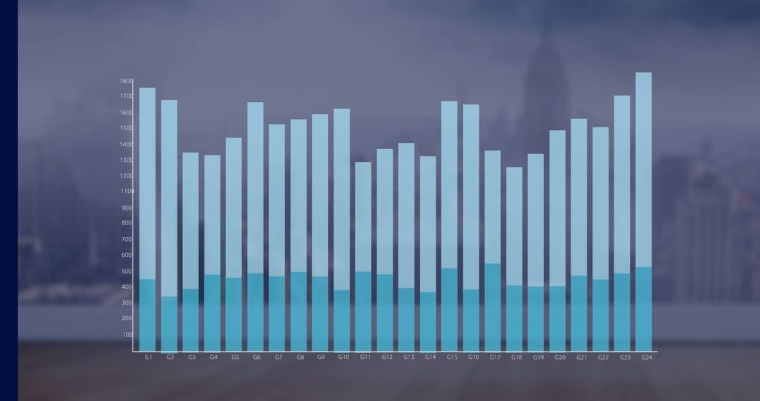
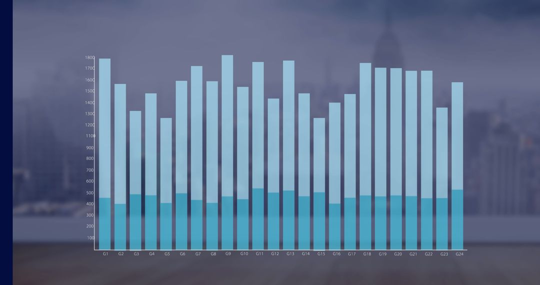
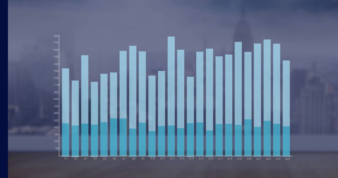
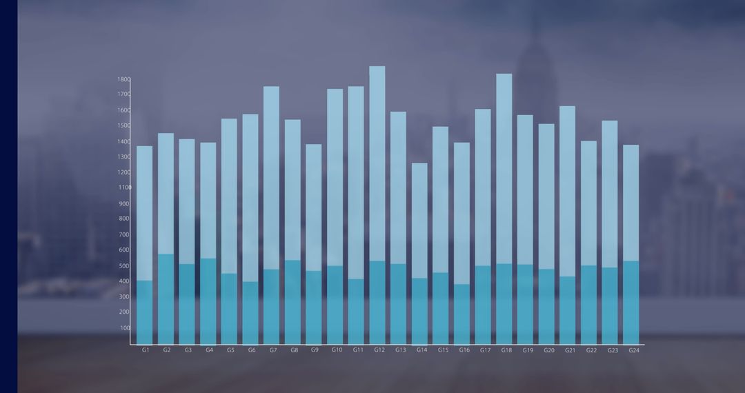
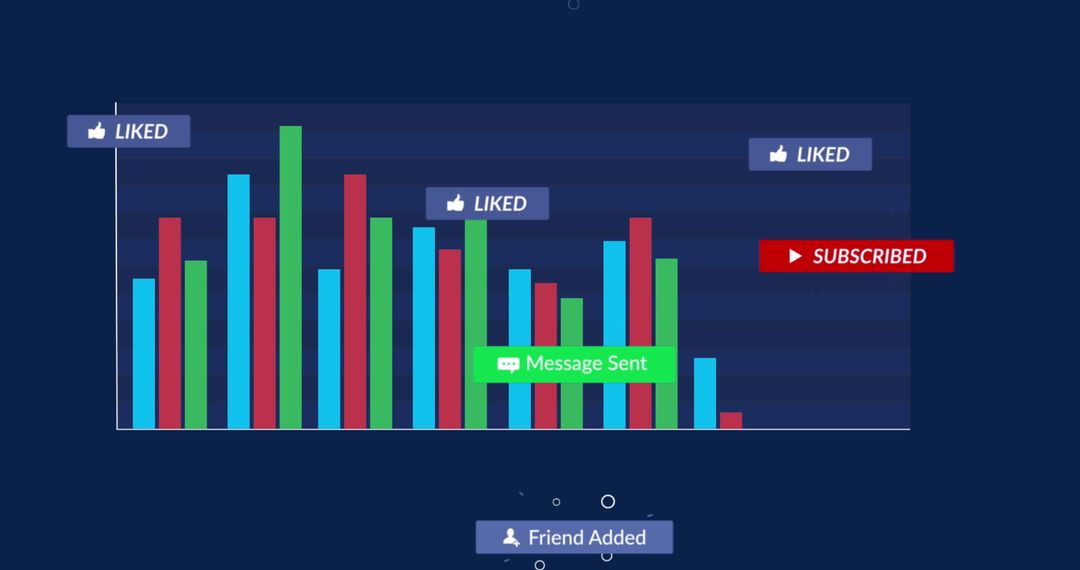
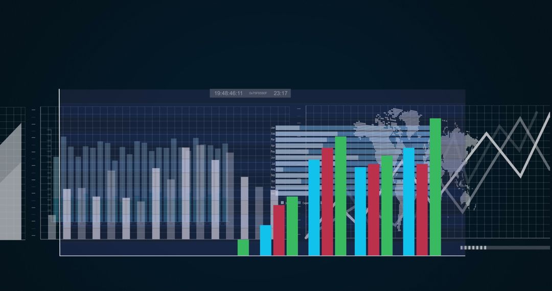
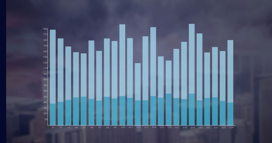
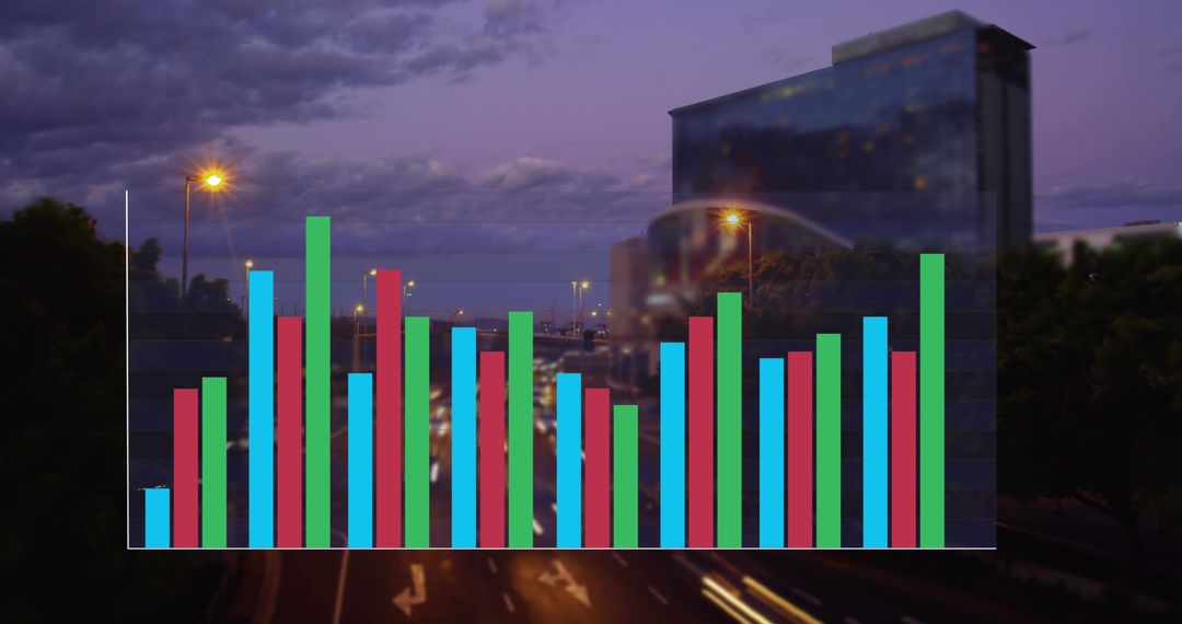
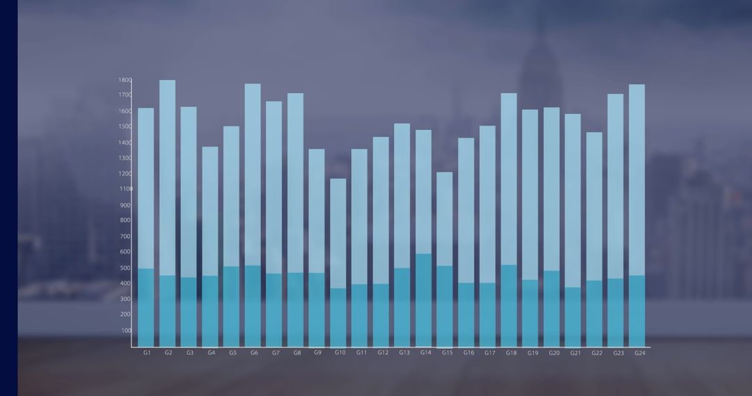
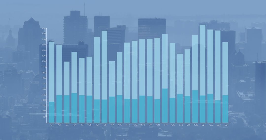
Illustrates concept of analyzing complex data. Four data series visualized in colors offer comparison insights. Ideal for presentations, business reports, educational materials on analytics or statistics. Enhances understanding of visual data interpretation with a dynamic array of charts and graphs.
Powered by 


0
downloads
downloads
Tags:
More
Credit Photo
If you would like to credit the Photo, here are some ways you can do so
Text Link
photo Link
<span class="text-link">
<span>
<a target="_blank" href=https://pikwizard.com/photo/colorful-data-visualization-bar-graph-analytics-concept/01280ce356f621c30c8f2a8e288f28c2/>PikWizard</a>
</span>
</span>
<span class="image-link">
<span
style="margin: 0 0 20px 0; display: inline-block; vertical-align: middle; width: 100%;"
>
<a
target="_blank"
href="https://pikwizard.com/photo/colorful-data-visualization-bar-graph-analytics-concept/01280ce356f621c30c8f2a8e288f28c2/"
style="text-decoration: none; font-size: 10px; margin: 0;"
>
<img src="https://pikwizard.com/pw/medium/01280ce356f621c30c8f2a8e288f28c2.jpg" style="margin: 0; width: 100%;" alt="" />
<p style="font-size: 12px; margin: 0;">PikWizard</p>
</a>
</span>
</span>
Free (free of charge)
Free for personal and commercial use.
Author: Creative Art
Similar Free Stock Images

Premium


Premium


Premium


Premium


Premium


Premium


Premium


Premium


Premium


Premium


Premium


Premium


Premium

Premium


Premium


Premium


Premium


Premium


Premium


Premium


Premium


Premium


Premium


Premium