- Home >
- Stock Photos >
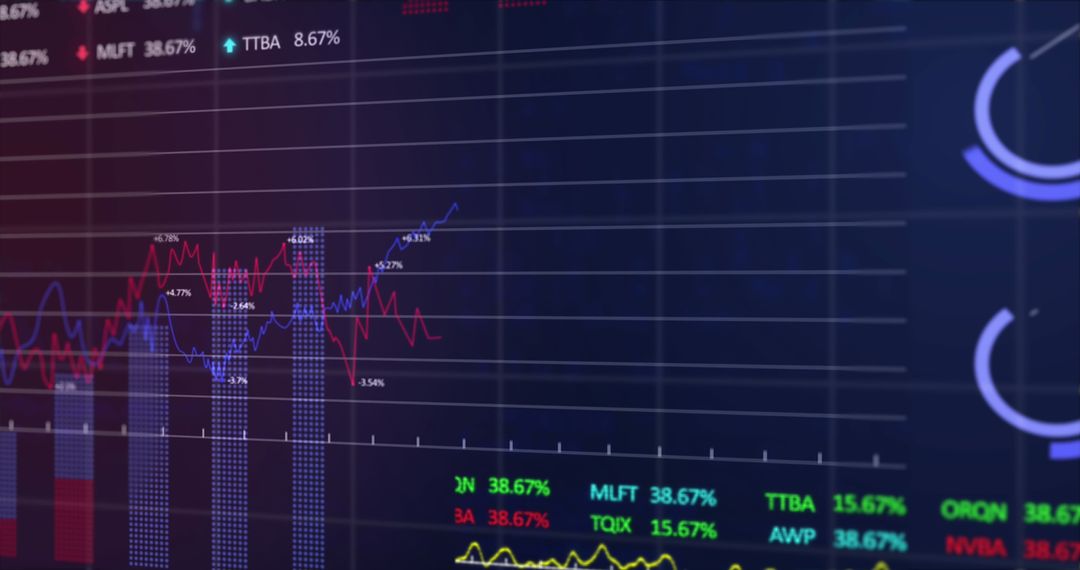
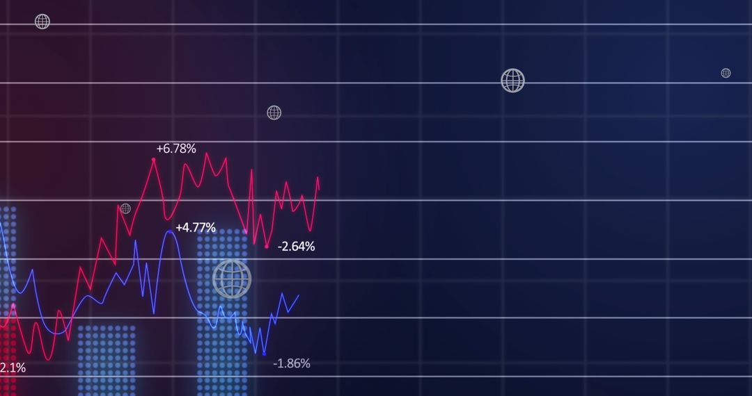
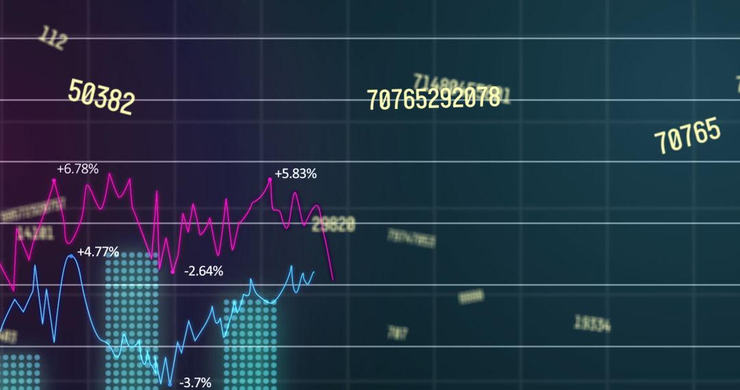
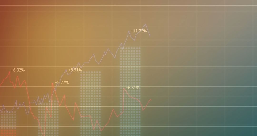
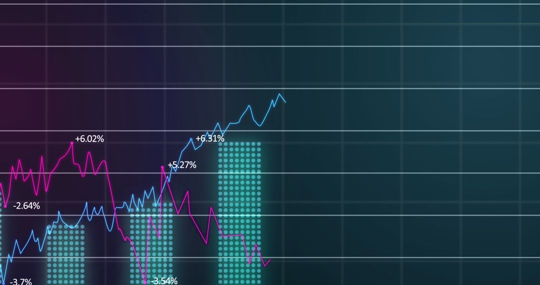
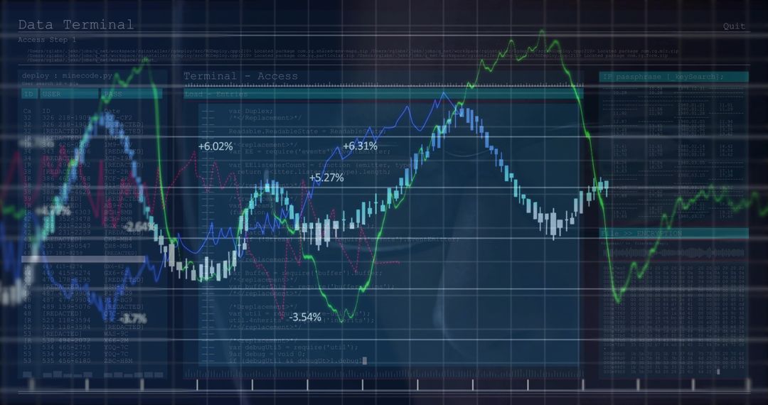
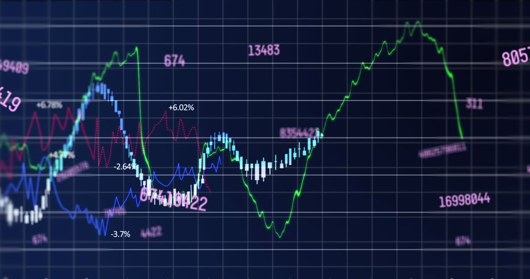
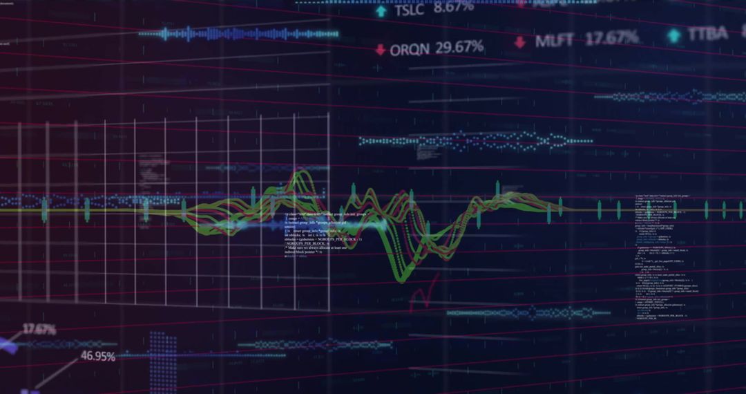
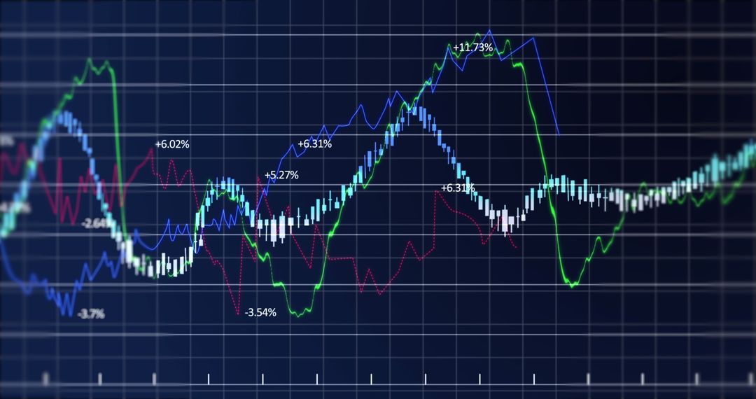
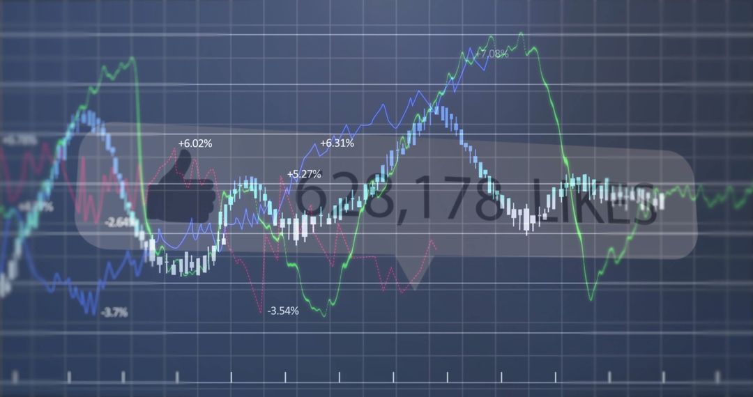
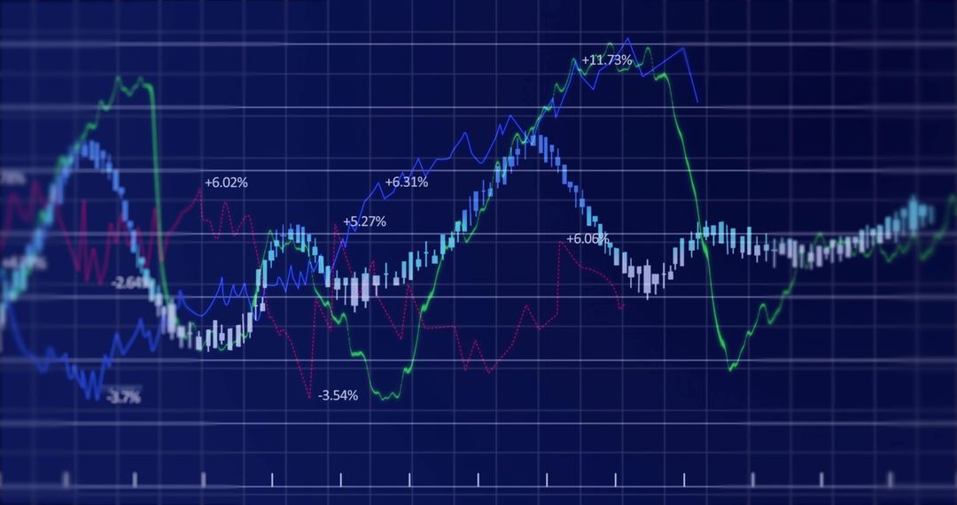
- Displaying financial market trends with blue and red line charts, dotted histogram columns and perce
Displaying financial market trends with blue and red line charts, dotted histogram columns and perce Image
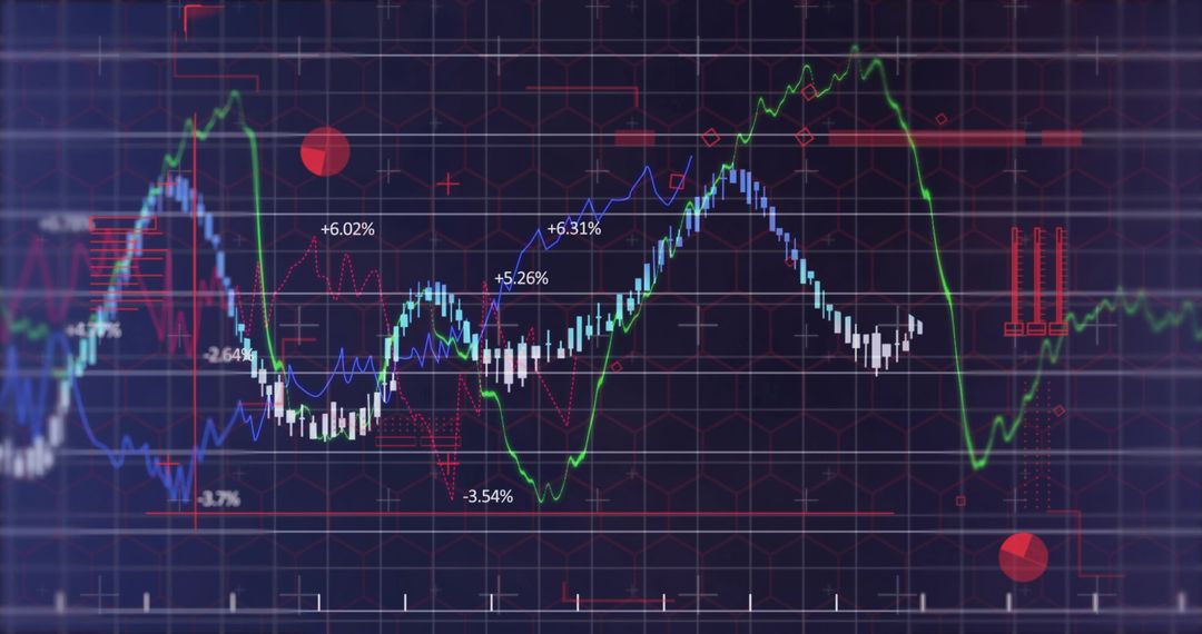
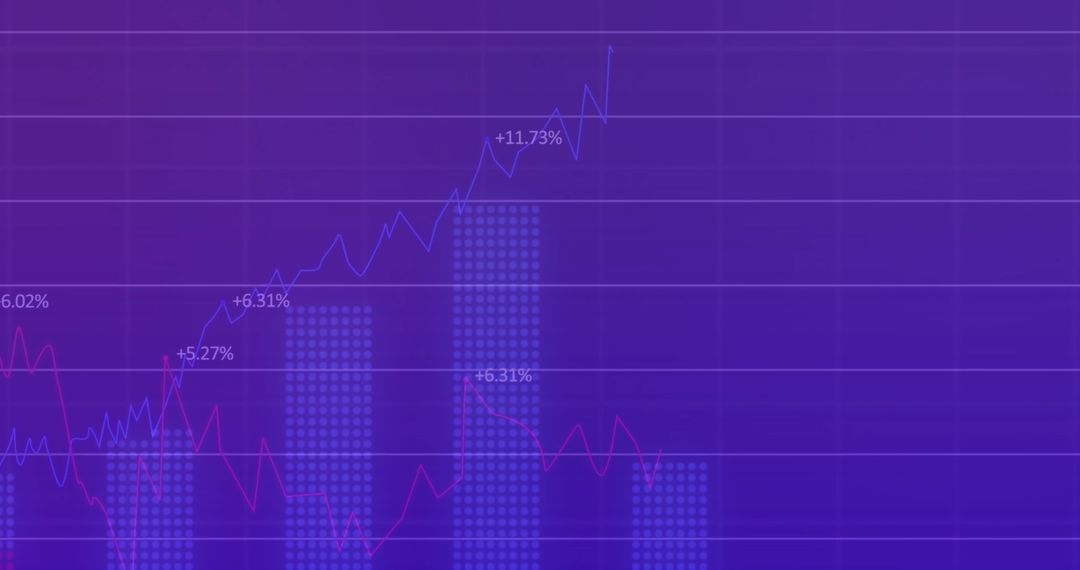
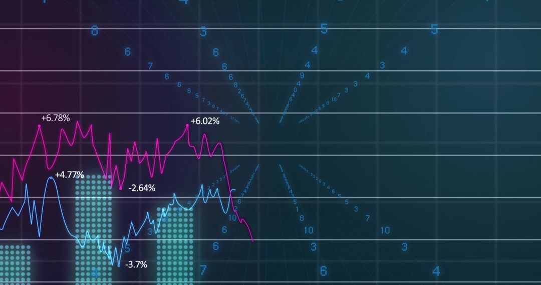
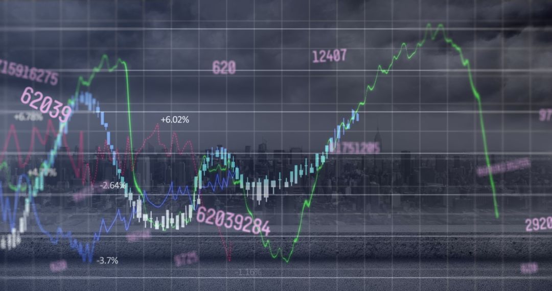
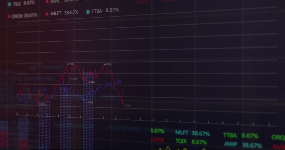
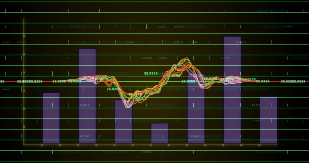
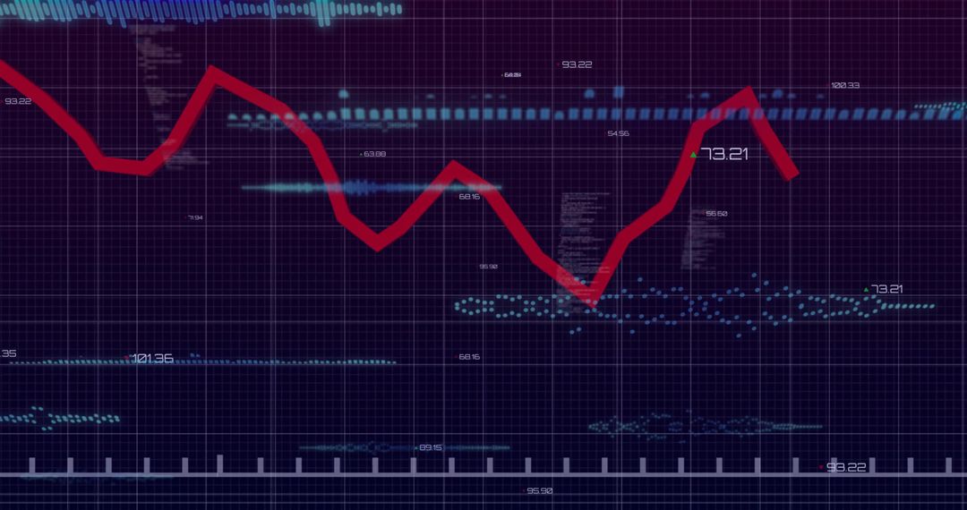
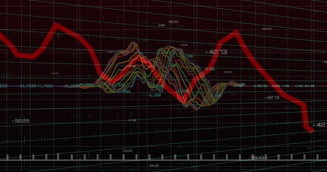
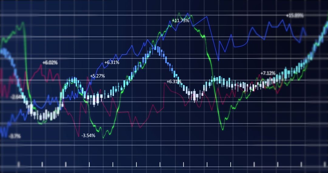
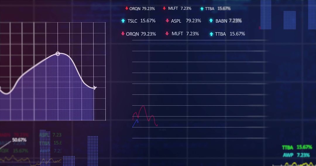
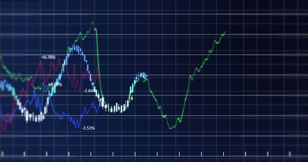
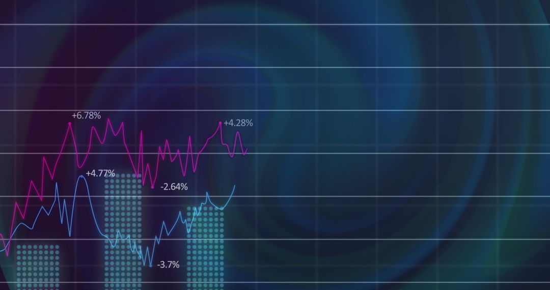
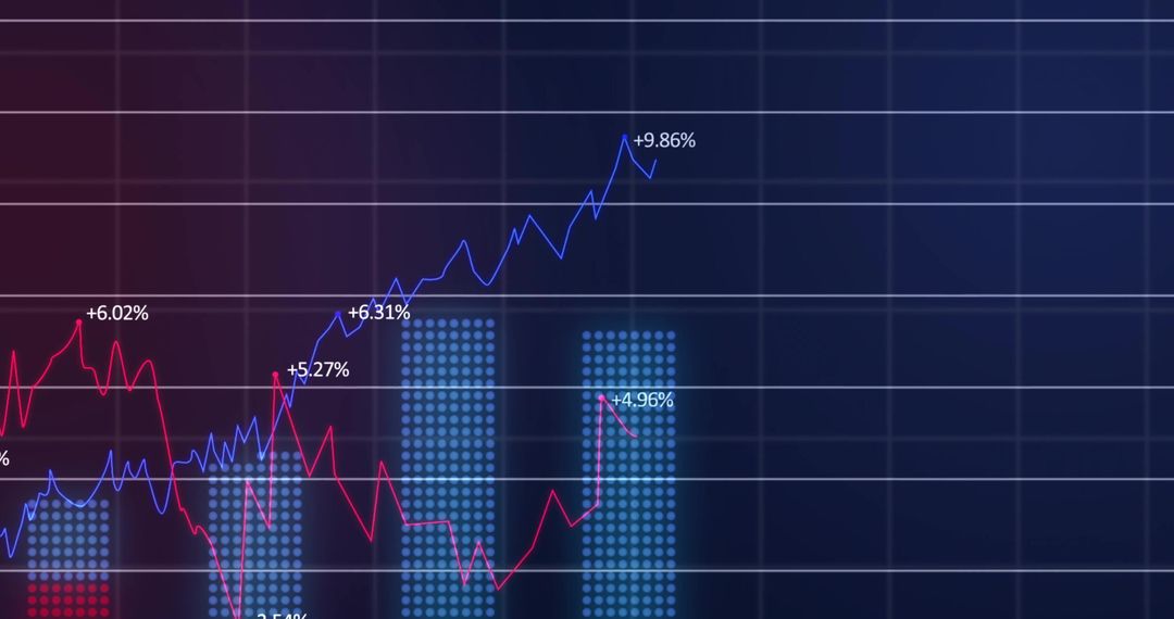
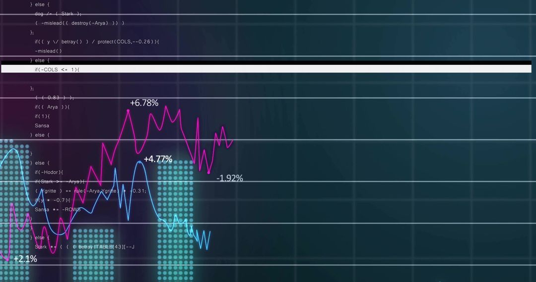
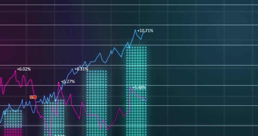
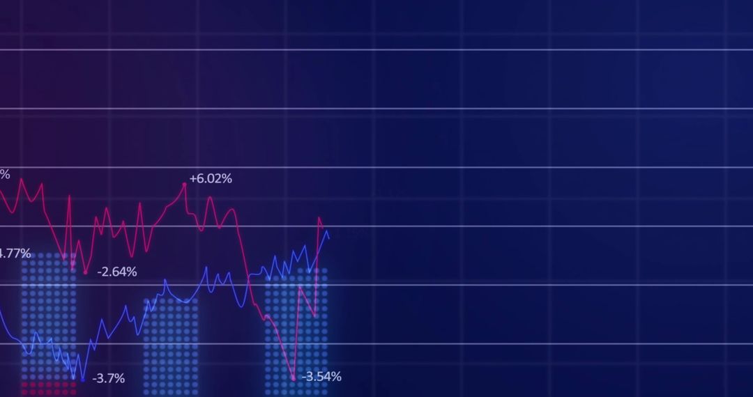
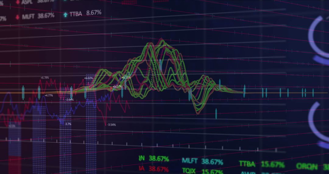
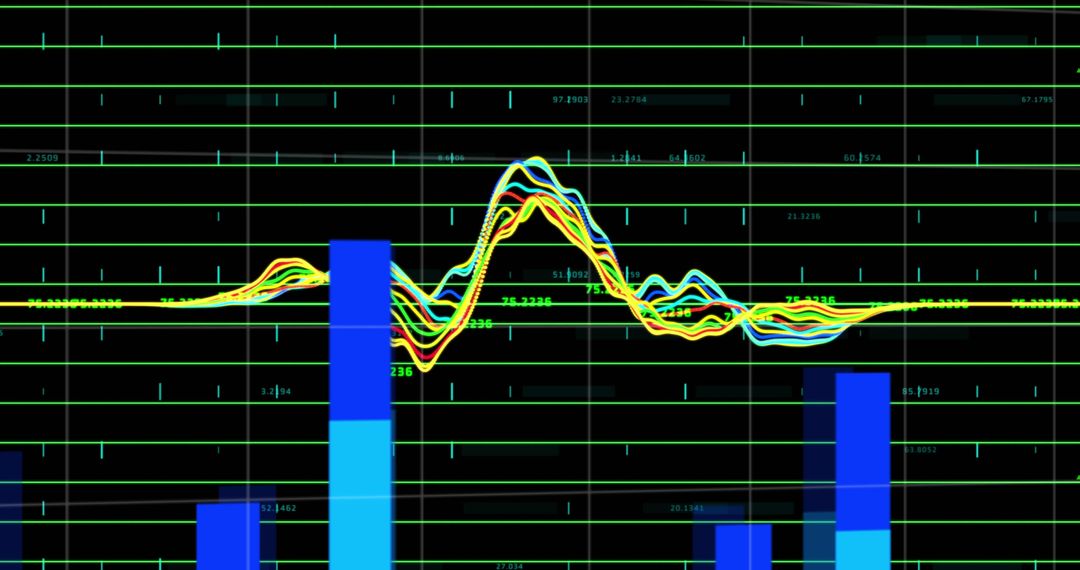
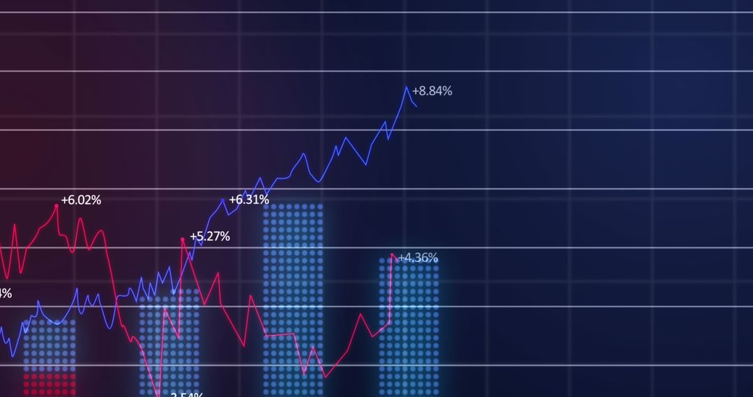
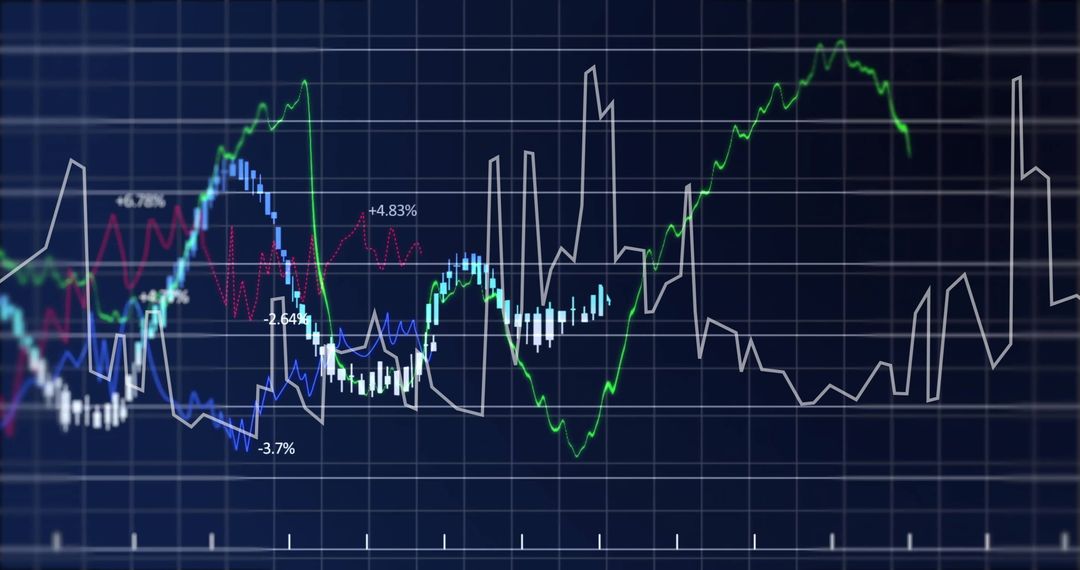
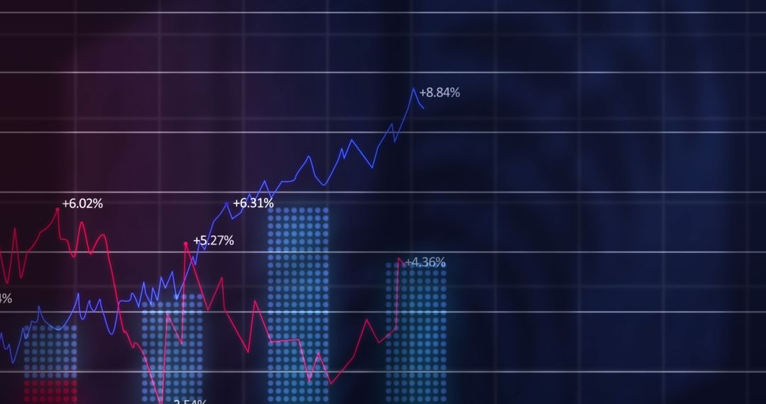
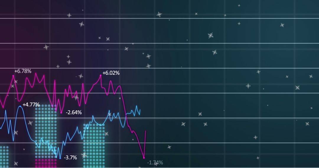
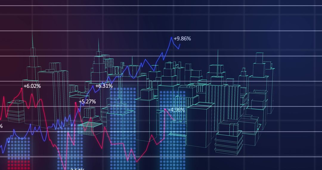
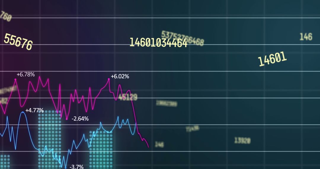
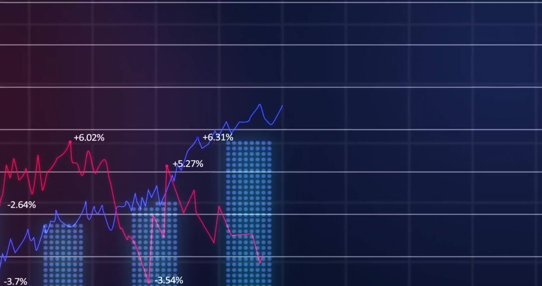
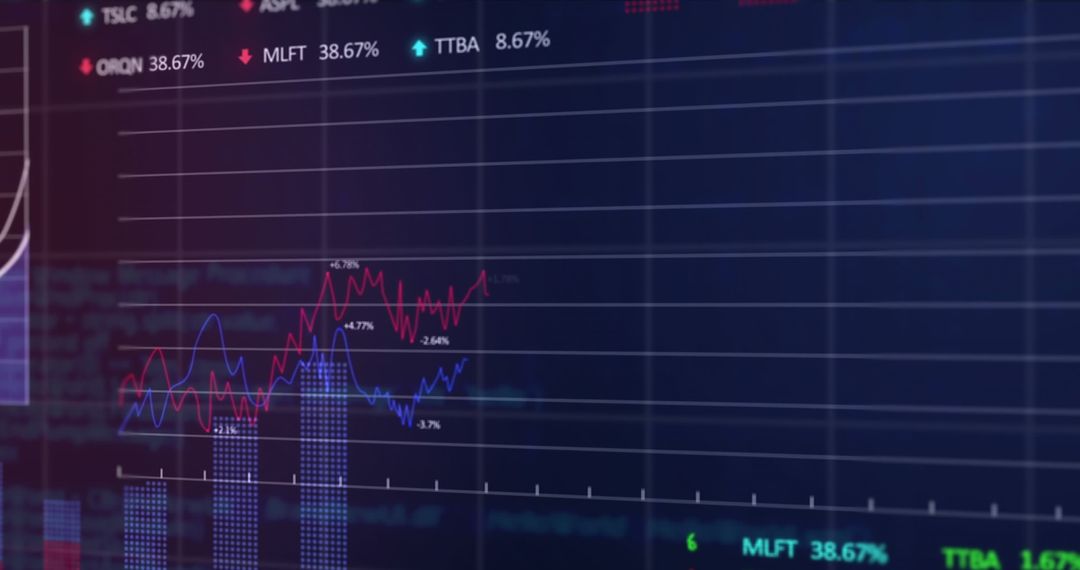
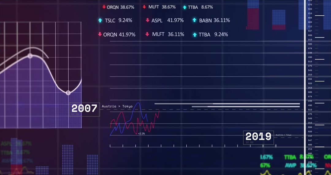
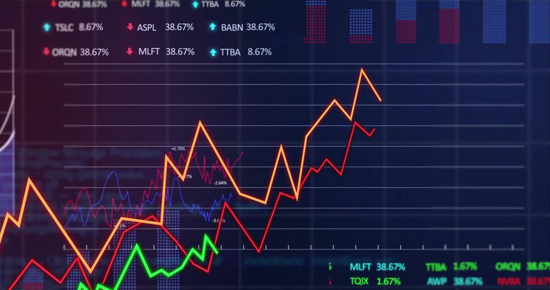
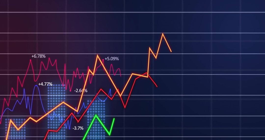
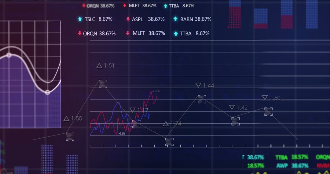
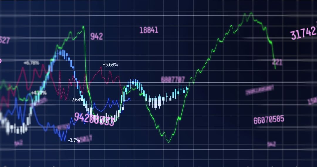
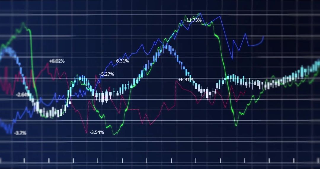
Navy dashboard visualization showing overlapping blue and red line graphs tracking market performance over time. Dotted vertical histogram columns marking trading volume while horizontal grid lines providing clear reference levels. Percent labels highlighting gains and losses at key peaks and troughs for immediate interpretation. Suitable for financial reports, market analysis presentations, business websites, fintech apps, news articles and blog posts about stock trends, investment pitch decks and educational materials. Ready for use as background for headlines, infographic panels, social media banners and slide decks. Design suggestions include overlaying brand colors, adding data callouts or annotations, cropping for banner formats and combining with headline text or KPI widgets for enhanced storytelling.
Powered by  - Get 15% off with code: PIKWIZARD15


0
downloads
downloads
Tags:
More
Credit Photo
If you would like to credit the Photo, here are some ways you can do so
Text Link
photo Link
<span class="text-link">
<span>
<a target="_blank" href=https://pikwizard.com/photo/displaying-financial-market-trends-with-blue-and-red-line-charts-dotted-histogram-columns-and-perce/a54a6aa676f3904d5b4ccbb0a4128232/>PikWizard</a>
</span>
</span>
<span class="image-link">
<span
style="margin: 0 0 20px 0; display: inline-block; vertical-align: middle; width: 100%;"
>
<a
target="_blank"
href="https://pikwizard.com/photo/displaying-financial-market-trends-with-blue-and-red-line-charts-dotted-histogram-columns-and-perce/a54a6aa676f3904d5b4ccbb0a4128232/"
style="text-decoration: none; font-size: 10px; margin: 0;"
>
<img src="https://pikwizard.com/pw/medium/a54a6aa676f3904d5b4ccbb0a4128232.jpg" style="margin: 0; width: 100%;" alt="" />
<p style="font-size: 12px; margin: 0;">PikWizard</p>
</a>
</span>
</span>
Free (free of charge)
Free for personal and commercial use.
Author: Creative Art
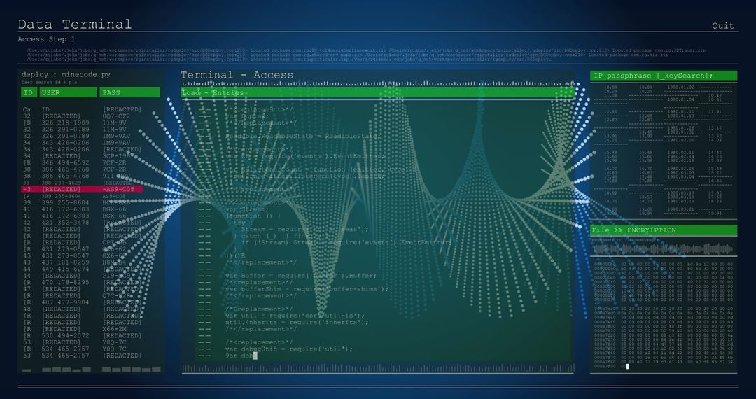
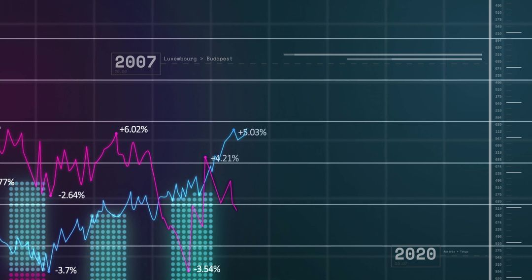
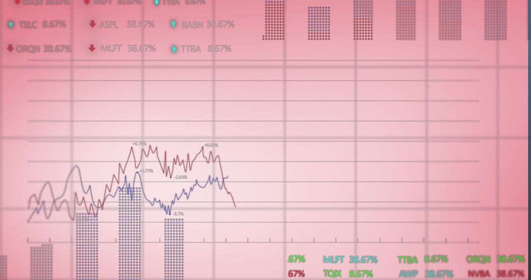
Similar Free Stock Images
Premium


Premium

Premium


Premium

Premium


Premium


Premium


Premium


Premium


Premium


Premium


Premium


Premium

Premium

Premium

Premium

Premium


Premium


Premium


Premium


Premium

Premium

Premium


Premium