
- Home >
- Stock Photos >
- Dynamic Colored Line and Candlestick Chart Representation
Dynamic Colored Line and Candlestick Chart Representation Image

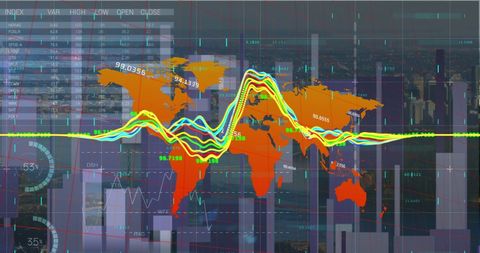
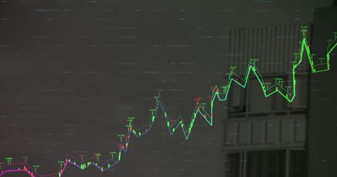
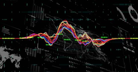
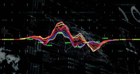
This depiction of a multi-colored line chart with candlestick markers and grid nodes is perfect for projects centered around finance, analytics, or data science. Ideal for illustrating financial trends, market analysis, or technological dashboards, it becomes a visual enhancer in presentations, reports, and digital content appreciating data complexity.
Powered by 


downloads
Tags:
More
Credit Photo
If you would like to credit the Photo, here are some ways you can do so
Text Link
photo Link
<span class="text-link">
<span>
<a target="_blank" href=https://pikwizard.com/photo/dynamic-colored-line-and-candlestick-chart-representation/0a9d35057f6ef7ceb151dc9f51fbb6e7/>PikWizard</a>
</span>
</span>
<span class="image-link">
<span
style="margin: 0 0 20px 0; display: inline-block; vertical-align: middle; width: 100%;"
>
<a
target="_blank"
href="https://pikwizard.com/photo/dynamic-colored-line-and-candlestick-chart-representation/0a9d35057f6ef7ceb151dc9f51fbb6e7/"
style="text-decoration: none; font-size: 10px; margin: 0;"
>
<img src="https://pikwizard.com/pw/medium/0a9d35057f6ef7ceb151dc9f51fbb6e7.jpg" style="margin: 0; width: 100%;" alt="" />
<p style="font-size: 12px; margin: 0;">PikWizard</p>
</a>
</span>
</span>
Free (free of charge)
Free for personal and commercial use.
Author: People Creations
Similar Free Stock Images

Premium


Premium


Premium


Premium


Premium


Premium

Premium

Premium


Premium


Premium

Premium


Premium


Premium


Premium

Premium

Premium


Premium


Premium


Premium


Premium


Premium


Premium


Premium


Premium


Premium

Explore More Free Stock Images