
- Home >
- Stock Photos >
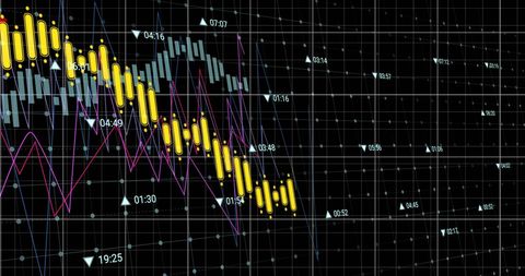
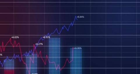
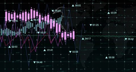
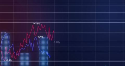
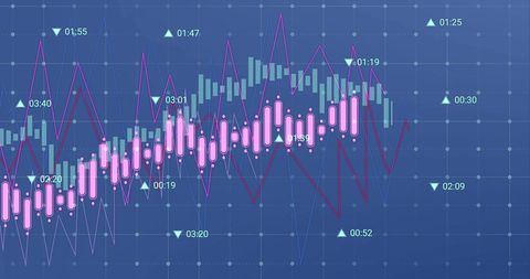
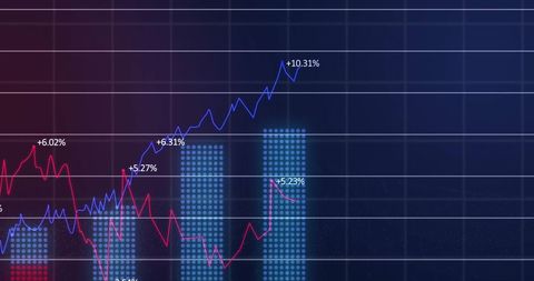
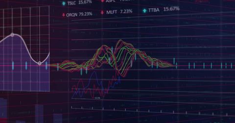
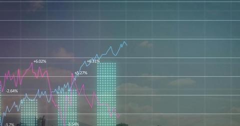
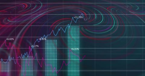
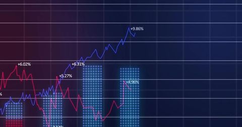
- Dynamic Data Dashboard with Multicolored Trendlines and Chart Bars
Dynamic Data Dashboard with Multicolored Trendlines and Chart Bars Image
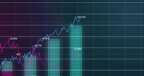
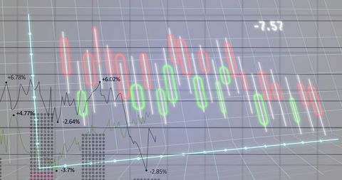
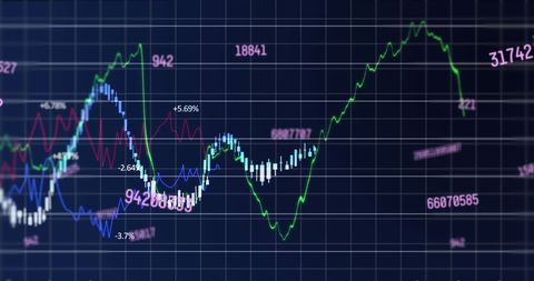
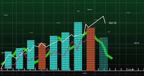
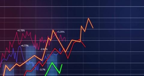
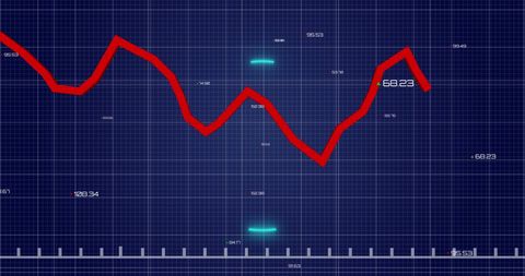
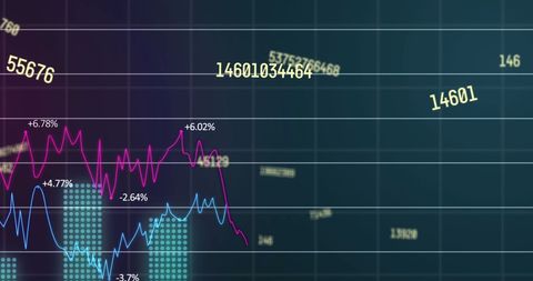
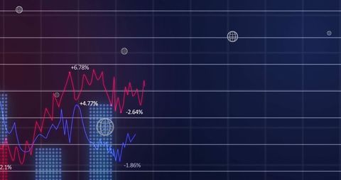
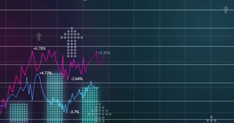
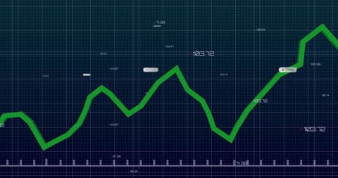
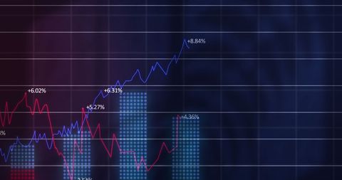
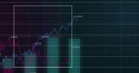
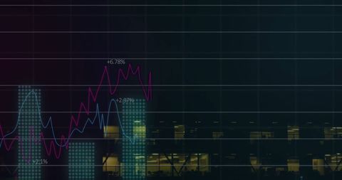
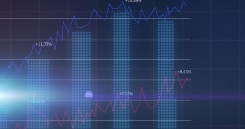
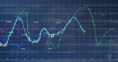
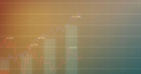
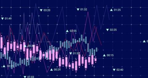
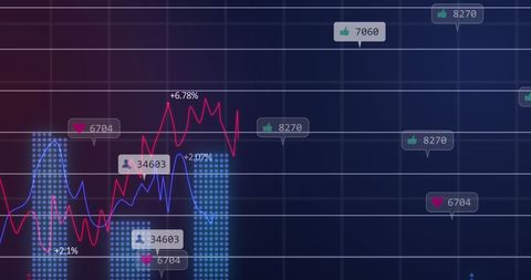
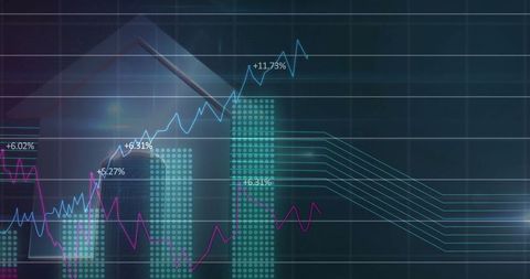
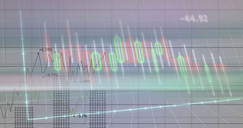
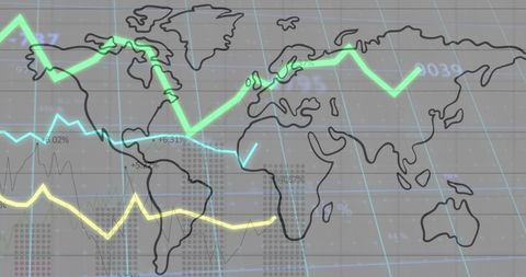
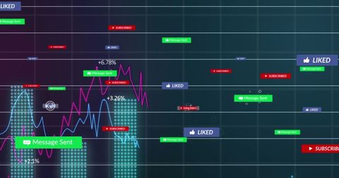
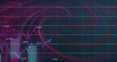
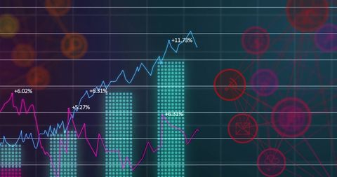
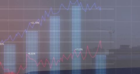
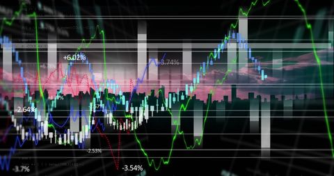
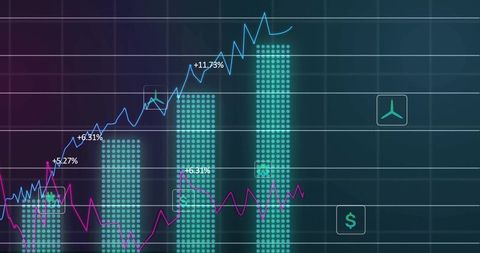
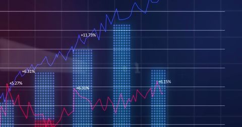
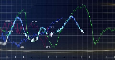
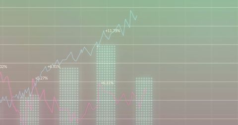
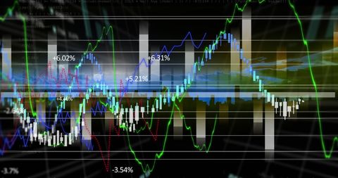
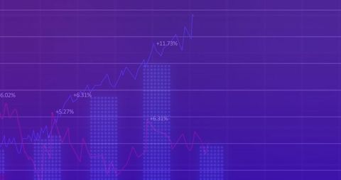
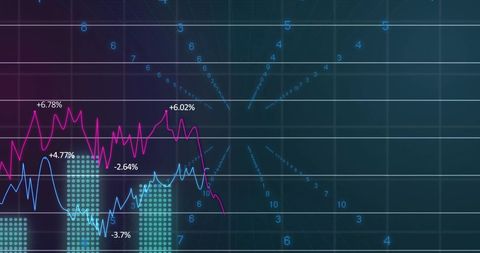
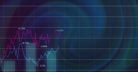
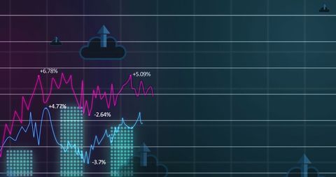
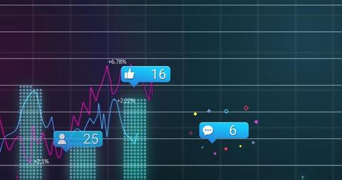
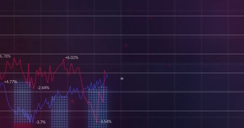
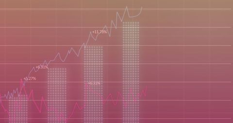
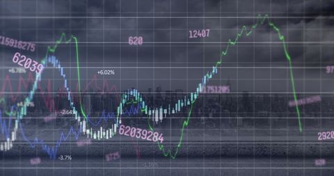
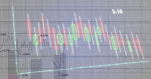
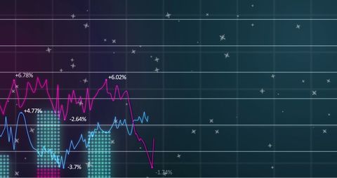
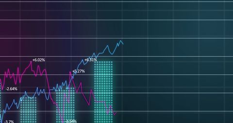
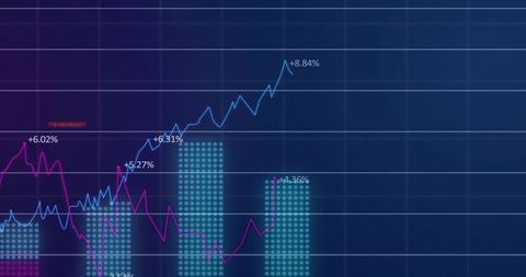
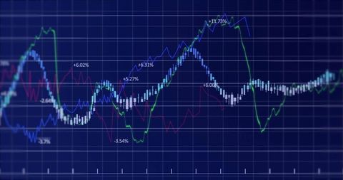
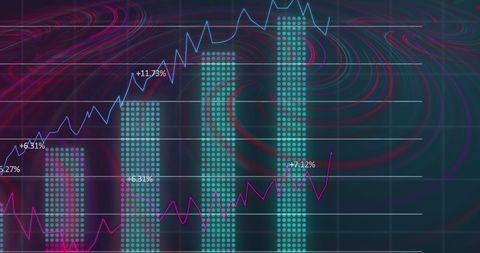
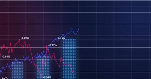
This dynamic representation of data shows trend lines and chart bars highlighting changes in performance metrics. Vibrant blue and magenta lines plot intricate data trends while teal bars mark significant data points with percentage values. Perfect for presentations related to data analytics, business intelligence reports, insights in technology fields, and illustrating complex information in clear formats.
Powered by 


downloads
Tags:
More
Credit Photo
If you would like to credit the Photo, here are some ways you can do so
Text Link
photo Link
<span class="text-link">
<span>
<a target="_blank" href=https://pikwizard.com/photo/dynamic-data-dashboard-with-multicolored-trendlines-and-chart-bars/95aaa4b2fe183ea4b5fb06efa7491c2d/>PikWizard</a>
</span>
</span>
<span class="image-link">
<span
style="margin: 0 0 20px 0; display: inline-block; vertical-align: middle; width: 100%;"
>
<a
target="_blank"
href="https://pikwizard.com/photo/dynamic-data-dashboard-with-multicolored-trendlines-and-chart-bars/95aaa4b2fe183ea4b5fb06efa7491c2d/"
style="text-decoration: none; font-size: 10px; margin: 0;"
>
<img src="https://pikwizard.com/pw/medium/95aaa4b2fe183ea4b5fb06efa7491c2d.jpg" style="margin: 0; width: 100%;" alt="" />
<p style="font-size: 12px; margin: 0;">PikWizard</p>
</a>
</span>
</span>
Free (free of charge)
Free for personal and commercial use.
Author: Awesome Content
Similar Free Stock Images
Premium

Premium

Premium


Premium


Premium


Premium


Premium


Premium


Premium


Premium


Premium


Premium

Premium

Premium

Premium


Premium


Premium

Premium


Premium

Premium


Premium


Premium

Premium

Premium

Premium


Explore More Free Stock Images