
- Home >
- Stock Photos >
- Dynamic Data Visualization on Digital Interface
Dynamic Data Visualization on Digital Interface Image

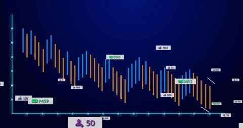
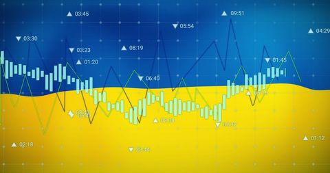
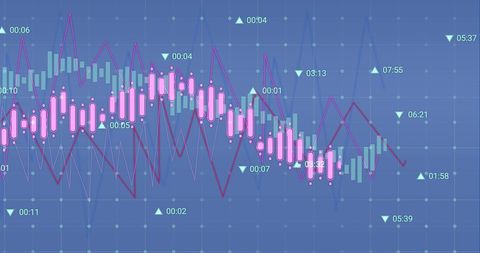
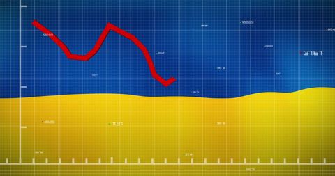
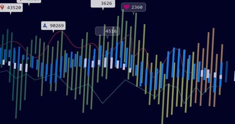
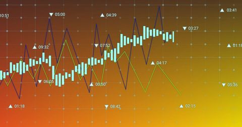
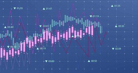
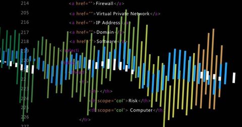
Colorful lines and charts create an engaging visual of data analytics on a blue and purple background, illustrating complex financial and business concepts in a digital design. This can be used in presentations related to financial forecasting, tech articles about digital transformation, and educational materials on data analytics.

downloads
Tags:
More
Credit Photo
If you would like to credit the Photo, here are some ways you can do so
Text Link
photo Link
<span class="text-link">
<span>
<a target="_blank" href=https://pikwizard.com/photo/dynamic-data-visualization-on-digital-interface/196aedea9a06a22b2b3231ed7a710bd2/>PikWizard</a>
</span>
</span>
<span class="image-link">
<span
style="margin: 0 0 20px 0; display: inline-block; vertical-align: middle; width: 100%;"
>
<a
target="_blank"
href="https://pikwizard.com/photo/dynamic-data-visualization-on-digital-interface/196aedea9a06a22b2b3231ed7a710bd2/"
style="text-decoration: none; font-size: 10px; margin: 0;"
>
<img src="https://pikwizard.com/pw/medium/196aedea9a06a22b2b3231ed7a710bd2.jpg" style="margin: 0; width: 100%;" alt="" />
<p style="font-size: 12px; margin: 0;">PikWizard</p>
</a>
</span>
</span>
Free (free of charge)
Free for personal and commercial use.
Author: Awesome Content
Similar Free Stock Images


AI


AI


AI

AI


AI


AI


Explore More Free Stock Images