
- Home >
- Stock Photos >
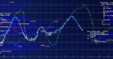
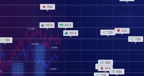
- Dynamic Data Visualization with Multicolor Line Chart and Metrics
Dynamic Data Visualization with Multicolor Line Chart and Metrics Image

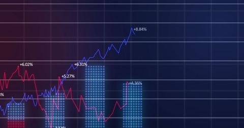
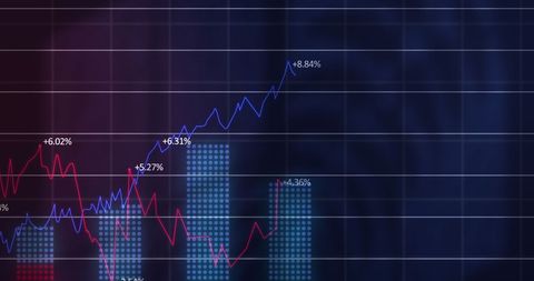
Colorful line chart illustrates real-time metrics on digital dashboard. Used for financial analysis, performance tracking, data-driven decision making, and reports. Great for enhancing business presentations or providing insights on analytics platforms.
Powered by 


downloads
Tags:
More
Credit Photo
If you would like to credit the Photo, here are some ways you can do so
Text Link
photo Link
<span class="text-link">
<span>
<a target="_blank" href=https://pikwizard.com/photo/dynamic-data-visualization-with-multicolor-line-chart-and-metrics/676bb94743dfcd77885e8bf3d29c63ab/>PikWizard</a>
</span>
</span>
<span class="image-link">
<span
style="margin: 0 0 20px 0; display: inline-block; vertical-align: middle; width: 100%;"
>
<a
target="_blank"
href="https://pikwizard.com/photo/dynamic-data-visualization-with-multicolor-line-chart-and-metrics/676bb94743dfcd77885e8bf3d29c63ab/"
style="text-decoration: none; font-size: 10px; margin: 0;"
>
<img src="https://pikwizard.com/pw/medium/676bb94743dfcd77885e8bf3d29c63ab.jpg" style="margin: 0; width: 100%;" alt="" />
<p style="font-size: 12px; margin: 0;">PikWizard</p>
</a>
</span>
</span>
Free (free of charge)
Free for personal and commercial use.
Author: Authentic Images
Similar Free Stock Images
Premium


Premium


Premium


Premium


Premium


Premium


Premium


Premium

Premium


Premium


Premium


Premium


Premium


Premium


Premium


Premium


Premium


Premium

Premium


Premium


Premium


Premium


Premium


Premium


Premium


Explore More Free Stock Images