- Home >
- Stock Photos >
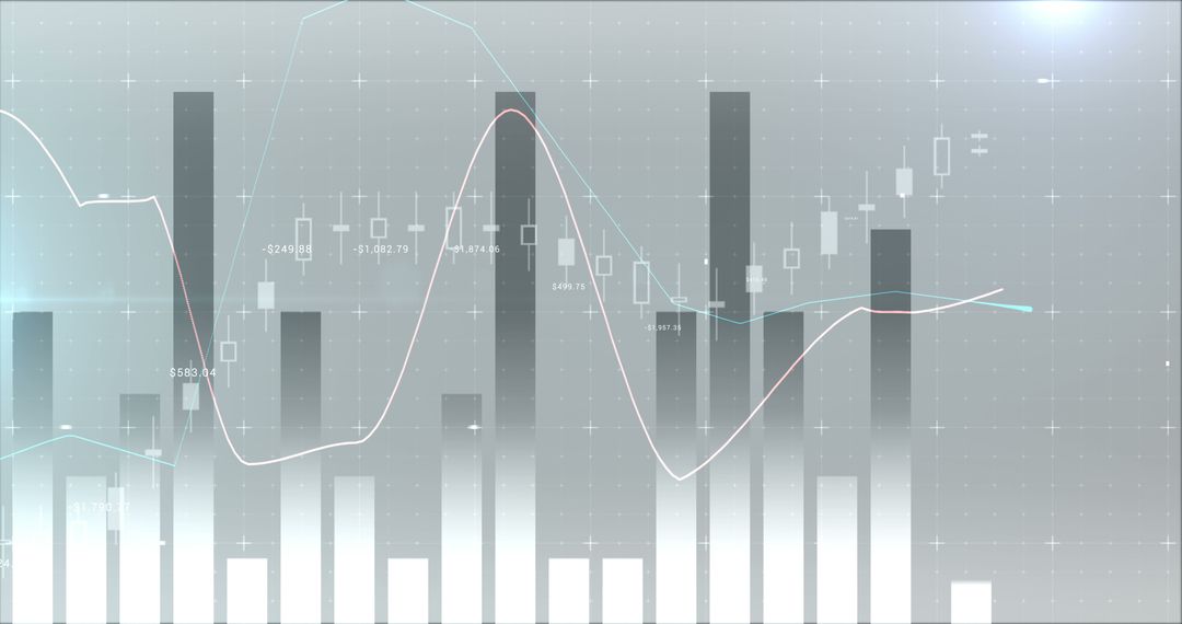
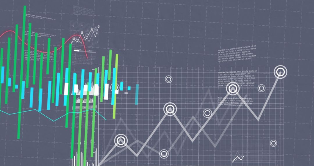
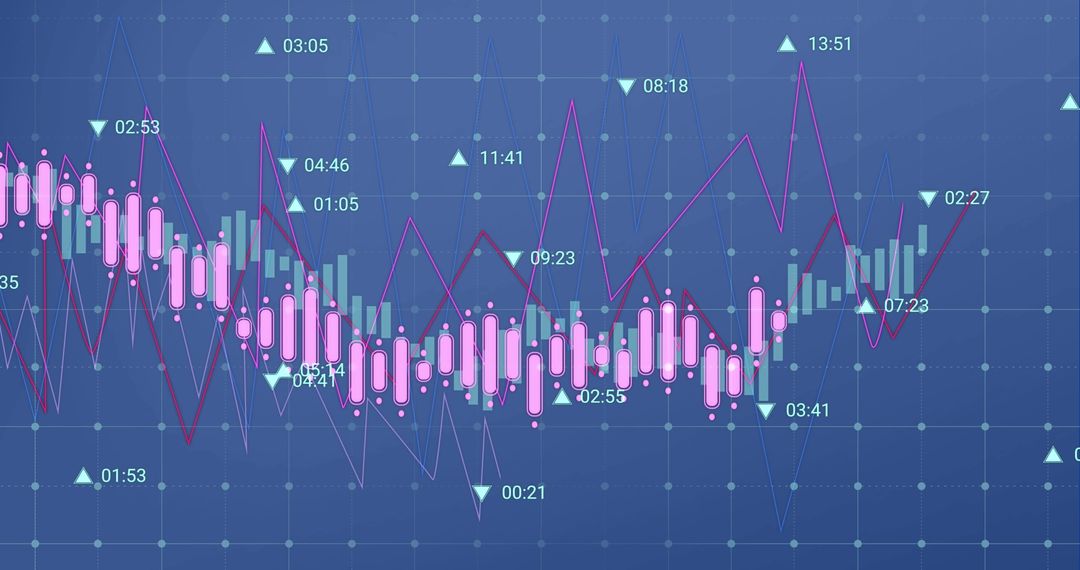
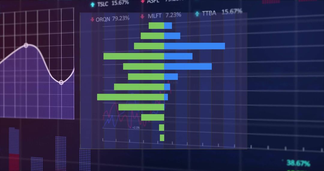
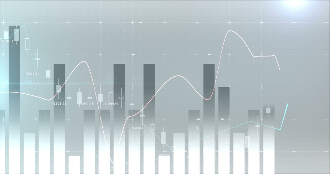
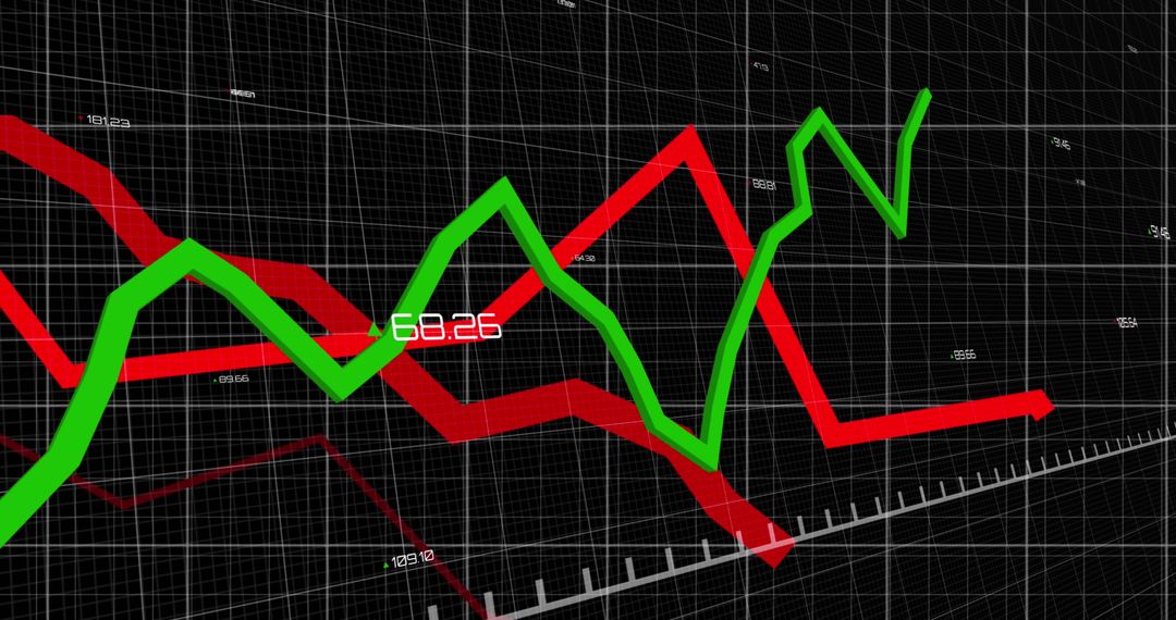
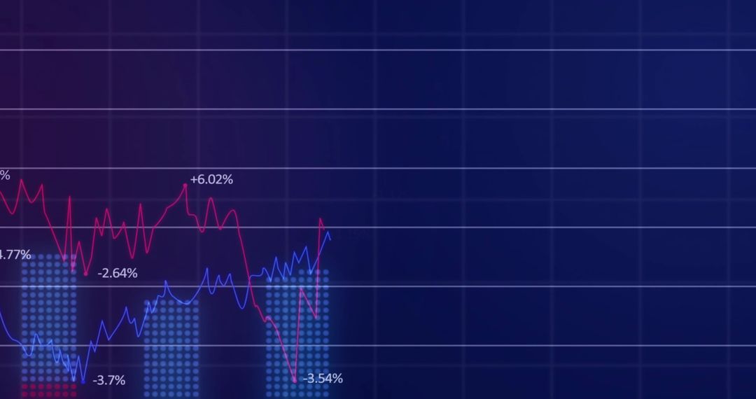
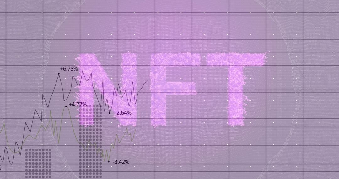
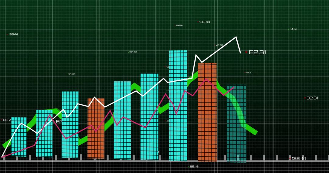
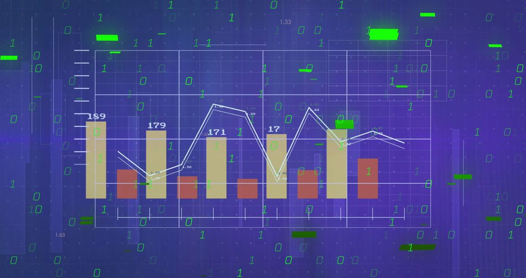
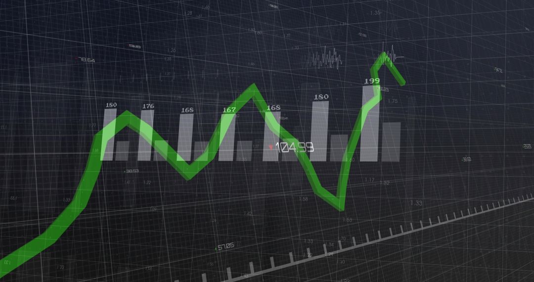
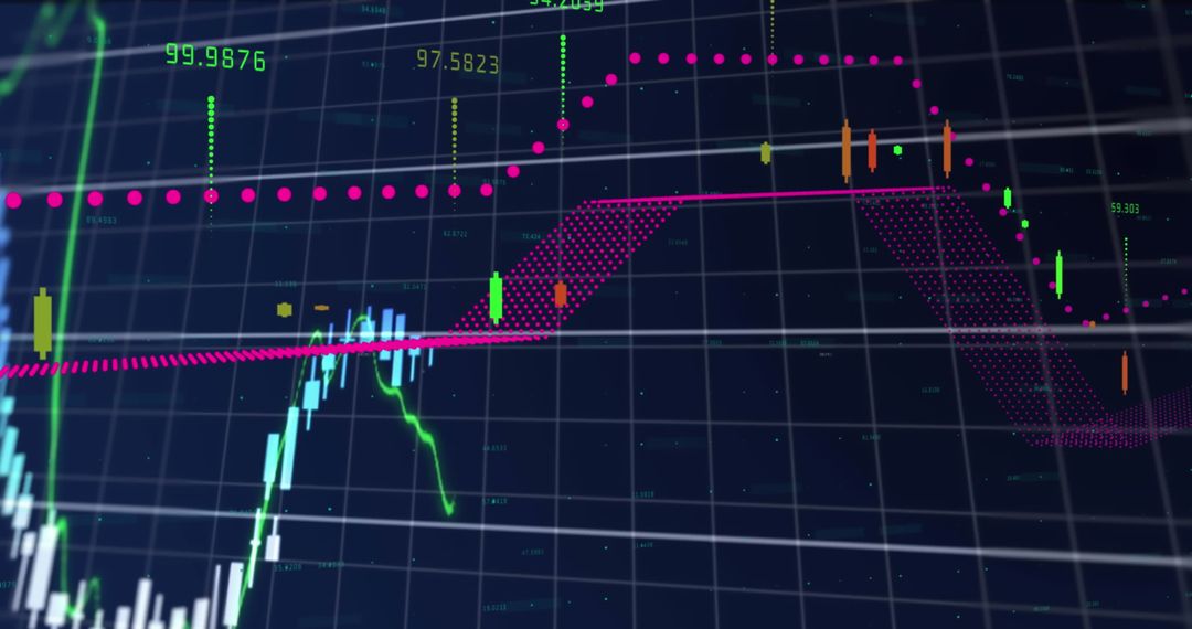
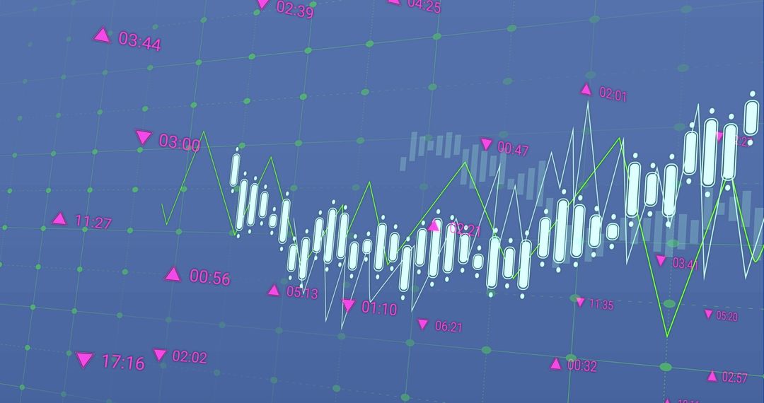
- Lavender Bar Chart with Multi-Line Trends and Grid Overlay for Analytics Dashboard
Lavender Bar Chart with Multi-Line Trends and Grid Overlay for Analytics Dashboard Image

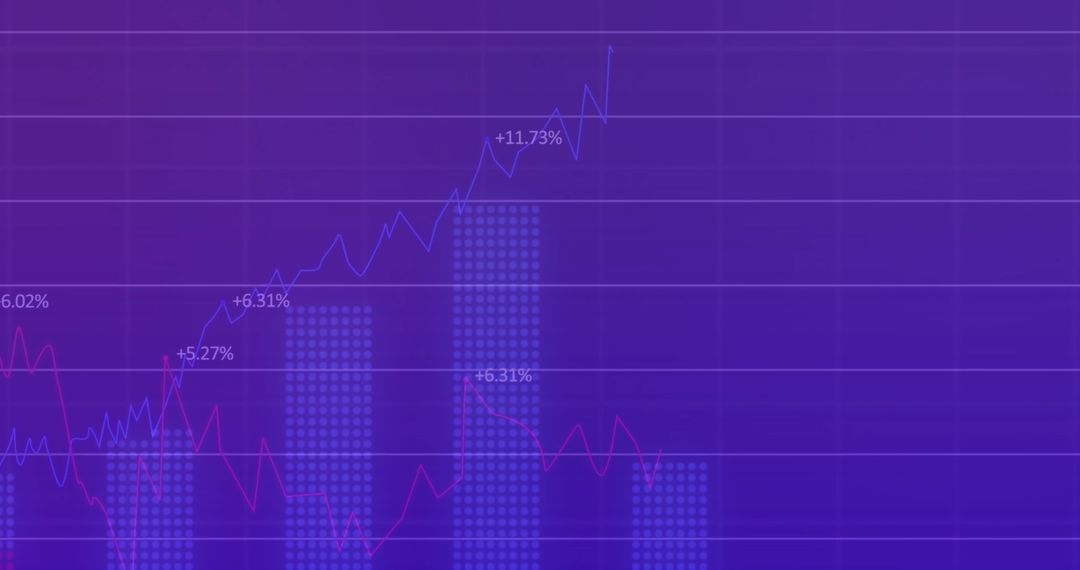
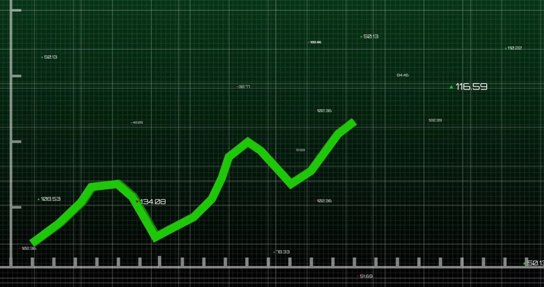
Displaying seven vertical lavender bars on grid with multiple colored trend lines and numeric labels, creating clear comparison between columns. Providing clean, modern look with pastel palette and translucent fills for emphasis without distraction. Working well for analytics dashboards, financial reports, business presentations, annual reviews, and marketing decks. Helping visualize month-to-month comparisons, trend analysis, KPI tracking, and performance benchmarking. Serving as hero graphic for slide headers, website dashboards, blog posts about data science, social media analytics posts, and printed report covers. Allowing easy overlay of custom labels or company branding for client proposals and investor presentations. Delivering concise visual language for stakeholders requiring fast insight into trends and outliers.
Powered by  - Get 15% off with code: PIKWIZARD15


0
downloads
downloads
Tags:
More
Credit Photo
If you would like to credit the Photo, here are some ways you can do so
Text Link
photo Link
<span class="text-link">
<span>
<a target="_blank" href=https://pikwizard.com/photo/lavender-bar-chart-with-multi-line-trends-and-grid-overlay-for-analytics-dashboard/62d108dfa14c524ffced850760f674f9/>PikWizard</a>
</span>
</span>
<span class="image-link">
<span
style="margin: 0 0 20px 0; display: inline-block; vertical-align: middle; width: 100%;"
>
<a
target="_blank"
href="https://pikwizard.com/photo/lavender-bar-chart-with-multi-line-trends-and-grid-overlay-for-analytics-dashboard/62d108dfa14c524ffced850760f674f9/"
style="text-decoration: none; font-size: 10px; margin: 0;"
>
<img src="https://pikwizard.com/pw/medium/62d108dfa14c524ffced850760f674f9.jpg" style="margin: 0; width: 100%;" alt="" />
<p style="font-size: 12px; margin: 0;">PikWizard</p>
</a>
</span>
</span>
Free (free of charge)
Free for personal and commercial use.
Author: Creative Art
Similar Free Stock Images

Premium

Premium


Premium

Premium


Premium


Premium


Premium


Premium


Premium


Premium


Premium


Premium


Premium


Premium


Premium


Premium


Premium


Premium


Premium


Premium

Premium

Premium

Premium


Premium