- Home >
- Stock Photos >
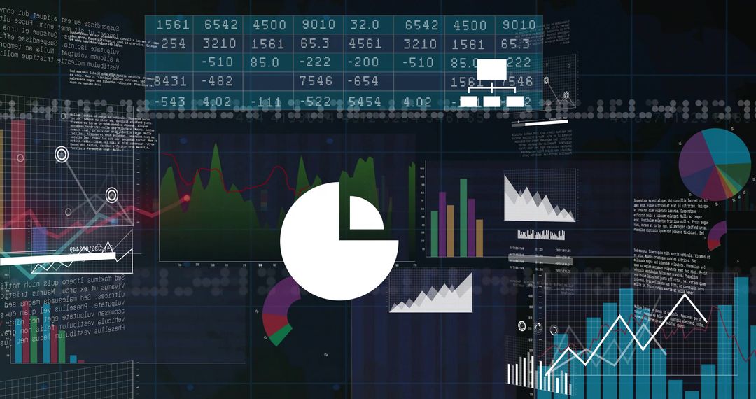
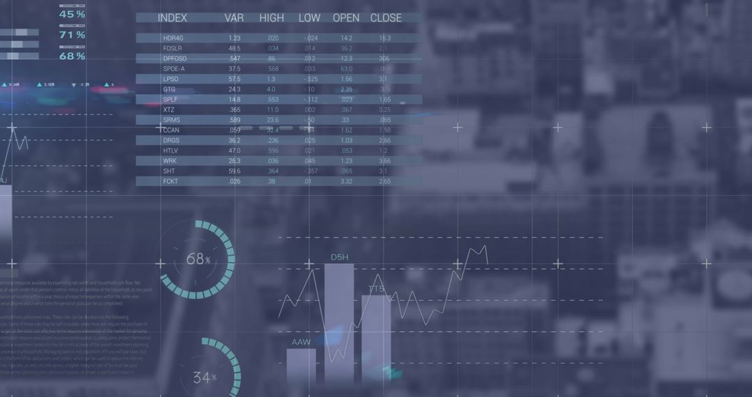
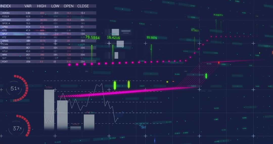
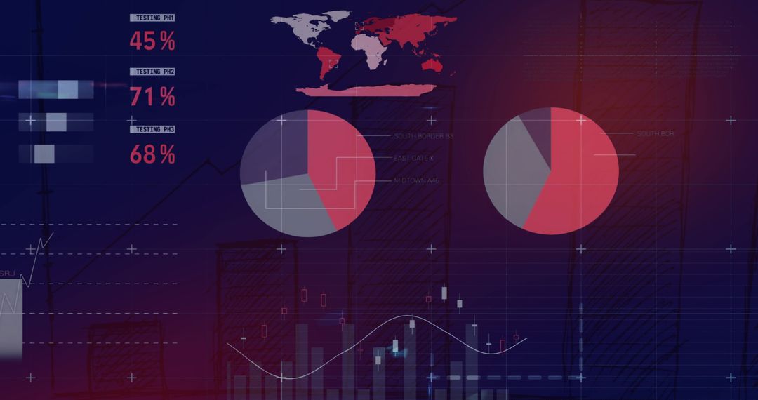
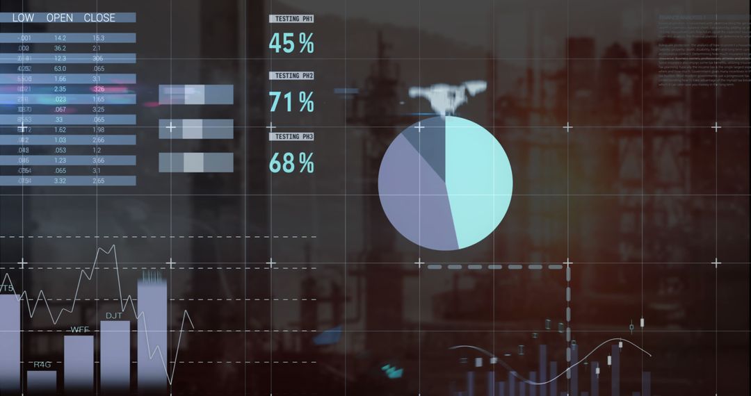
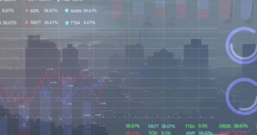
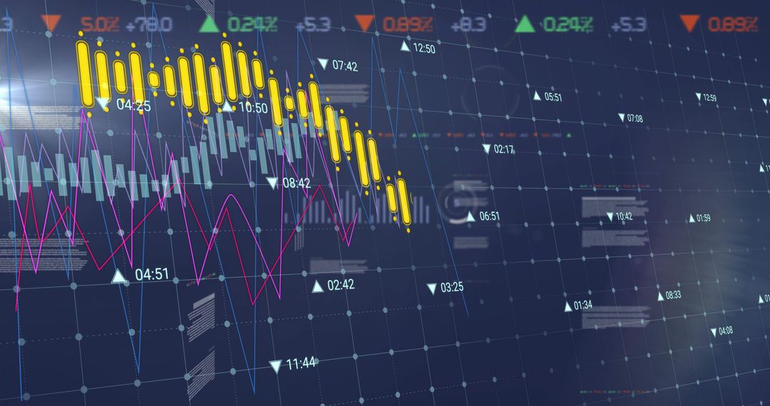
- Maroon Data Dashboard Showing Declining Red Area Chart With Pie Charts and Candlestick Trends
Maroon Data Dashboard Showing Declining Red Area Chart With Pie Charts and Candlestick Trends Image

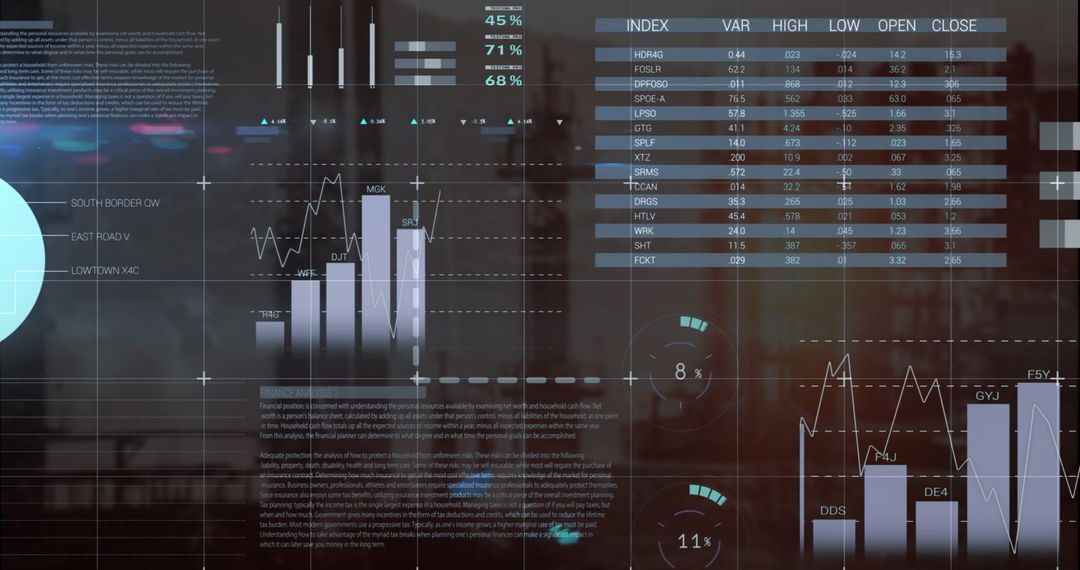
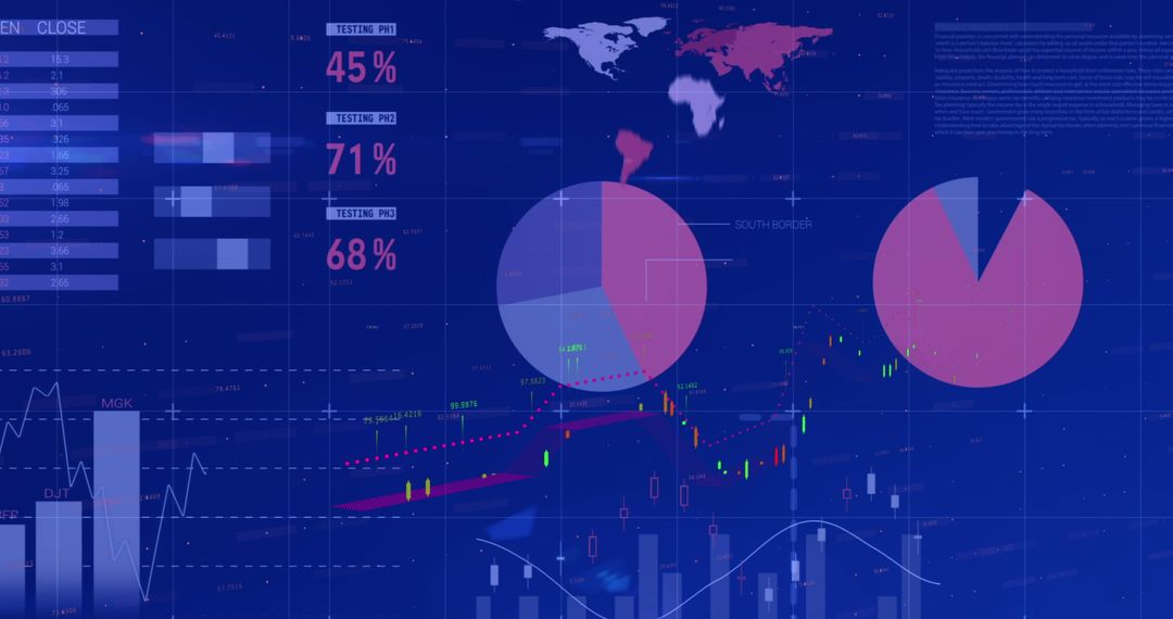
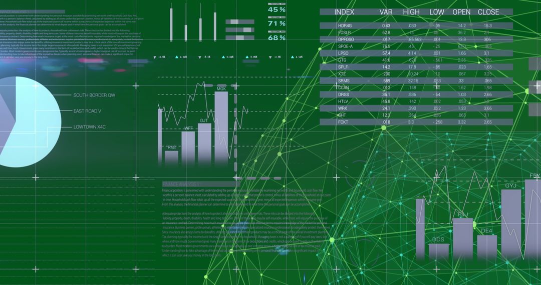
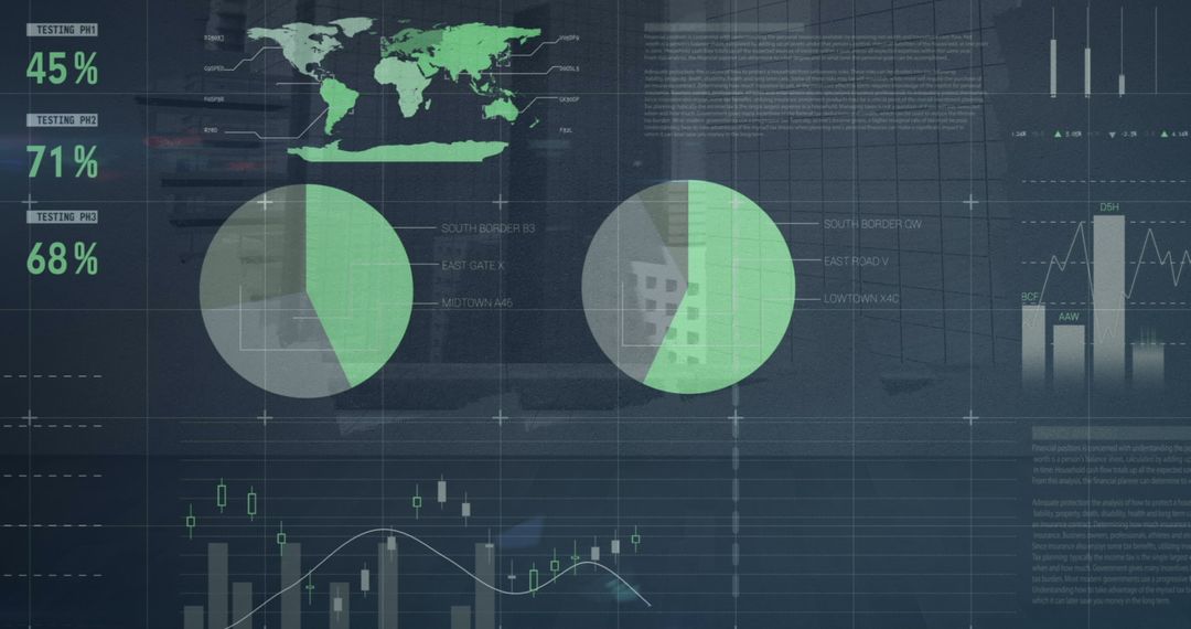
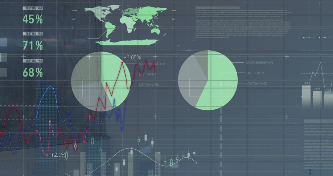
Displaying maroon analytics dashboard with descending red area chart, overlapping pie charts, candlestick bars, trendline, world map overlay, and gridlines. Featuring layered data elements for illustrating market decline, revenue drop, portfolio performance, and regional distribution. Providing high-contrast palette and modern UI elements for clear visual communication and editorial use. Working well as header visual for financial reports, market trend presentations, investor briefings, business intelligence dashboards, fintech websites, slide decks, press releases, and social media campaigns. Helping designers and content creators convey data-driven narratives, risk analysis, and performance summaries. Editable color and overlay options enabling brand alignment and layout customization.
Powered by  - Get 15% off with code: PIKWIZARD15


0
downloads
downloads
Tags:
More
Credit Photo
If you would like to credit the Photo, here are some ways you can do so
Text Link
photo Link
<span class="text-link">
<span>
<a target="_blank" href=https://pikwizard.com/photo/maroon-data-dashboard-showing-declining-red-area-chart-with-pie-charts-and-candlestick-trends/1f51862b55491937b7df9229b25a846d/>PikWizard</a>
</span>
</span>
<span class="image-link">
<span
style="margin: 0 0 20px 0; display: inline-block; vertical-align: middle; width: 100%;"
>
<a
target="_blank"
href="https://pikwizard.com/photo/maroon-data-dashboard-showing-declining-red-area-chart-with-pie-charts-and-candlestick-trends/1f51862b55491937b7df9229b25a846d/"
style="text-decoration: none; font-size: 10px; margin: 0;"
>
<img src="https://pikwizard.com/pw/medium/1f51862b55491937b7df9229b25a846d.jpg" style="margin: 0; width: 100%;" alt="" />
<p style="font-size: 12px; margin: 0;">PikWizard</p>
</a>
</span>
</span>
Free (free of charge)
Free for personal and commercial use.
Author: Awesome Content
Similar Free Stock Images

Premium


Premium


Premium


Premium


Premium


Premium


Premium


Premium


Premium


Premium


Premium


Premium


Premium


Premium


Premium


Premium


Premium


Premium


Premium


Premium


Premium


Premium


Premium


Premium