
- Home >
- Stock Photos >
- Multicolored Line Chart with World Map for Data Visualization
Multicolored Line Chart with World Map for Data Visualization Image
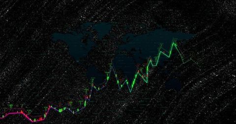
Multicolored line chart with candlesticks on dark world map silhouette illustrates the dynamic nature of global financial markets. Vibrant colors represent varied market trends or financial metrics on a complex trading screen. Graph's candid elation from ascending lines symbolizes growth and investment progress. Ideal for corporate presentations, financial reports, and technology discussions depicting global analytics and financial instruments.

downloads
Tags:
More
Credit Photo
If you would like to credit the Photo, here are some ways you can do so
Text Link
photo Link
<span class="text-link">
<span>
<a target="_blank" href=https://pikwizard.com/photo/multicolored-line-chart-with-world-map-for-data-visualization/38aae8f59947aed24bbfa40aaa1dacfc/>PikWizard</a>
</span>
</span>
<span class="image-link">
<span
style="margin: 0 0 20px 0; display: inline-block; vertical-align: middle; width: 100%;"
>
<a
target="_blank"
href="https://pikwizard.com/photo/multicolored-line-chart-with-world-map-for-data-visualization/38aae8f59947aed24bbfa40aaa1dacfc/"
style="text-decoration: none; font-size: 10px; margin: 0;"
>
<img src="https://pikwizard.com/pw/medium/38aae8f59947aed24bbfa40aaa1dacfc.jpg" style="margin: 0; width: 100%;" alt="" />
<p style="font-size: 12px; margin: 0;">PikWizard</p>
</a>
</span>
</span>
Free (free of charge)
Free for personal and commercial use.
Author: People Creations