- Home >
- Stock Photos >
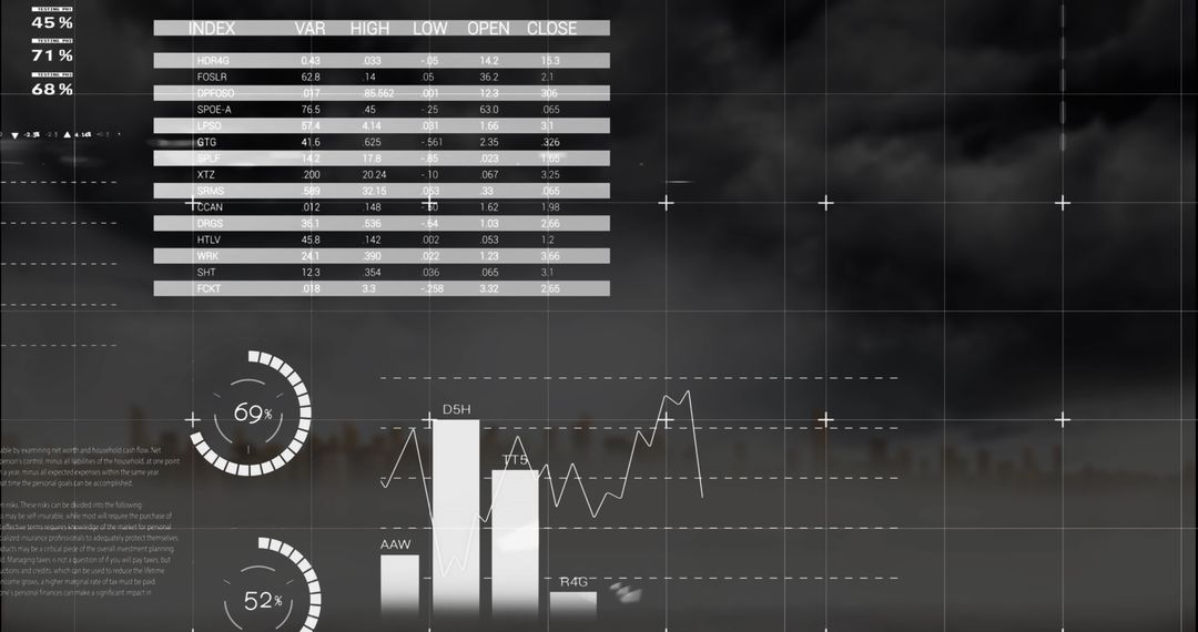
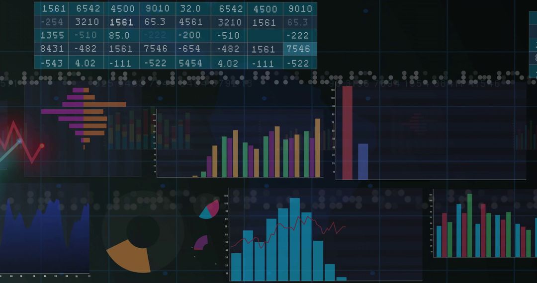
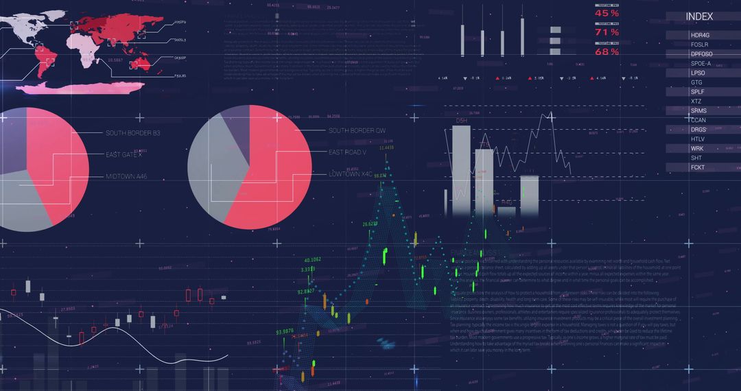
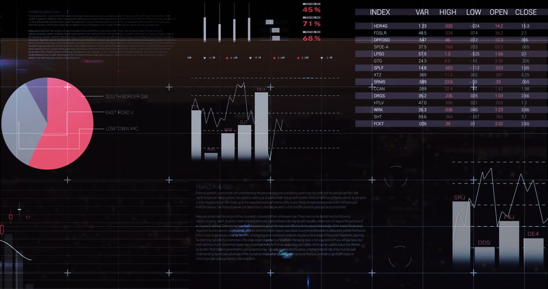
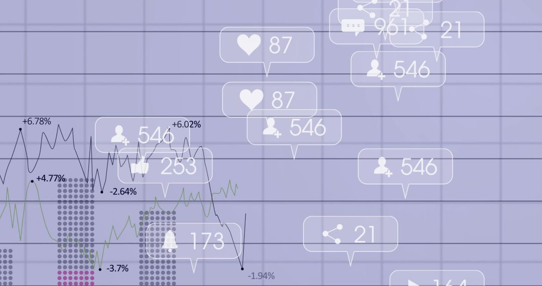
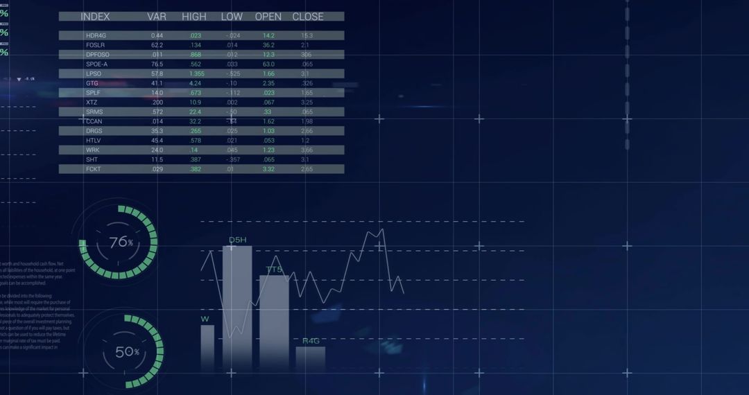
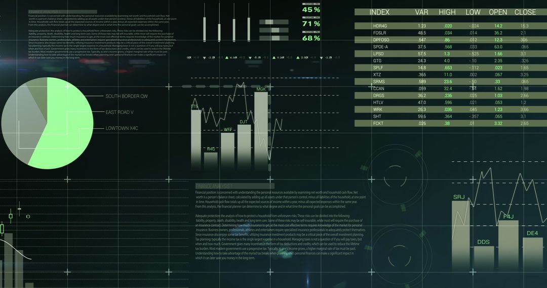
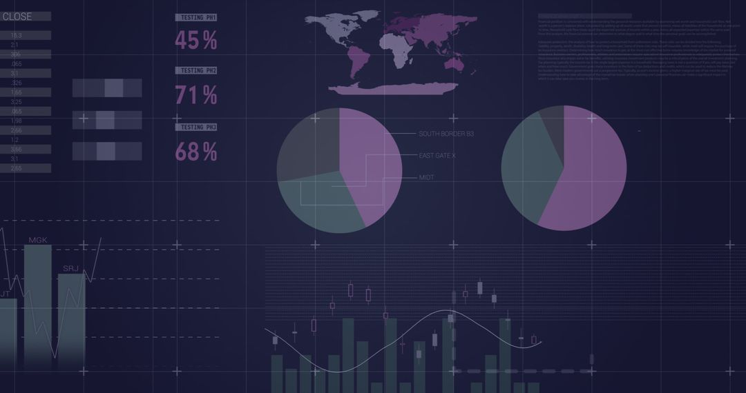
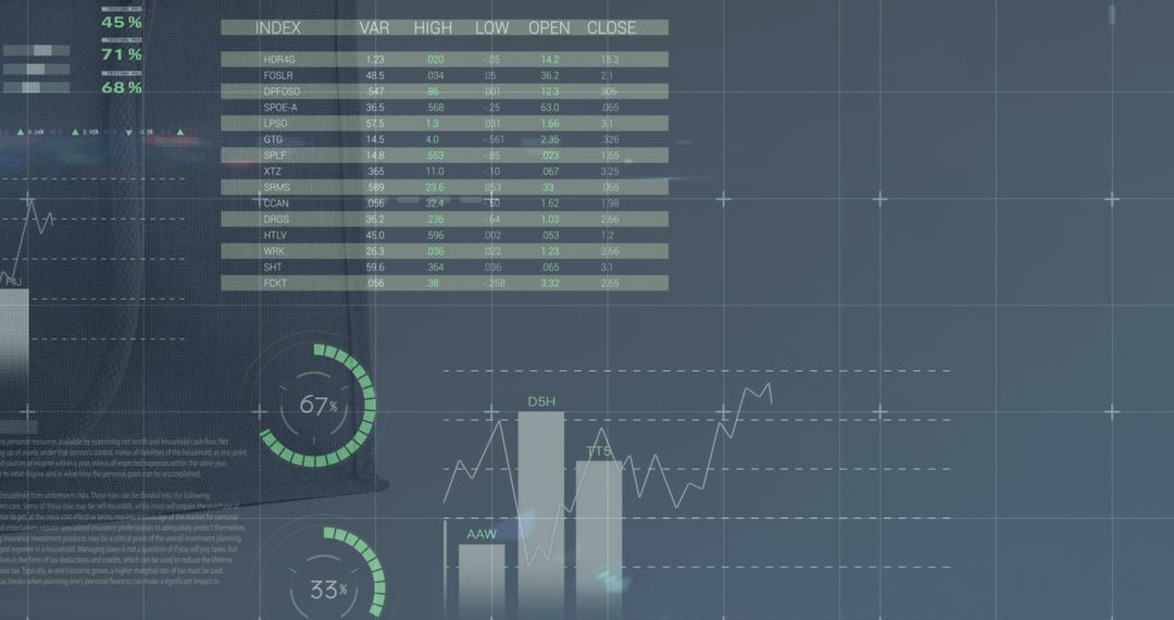
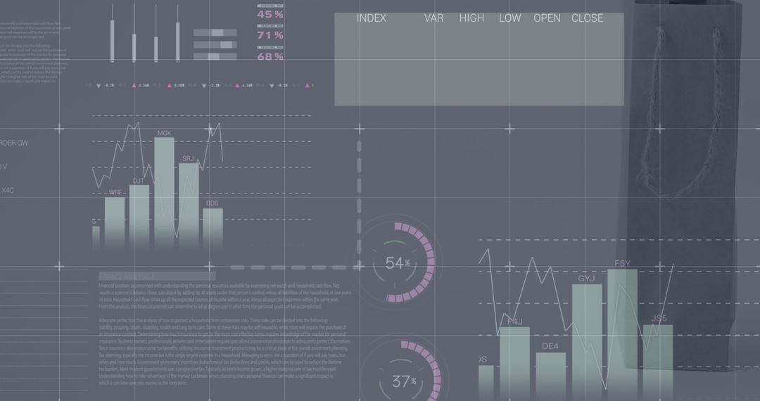
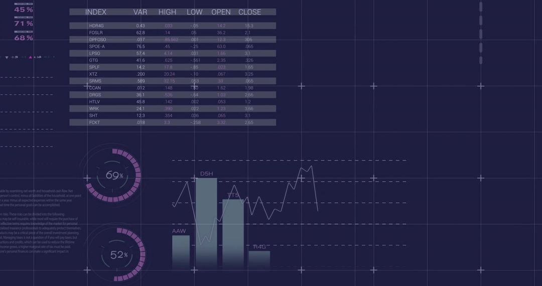
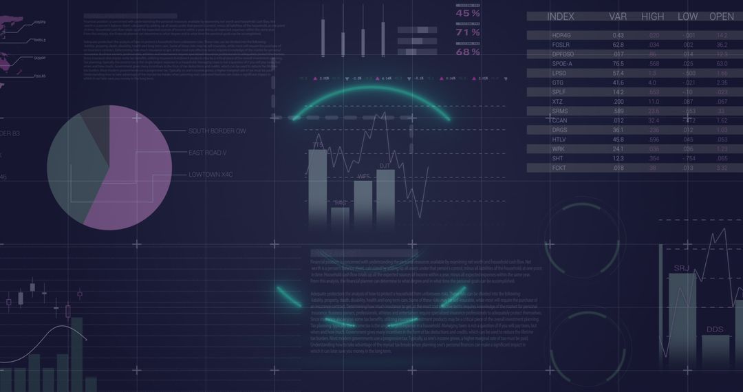
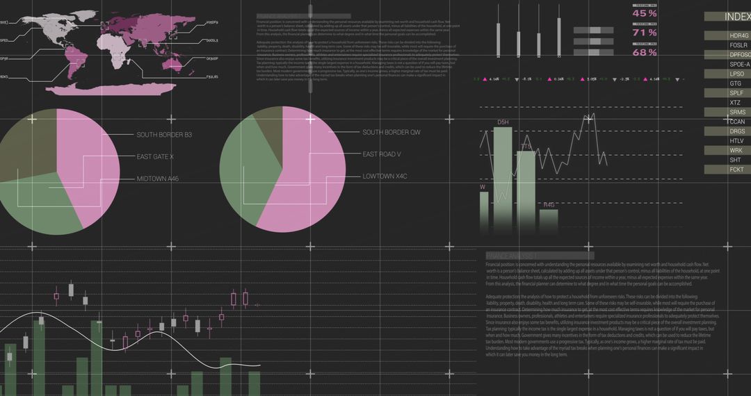
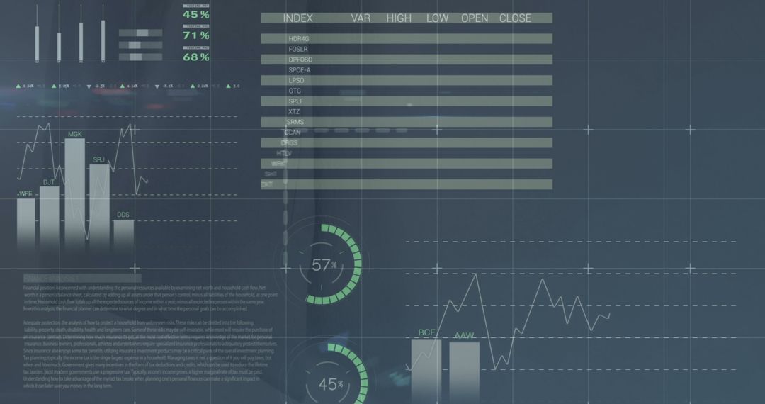
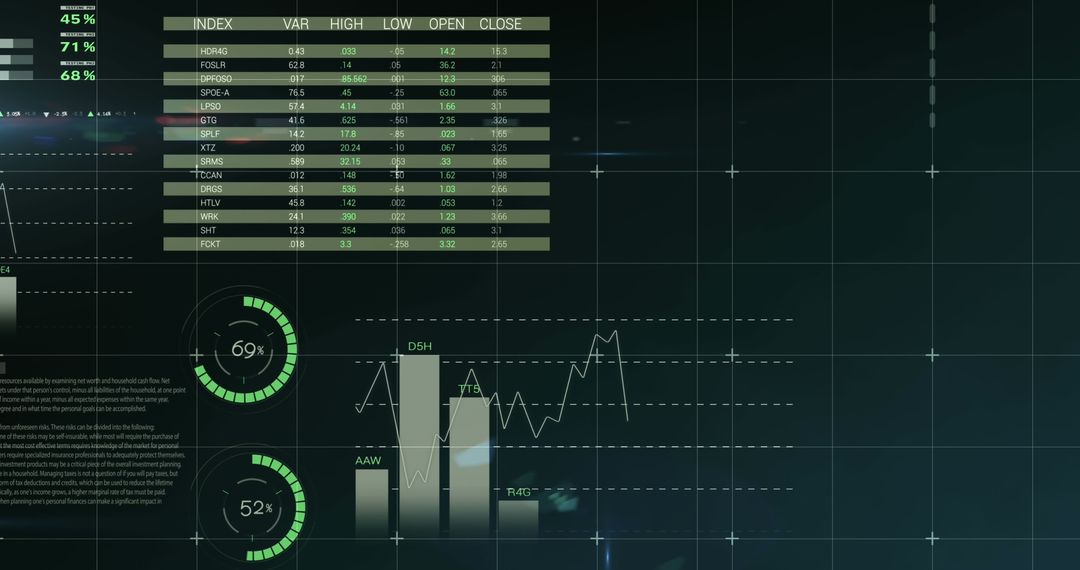
- Neon Purple Analytics Dashboard Displaying Tabular Data, Bar and Line Charts, Percentage Rings
Neon Purple Analytics Dashboard Displaying Tabular Data, Bar and Line Charts, Percentage Rings Image
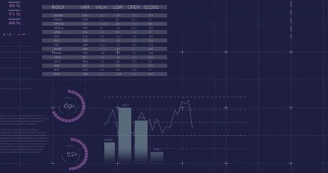
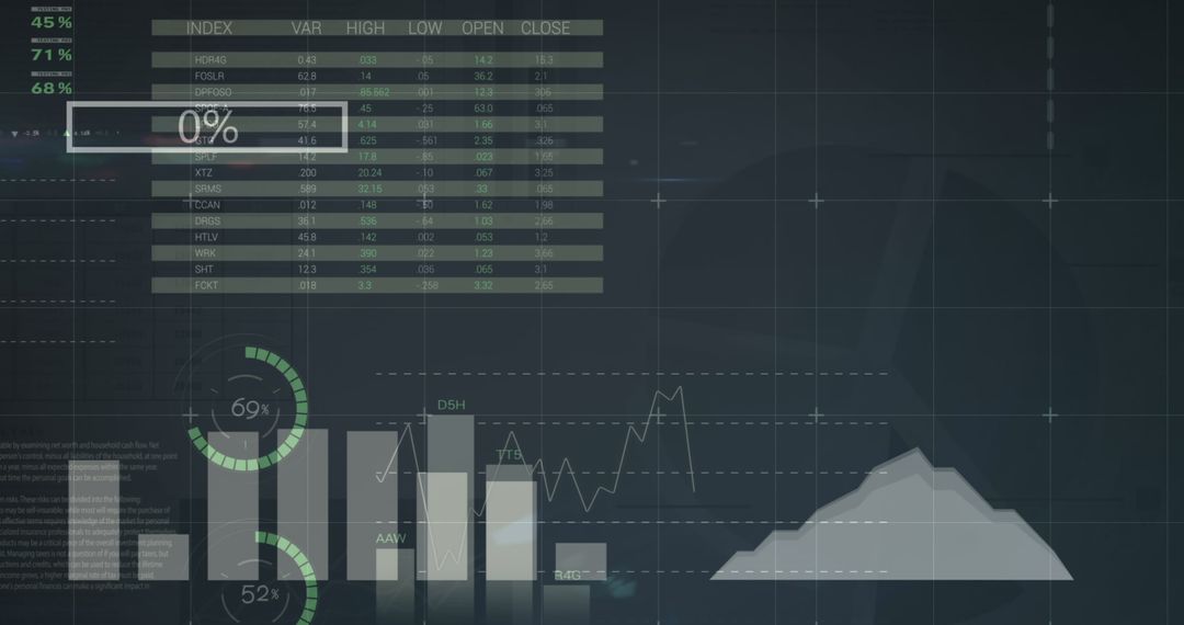
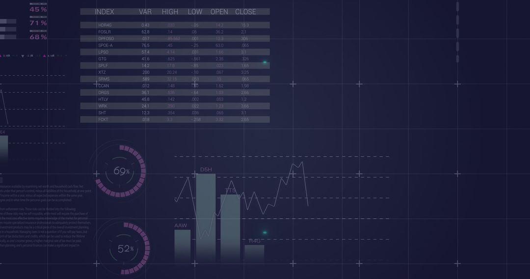
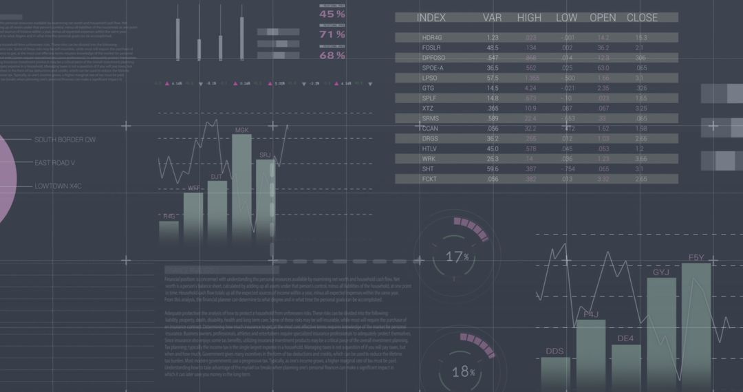
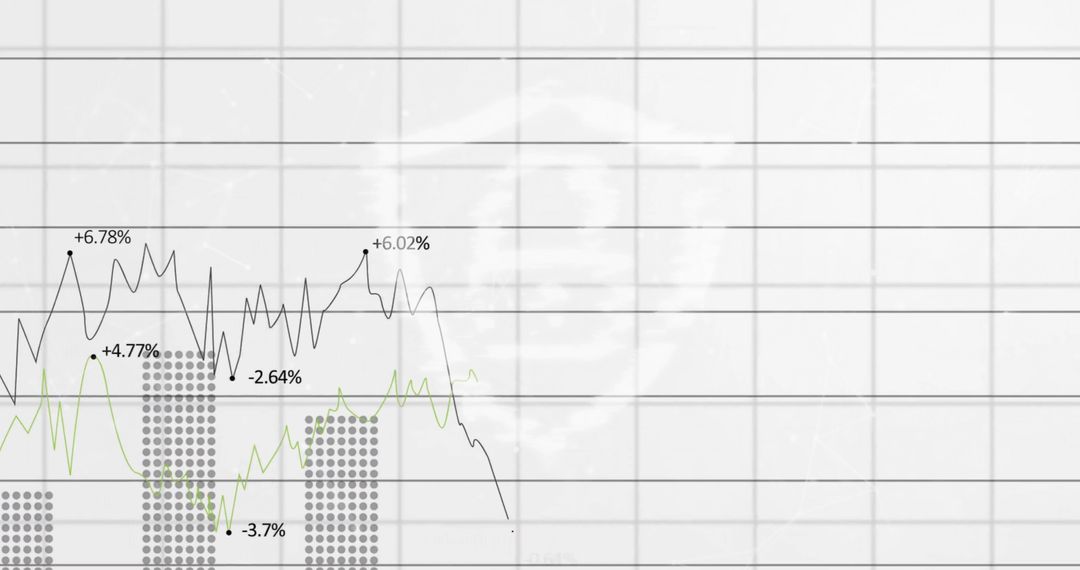
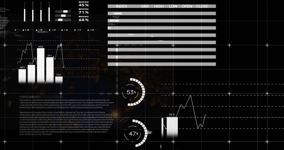
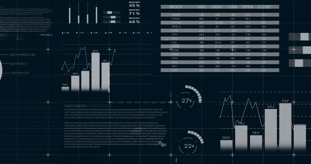
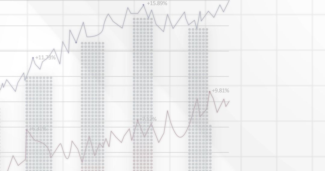
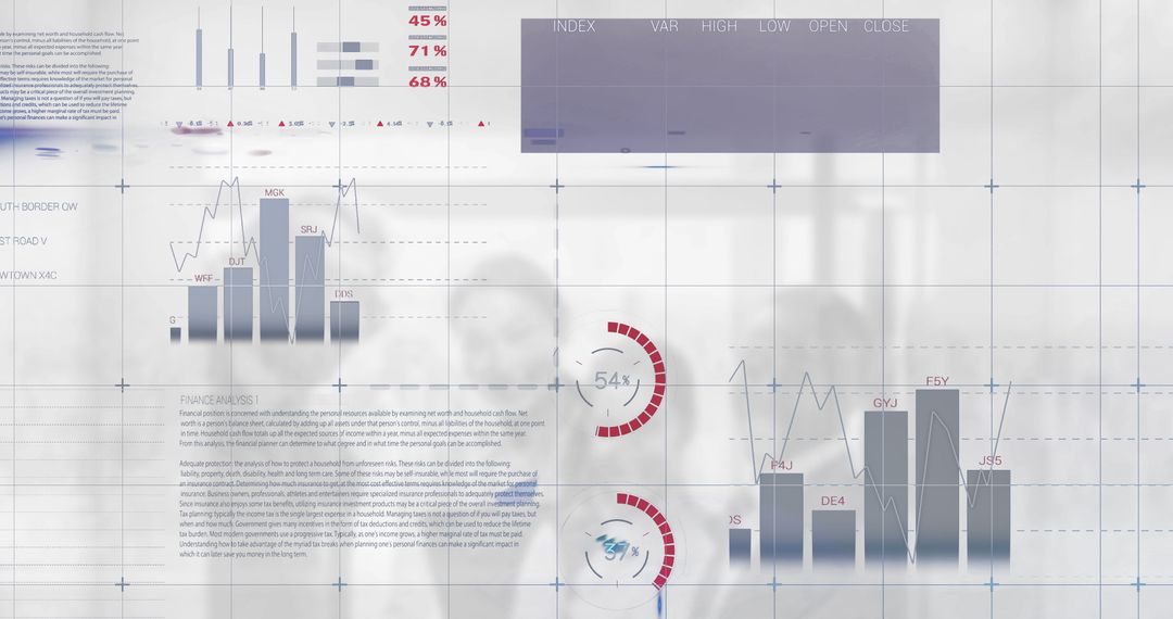
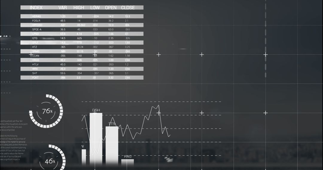
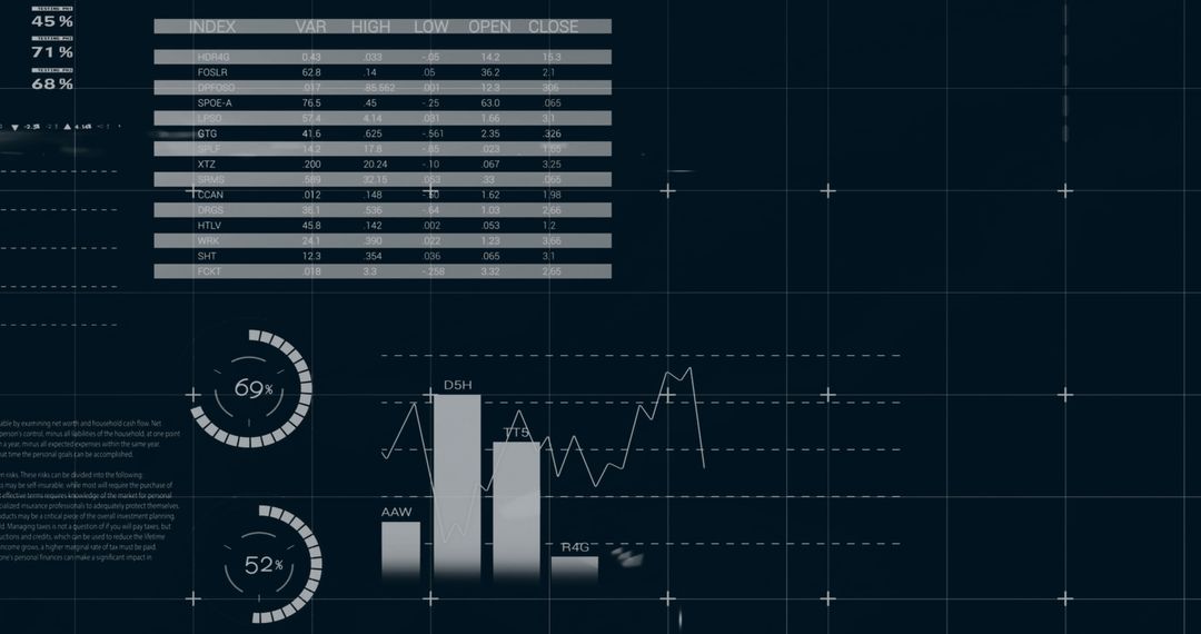
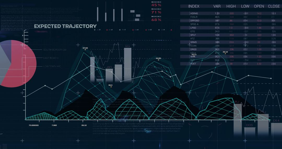
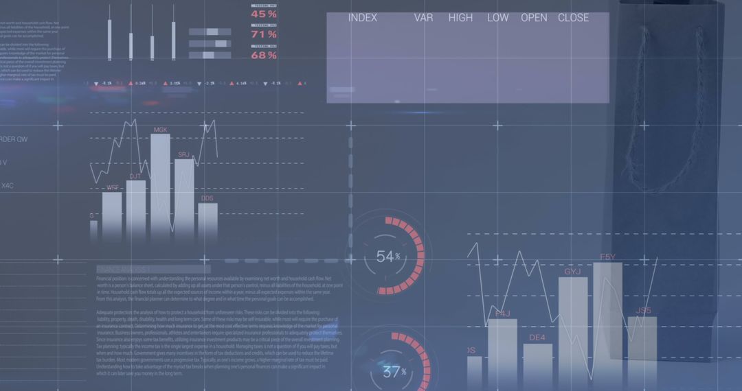
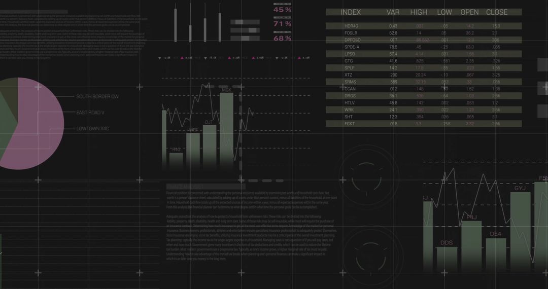
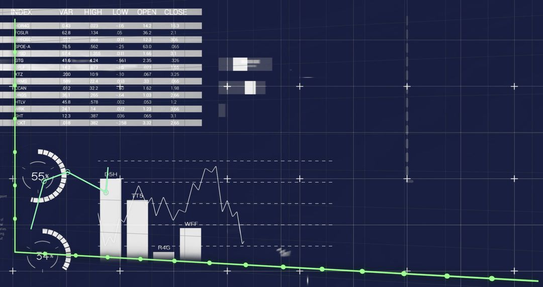
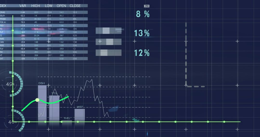
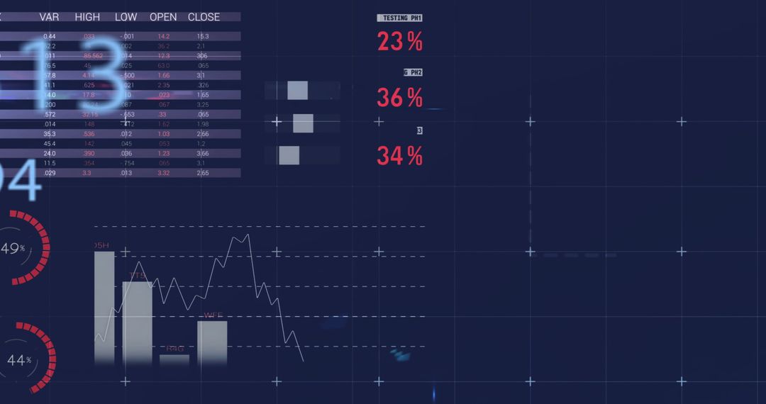
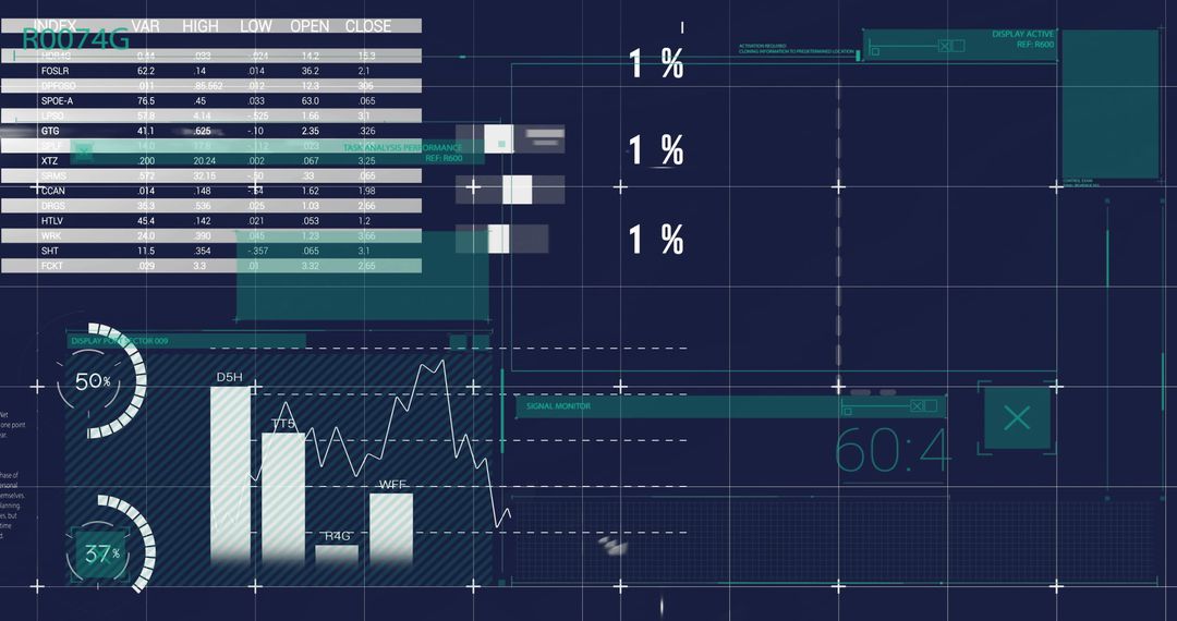
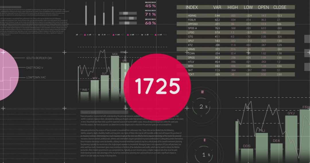
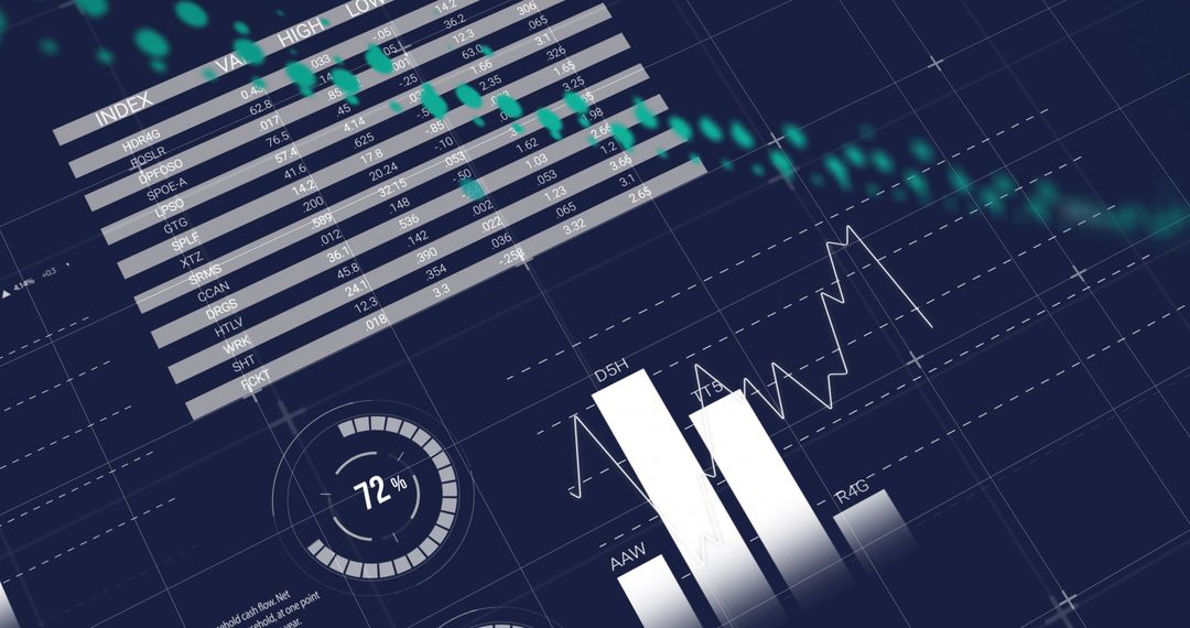
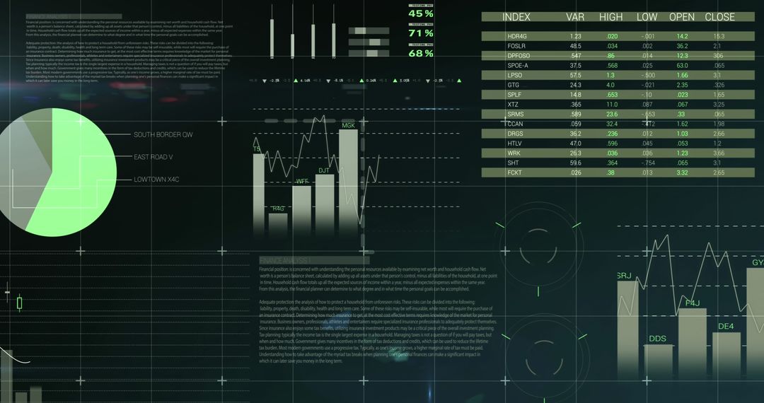
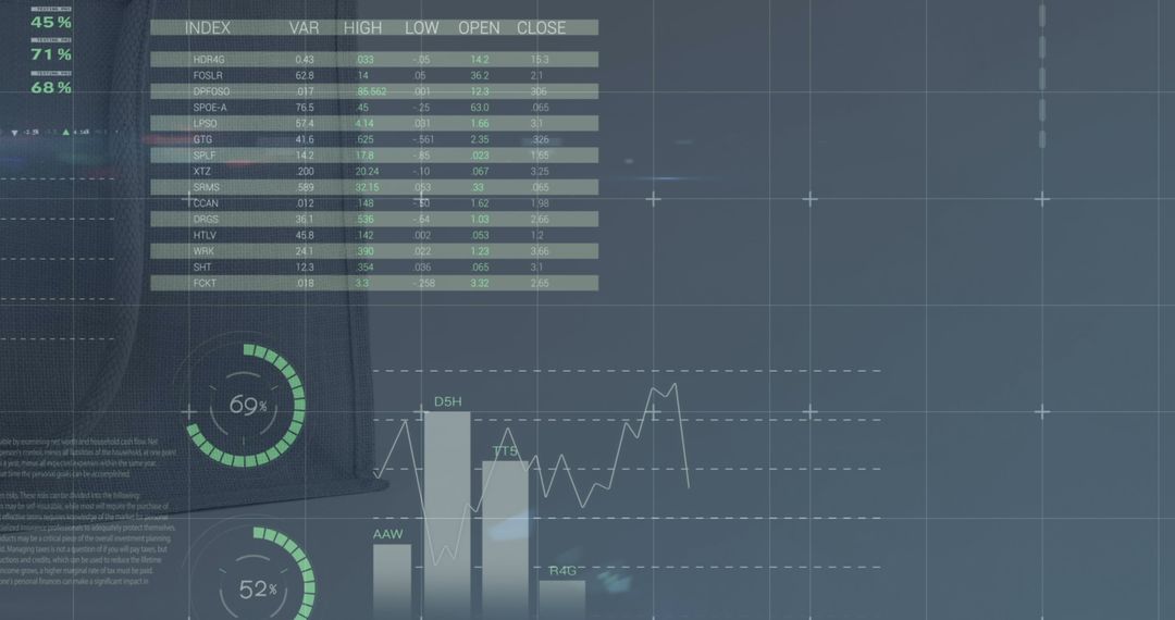
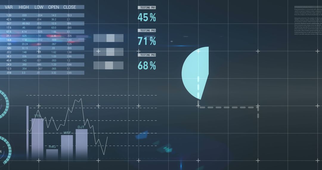
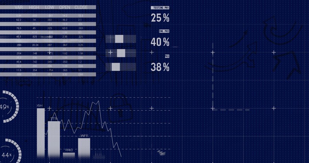
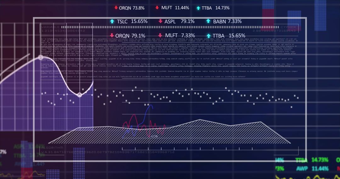
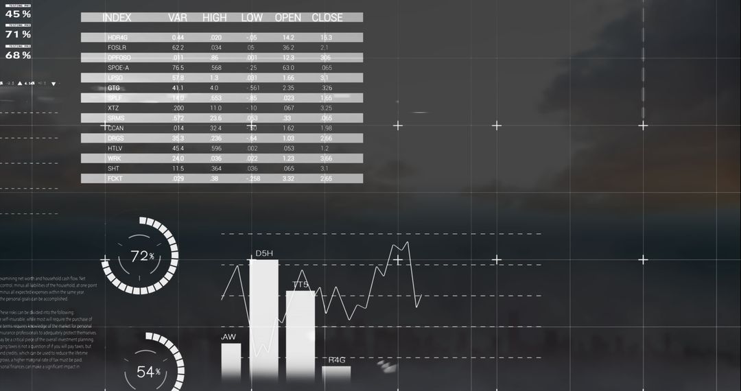
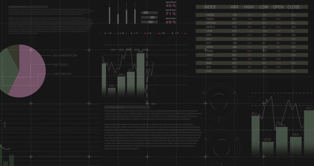
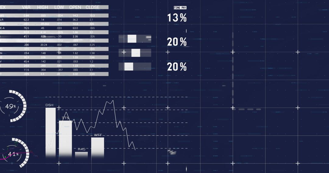
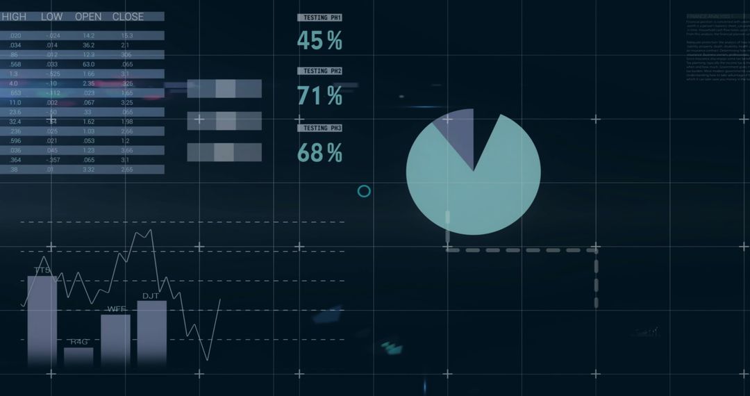
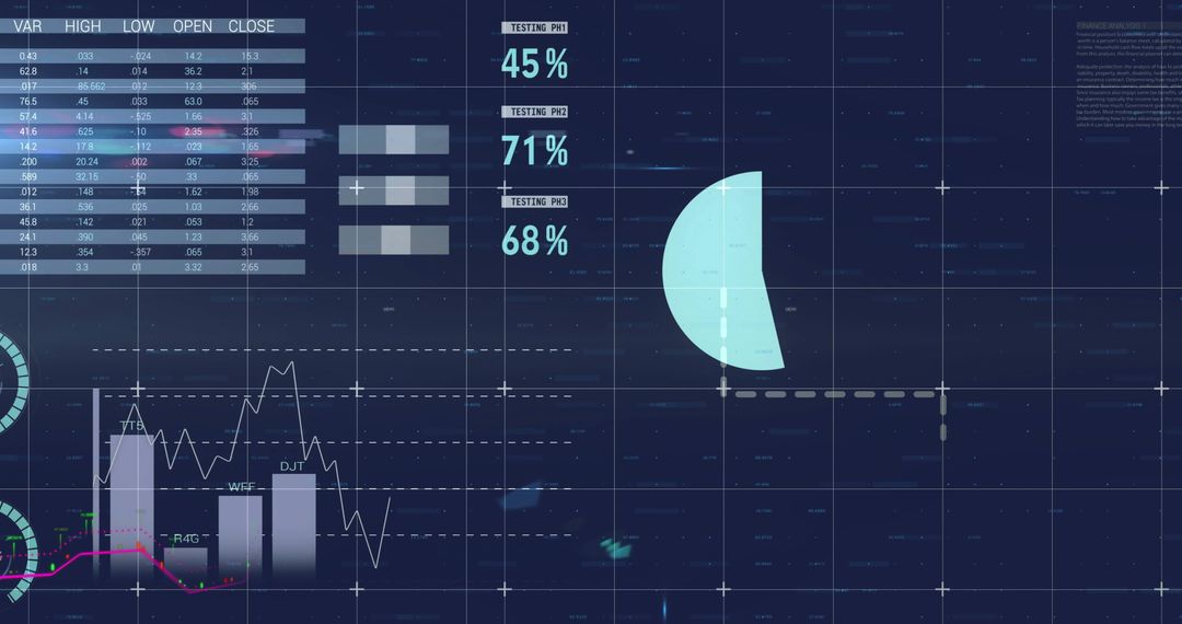
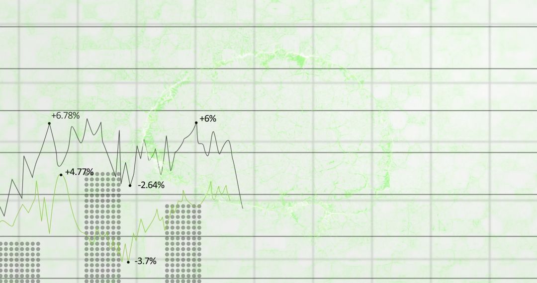
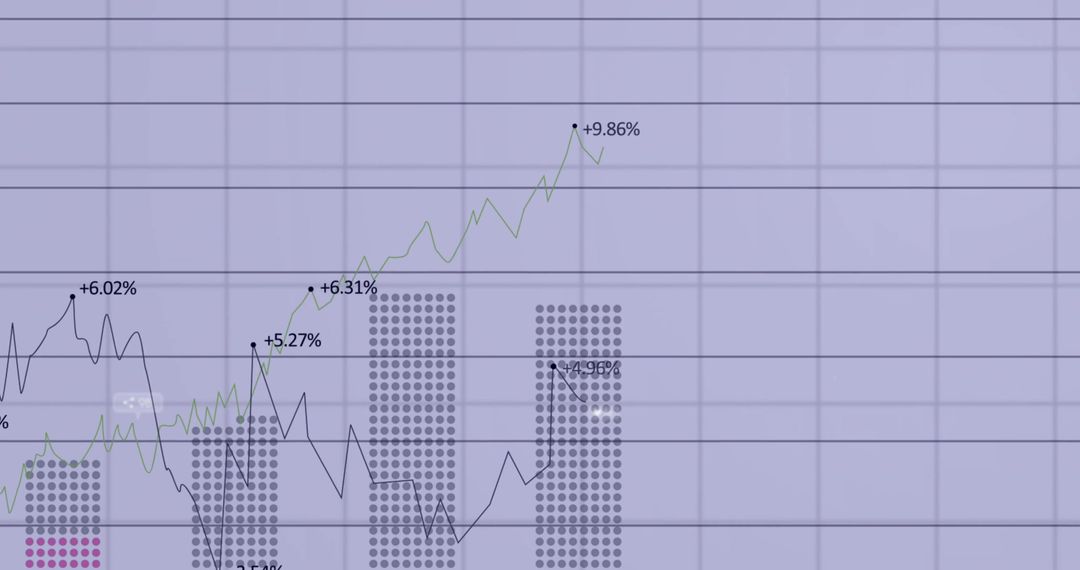
Showing tabular financial metrics with circular progress rings, vertical bar charts and jagged line chart over grid and crosshair guides. Using neon purple palette, translucent HUD panels and subtle numeric columns for tech aesthetic. Providing clear focal area for headline and logo overlay or call-to-action element. Working well for fintech dashboards, business intelligence reports, analytics blog posts, investor presentations, UI/UX mockups, marketing banners and social media ads. Supplying high-contrast visual for illustrating data trends, performance metrics, KPI tracking, system monitoring and dashboard design concepts. Allowing easy customization of colors, labels and values to match brand identity.
Powered by 


0
downloads
downloads
Tags:
More
Credit Photo
If you would like to credit the Photo, here are some ways you can do so
Text Link
photo Link
<span class="text-link">
<span>
<a target="_blank" href=https://pikwizard.com/photo/neon-purple-analytics-dashboard-displaying-tabular-data-bar-and-line-charts-percentage-rings/d53b10160c97510dd27523ec95ba5917/>PikWizard</a>
</span>
</span>
<span class="image-link">
<span
style="margin: 0 0 20px 0; display: inline-block; vertical-align: middle; width: 100%;"
>
<a
target="_blank"
href="https://pikwizard.com/photo/neon-purple-analytics-dashboard-displaying-tabular-data-bar-and-line-charts-percentage-rings/d53b10160c97510dd27523ec95ba5917/"
style="text-decoration: none; font-size: 10px; margin: 0;"
>
<img src="https://pikwizard.com/pw/medium/d53b10160c97510dd27523ec95ba5917.jpg" style="margin: 0; width: 100%;" alt="" />
<p style="font-size: 12px; margin: 0;">PikWizard</p>
</a>
</span>
</span>
Free (free of charge)
Free for personal and commercial use.
Author: Awesome Content
Similar Free Stock Images
Premium

Premium


Premium


Premium

Premium

Premium


Premium


Premium


Premium

Premium


Premium


Premium


Premium

Premium
Premium

Premium


Premium


Premium


Premium


Premium

Premium


Premium


Premium


Premium