
 - Get 15% off with code: PIKWIZARD15
- Home >
- Stock PNGs >
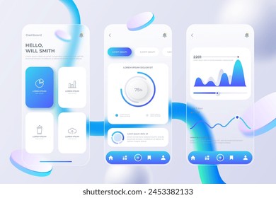
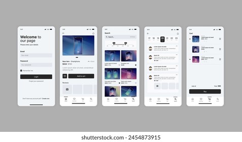
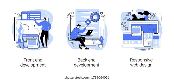
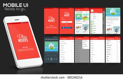
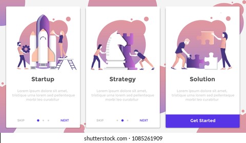
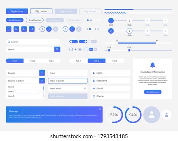
- Responsive Web Design Concept with Gray and Red Layout
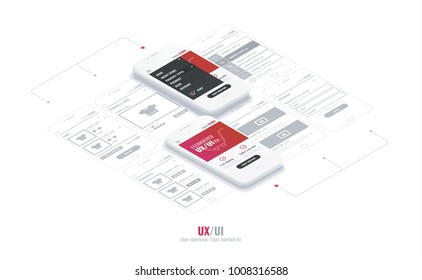
Responsive Web Design Concept with Gray and Red Layout PNG
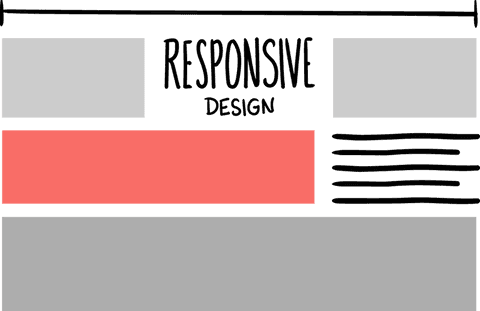
Illustration showcasing responsive web design concept with gray blocks and red emphasized area. Useful for discussing user interface design, digital layouts, and web development strategies. Ideal for presentations, articles, and resource materials about modern website design solutions.
Powered by - Get 15% off with code: PIKWIZARD15
- Get 15% off with code: PIKWIZARD15


downloads
Credit Photo
If you would like to credit the Photo, here are some ways you can do so
Text Link
png Link
<span class="text-link">
<span>
<a target="_blank" href=https://pikwizard.com/png/responsive-web-design-concept-with-gray-and-red-layout/047866ac4b6e50751fa62af7424a72d9/>PikWizard</a>
</span>
</span>
<span class="image-link">
<span
style="margin: 0 0 20px 0; display: inline-block; vertical-align: middle; width: 100%;"
>
<a
target="_blank"
href="https://pikwizard.com/png/responsive-web-design-concept-with-gray-and-red-layout/047866ac4b6e50751fa62af7424a72d9/"
style="text-decoration: none; font-size: 10px; margin: 0;"
>
<img src="https://pikwizard.com/pw/medium/047866ac4b6e50751fa62af7424a72d9.png" style="margin: 0; width: 100%;" alt="" />
<p style="font-size: 12px; margin: 0;">PikWizard</p>
</a>
</span>
</span>
Free (free of charge)
Free for personal and commercial use.
Author: Awesome Content
Similar Free PNG Images With Transparent Background
Loading...


Premium


Premium


Premium

Premium


Premium


Premium


Premium


Premium

Premium


Premium


Premium
Premium


Premium


Premium


Premium


Premium


Premium

Premium


Premium


Premium


Premium


Premium
Premium


Premium


Premium