
- Home >
- Stock Videos >
- Power Lines with Declining Graph Overlay Data Visualization
Power Lines with Declining Graph Overlay Data Visualization Video
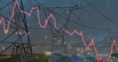
Visualizing power lines with a declining data graph suggests the interplay between infrastructure and data analytics. The video is perfect for discussions about energy management, data analysis, or technological trends in the power industry. It is suitable for use in presentations, articles focused on energy or data visualization, and content stressing infrastructure issues or advancements.
Powered by  - Get 15% off with code: PIKWIZARD15


downloads
Tags:
More
Credit Photo
If you would like to credit the Photo, here are some ways you can do so
Text Link
video Link
<span class="text-link">
<span>
<a target="_blank" href=https://pikwizard.com/video/power-lines-with-declining-graph-overlay-data-visualization/b265736d5ed0b04793523be0d9510ddb/>PikWizard</a>
</span>
</span>
<span class="image-link">
<span
style="margin: 0 0 20px 0; display: inline-block; vertical-align: middle; width: 100%;"
>
<a
target="_blank"
href="https://pikwizard.com/video/power-lines-with-declining-graph-overlay-data-visualization/b265736d5ed0b04793523be0d9510ddb/"
style="text-decoration: none; font-size: 10px; margin: 0;"
>
<video controls style="width: 100%; margin: 0;">
<source src="https://player.vimeo.com/progressive_redirect/playback/1090384163/rendition/240p/file.mp4?loc=external&oauth2_token_id=1223210874&signature=4fdfcbac9408bd7ee5728829d58caa0df837419b0acd89fc47dab1deaabb9482" type="video/mp4"
poster="https://pikwizard.com/pw/medium/b265736d5ed0b04793523be0d9510ddb.jpg"/>
Your browser does not support the video tag.
</video>
<p style="font-size: 12px; margin: 0;">PikWizard</p>
</a>
</span>
</span>
Free (free of charge)
Free for personal and commercial use.
Author: Awesome Content