Popular:

  1. Home  > 
  2. Blog   >  
  3. How to Create Simple & Effective Graphics for Business

How to Create Simple & Effective Graphics for Business

When you are creating business graphics, there are many things to bear in mind. There are amazing examples of great graphics, but there are many faux-pas that should be avoided at all costs!


Ideally, you want to create a design that is simple and effective for your business, making sure you stand out but stay true to your brand. Knowing how to spot the good from the bad is essential, so if you’re looking for some guidance in this area, we’re here to help.


Follow these useful pointers that will help you down the road to success in terms of design fundamentals. With these tips, you’ll be able to create work that looks more professional.


As this famous graphic design quotes by Ellen LUPTON " Think more, design less".

Colours

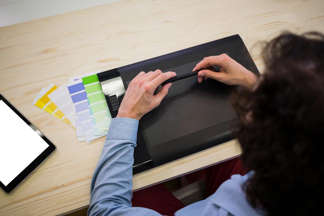
It’s essential that you can clearly designate the primary and secondary colours you are using. The colours you use will depend on the brand and overall project management, but ensuring you opt for the best colours possible can be the make or break for your graphic.


When people look on a big brand on a famous blog, sometimes they don't even remember what they have to sell, to read but they remember the color of the store, website. If you succeed to have and give for people a clear colour schemes for your website


Colour theory plays a significant role in how we interpret what we see. You can learn more about this in our blog on how colour schemes affect graphic design!


No one should underestimate the effects of colour schemes on graphic design. 

Fonts

As with your colours, remaining consistent with the fonts you use and the purposes they are given is the next tip to consider. When using fonts, treat them like primary and secondary colours so that you can then assign them for specific purposes, such as body and title text.


You just need to be clear with yourself and for the person who's going to read your blog, best way is to have a clear and precise graphic business marketing

Adopt Consistent Design Elements

Patterns, icons and borders are three of the main design elements that need to stay the same throughout your graphic. It can be confusing for viewers if you don’t keep these styles the same. Remaining “on brand” sounds cliché, but it is vital for maintaining that professional approach.

Only Use High-Quality Images

There’s no excuse for using low-quality images these days! For all your high-quality, free-to-use image needs, you can browse our vast catalogue to find exactly what you’re looking for. You can then take those images and turn them into fantastic graphics using Design Wizard!

Use Consistent Editing Techniques

As with your patterns, it helps to stick to the same contrast, exposure, saturation and other editing techniques. This is pretty self-explanatory, but if you go heavy on a particular aspect of your graphic when editing, it can counteract the look and goal you’re trying to achieve.


Don’t overload the viewer; keep your designs as minimal as possible. Remember, in some instances, you may only get a few seconds to get your main point across!

Create a Hierarchy

When we refer to the hierarchy, we mean using the ability to direct viewers to the main elements of your business graphic. Hone in on one aspect of the graphic that you want people to be drawn to, whether that’s the brand, an offer or statistic. Once you have this, it will assist you in the process of building around it correctly.


If you remember that larger objects typically attract more attention than smaller ones, you’ll be able to start creating a successful hierarchy method. By the same account, if something is less important, don’t place it front and centre!

Understand Space

This point ties in nicely with the one above. While it can be tempting to fill your graphic with pictures and information, space shouldn’t be underestimated. You can utilise space to your advantage to help bring your design to life and make any focal areas stand out.


Don’t squeeze shapes and designs too close together if you can help it. When things are squashed, viewers tend to find it uncomfortable! Give your objects a little breathing room.

Hopefully, these tips will point you in the right direction when it comes to creating exciting graphics of your own! Remember, you can utilise PikWizard and our Design Wizard tool to ensure all your designs have a high-quality look and feel.