Web designers know that images play a crucial role to creating a good website. You can communicate a business’s brand and orient its website with images. They say a picture can paint 1,000 words, and in strategic web design, you want to make sure your images can paint as many words as possible. So, let’s go over how you should approach images in web design.
Table of contents:
- 1. Only Use Meaningful Images
- 2. Use Engaging Images
- 3. Use Images With People
- 4. Use A Hero Image At The Top Of Your Webpage
- 5. Understand Image Placement
- 6. Use Logos To Provide Orientation
- 7. Use Infographics To Build Credibility
- 8. Consider How Images Appear & Respond To A Customer I When Resized & Test How Your Images Appear & Respond On Different Screen Size
- 9. Don’t Let Images Suffer From Banner Blindness
- 10. Add Alt Text
- 11. Integrate Image Icons
- ● Bonus: The Importance Of Copyright In Web Design
- ● Try Starting With Stock Photos
- ● Sales CRM And Growth Engine
1. Only Use Meaningful Images
Images must be highly relevant to work. Flashy and attention-grabbing images will attract attention and possibly lead more people to click. But any images that don’t make sense or make unfulfilled promises won’t work.
Website images are meant to enhance a webpage and provide a visual aid that offers either information or context. An image should communicate the information you’re trying to share or demonstrate the results that your business is offering customers. For example, images of happy people surfing on a beach are a great idea for a business offering tourism services. You can find such high-quality visuals on Pikwizard. The image doesn’t have to provide information, but it sets the tone for what the viewer can expect if they continue scrolling down.

Lesson one is that you can’t just add images to make your website look pretty. But you should make your website look pretty with images that enhance your propositions and brand. This first challenge is unfortunately the hardest for a business to take care of on its own. But there’s still a solution.
The easiest way to always have access to high-quality images is to use stock images. Stock agencies offer access to and licensing for stock photos of all categories. Stock image sites like Pikwizard offer photos for everything while focusing on the trendiest categories of the day. They offer different pricing plans so you can pay just enough to suit your needs.
Search for the stock images in the category you need.
2. Use Engaging Images
Engagement may sound like a vague topic at first. But web designers and UX professionals know there’s a science behind engaging imagery. Psychology provides us with what we need to know about how certain images promote certain responses. Different colours trigger different emotions, you have to choose the right colour schemes for website. For example. But there are several things you may want to use in your images. As a start, read some of our other articles about colours and design. Creative success is based on stable foundations in design.

Once you find the right photo from a stock image site or your own library, you can edit it for more engagement. You can be as minimal as extravagant as you feel your subject matter justifies. But it’s commonplace to add text with trendy fonts or other embellishments to a design.
For the quality and the download of your photos you have to know what jpeg and png is for a better use of your images
3. Use Images With People
Photos of or with people are one of the most effective ways to capture attention and build engagement. In photos of people, it’s the faces that draw attention and create an emotional response. People are hardwired to want to communicate with other people, not just text and website code.
Websites that feature human faces create trust and lead to conversions. That’s why so many images used in ads feature happy people. If you find the right photo of people, just embellish it to be more relevant to your brand. It’s a proven recipe for greater engagement and sales.

Not only are people drawn to images of other people, they even follow their line of sight. So, when you use images of people on your site, pay attention to where the person’s eyes are looking. Use professional stock photos of people who look and emote in a way that matches your brand’s personality.
4. Use A Hero Image At The Top Of Your Webpage
Hero images are an increasingly common feature on landing pages and home pages. They are large images that cover the entire screen, with text and other UI places on top. They are normally edited for some transparency, with the text and UI options on top coloured to be easy to read.

A hero image is a unique type of image that sets your website’s first impression. You can create a hero image using your own photos, or with a professional template. For example, if you offer dental services, you could choose a professional medical hero image. Then you can embellish and edit it to make it look better on your site.
5. Understand Image Placement
Half the battle of making images efficient is choosing the right placement. The best web designs were made by professionals who knew exactly where to place every image, infographic, ad banner, and more. Once you’ve made your choice, you still need to ask yourself a few questions.
- Why did I place this image here?
- Why did I not place this image somewhere else?
- Would this image perform better as an ad, or is it better as a visual aid for my content?

Generally, the most detailed and large images should be placed below the fold. The images closer to the top of the page should be introductory, they should set the mood of the page. As visitors scroll through your content, images should enhance their experience and make it easier to understand your point.
6. Use Logos To Provide Orientation
A logo is the one image you will find on almost all company websites. On your own site, you should feature your logo in the same place on all pages. This does a few important things. First, it helps visitors quickly identify your site and everything associated with your company. It reminds visitors where they are and removes any confusion about if they’re still in the right place.

For maximum effectiveness, place your logo in the same spot, preferably near the top of your page. Make your logo clickable so users can be redirected back to the home page at any time. If you want, you can also just make the logo redirect viewers back to the website section’s home page. For example, if they’re browsing specific services, customize the logo to say “services” and make the logo clickable to redirect them to the services home page.
7. Use Infographics To Build Credibility
Including statistics and studies will boost your credibility and add weight to any claims you make on your site. But people will appreciate the information more if you design a visual aid to accompany it.

Infographics are just graphical representations of information. They can be simple graphs that illustrate data. But you can get very creative with your infographic’s design and learn a lot of graphic design tips.
Good infographic design can be used to draw attention to the data that you want viewers to remember the most. So, make infographics for the information you want them to notice and remember.
8. Consider How Images Appear & Respond To A Customer I When Resized & Test How Your Images Appear & Respond On Different Screen Size
When a customer visits your site, regardless of what device they’re browsing on, they will notice image quality. The easiest way to ruin your images’ appearances is to inappropriately resize them.
If you need to resize photos to standard photos sizes on your site, it’s usually better to use a professional tool. You can maintain an image’s appearance while reducing its size more easily. But you need to be careful when you’re trying to increase their sizes.

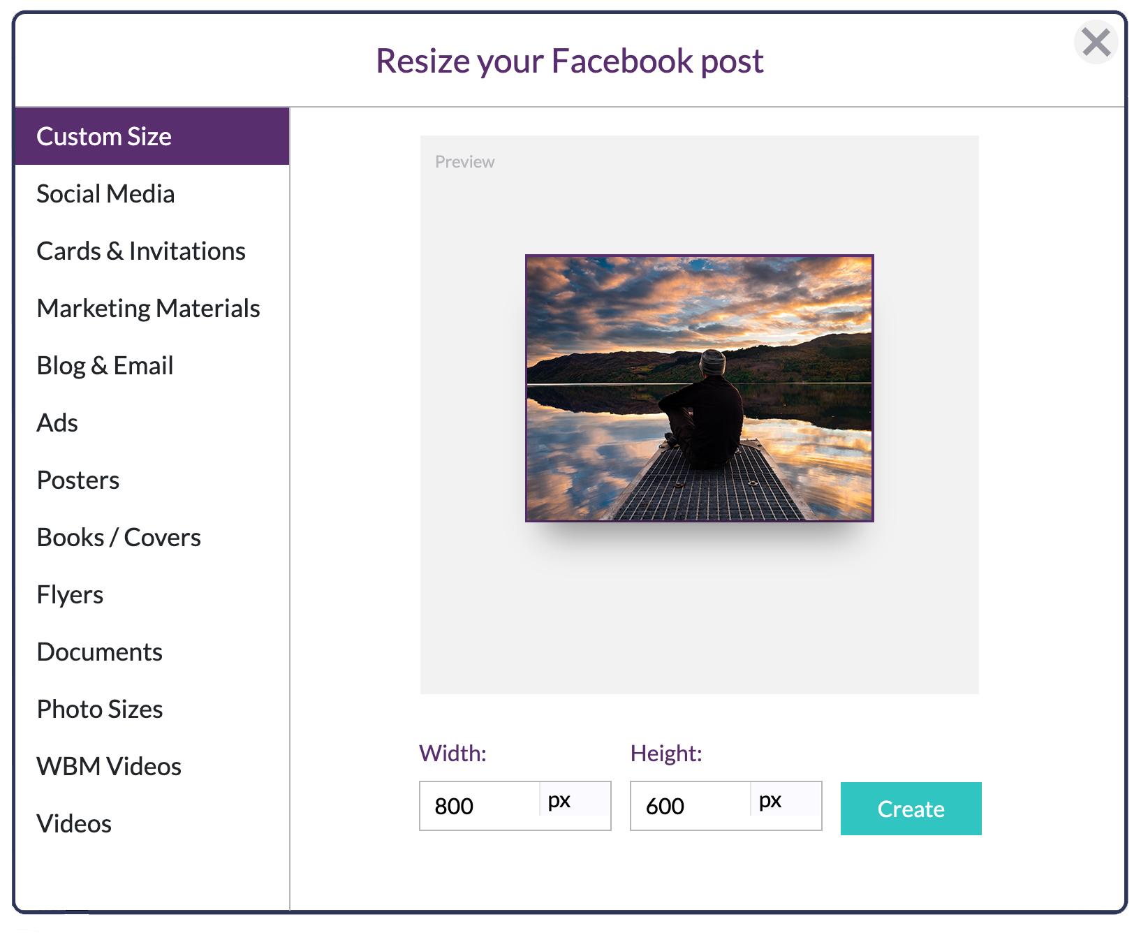
Design Wizard has a free image resizing tool you can use. You can also find all the most common image sizes for the most common templates. That includes Facebook banner and ad image sizes and all the most common banner sizes throughout the internet. If you’d prefer, you can also manually input the pixel values you want.

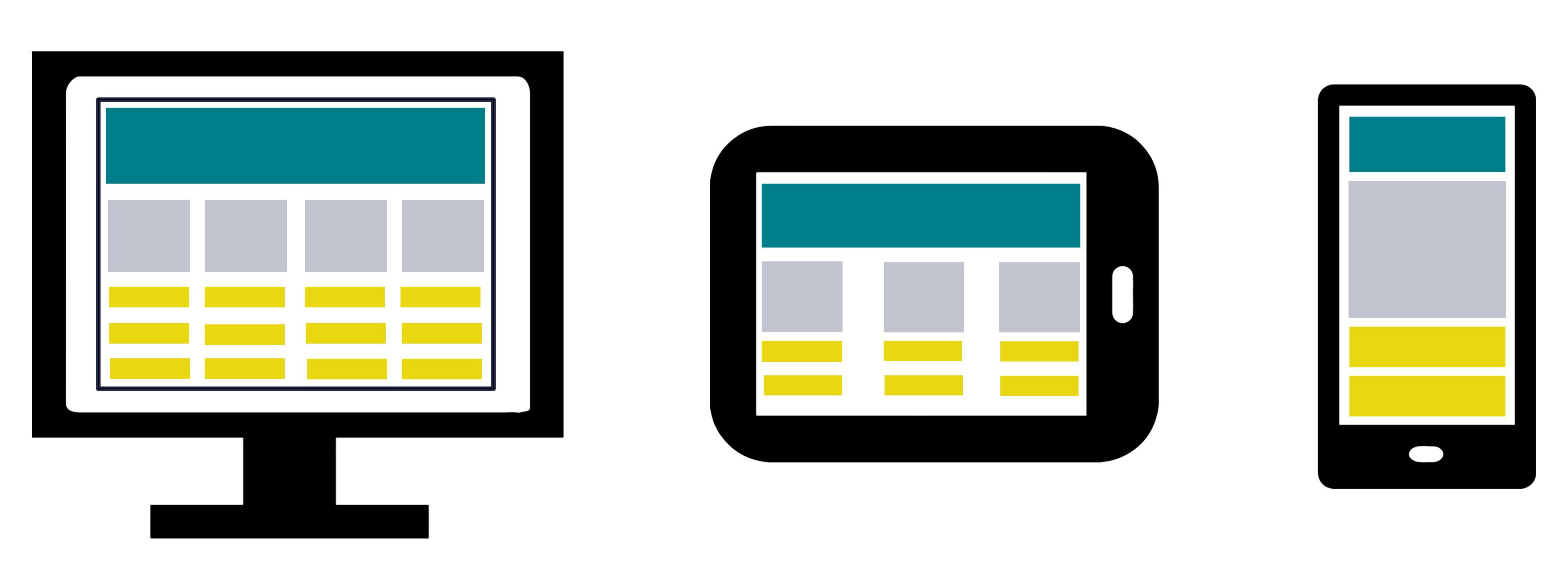
Images also need to fit on different screens. If your design was made for a full-size desktop, you need to make sure it will respond nicely on a smaller device. If you don’t, users won’t have the same experience on different devices.
Pay attention to each photos’ resolution. The resolution might not be important when you crop a photo, but it will if you’re resizing it.
Ideally, all your desktop photos will have a density of 72 Dots Per square Inch (DPI). The challenge is maintaining that same quality when you resize it. Avoid posting distorted photos on your site by mistake.
9. Don’t Let Images Suffer From Banner Blindness
“Banner Blindness” is a strange phenomenon. Users on websites will often ignore banner-like imagery. We’re not sure if it’s an active or subconscious decision, but marketers have been dealing with it for a while. Fortunately, they’ve already found a few solutions for you.
Beyond placement, banner blindness can be defeated by sticking to only the most relevant content. If you sell to business professionals, use business images that are directly related to what you sell.

Next, prepare your banner ad images and other banners for mobile users. Mobile users will have a completely different experience with your banners. If you’ve ever browsed sites on your phone, you know that it’s easy to get frustrated by inappropriately formatted images.
Lastly, experiment. It’s important to test new images and sizes. A change in your approach might be the key to nailing your website design. Try different stock images, play around with their locations on your page, and try optimizing them for SEO.
10. Add Alt Text
You can help fight banner blindness and your site’s overall presence online with a few extra steps with your images. Add alt text to your images that is relevant to the content of your page.

Using the right alt text is good for multiple organic marketing functions. First of all, it’s easier for people to stumble into your site when looking for images on Google. The alt text should match the most important text in your page’s content.
If you add relevant alt text, your visibility on Google’s “All” search engine will also improve. So, use alt text and take advantage of captions and buttons while you’re at it.
11. Integrate Image Icons
Integration is one of the most effective ways for a user to interact with images. Clickable images can have amazing results, even just for navigation. Instead of just using text, let your images take visitors to your home page, search page, and any relevant page on your site.

Bonus: The Importance Of Copyright In Web Design
Remember that when you look for images online, you need to make sure you’re not using copyrighted material without permission. If you’re looking for images, or even just templates, with a Google search, you risk copyright infringement if you’re not careful. Normally, the highest quality images will be actively protected with the enforcement of copyright law.

The good news is you can quickly and easily gain permission to download, edit, and use thousands of high-quality images. PikWizard is a free source of high-quality imagery. You can download and use many images for free. Then, you can even edit your favourite images for free.
Try Starting With Stock Photos
Stock photos are the easiest place to start if you need images for web design. PikWizard has a vast library of stock photos for dozens of categories.
Stock images are a great way to:
- Ensure you have continuous access to relevant images.
- Have the choice for the most engaging images you could use.
- Have access to the most engaging photos with people.
- Choose from the best templates for hero images and be able to edit them accordingly.
- Pick the right size of image for the right placement on your website.
- Find the best logo template.
- Resize your images without distorting them or reducing their quality.
Get started with a free and easy search today.
Sales CRM And Growth Engine
When starting up a business it's important to seamlessly manage your leads, proposals and invoices etc. All the team members are expected to be kept in loop with updates happening. Thus, one needs to think of such a way that their sales and the marketing team can talk with each other effortlessly. You require one place for your clients’ contacts, invoices, proposals and everything in between.
One should create a robust and reliable repository of contacts and have a pipeline view of their sales. At the same time, never forget to create a good impression with your clients with beautiful looking proposals. Agencies face problems with timely invoices, reminders and what not. But with a clean piece of software to help you, you should be rolling.
There are plenty of Sales CRM out there, but if you're looking for something simpler Clientjoy is a great option. When you can manage your Leads, Proposals, Clients, Invoices & Payments in one place, you will be left with happier clients and faster turn around times.


