Popular:

  1. Home  > 
  2. Blog   >  
  3. The Most Popular Colours of 2020

The Most Popular Colours of 2020

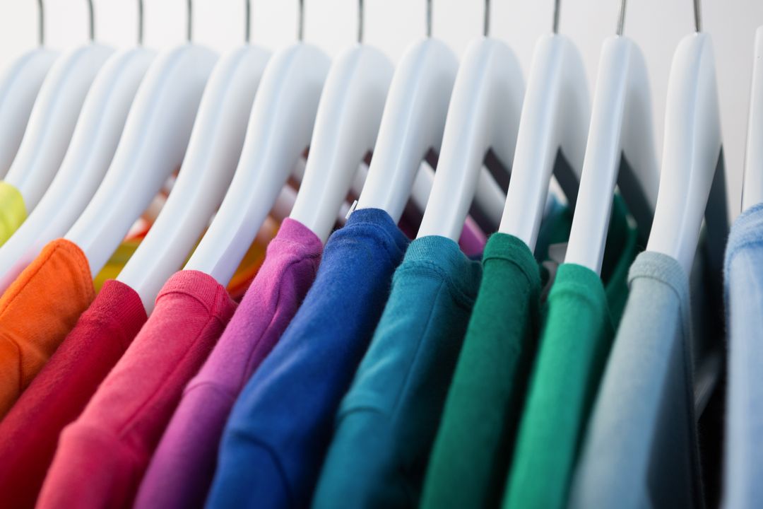
Every year, new trends appear – whether that be our home décor, fashion choices, or the types of aesthetics we like to see in imagery.


Colour plays a huge part in these trends and what is considered fashionable.


Colour is also absolutely essential for branding and marketing as the colours you choose can send a powerful message and evoke a range of emotions.


We can see what colours are the most popular each year by seeing the most frequently chosen paint colours, the colours available for clothes in stores and the décor and style options that dominate social media and magazines.


In this post, we explore some of the colour options that have been most popular in 2020.

Pantone Colour of the Year 2020 – Classic Blue

Each year, Pantone announce their colour of the year – a shade they think is representative of the year to come. For 2020, they chose Classic Blue.


When the Pantone Color Institute released the Colour of the Year back in late 2019, they identified Classic Blue as a shade to offer reassurance and confidence to the world, due to the feelings of instability felt globally.


To celebrate the announcement of the Colour of the Year, Pantone created a multi-sensory experience featuring Classic Blue-coloured drinks, Classic Blue- textured décor and their official Classic Blue fragrance – a scent described as "a contemplation of where sky and sea meet"!


In interior design terms, the colour blue has been described as the ‘new neutral’ and is being used widely in home décor choices this year. This colour is the new one for the graphics design trend.

Rich, Deep Green

In 2020, creating a comforting space and feel has been incredibly important. With the outside world often seeming a scary place, creating a cosy atmosphere has been a core aspect of 2020.


Rich green shades can help to accomplish just this, with the deep hues creating a cosy and nurturing feel. This dark green shade encompasses a blend of many colours, meaning it matches well with most other colours without clashing!


Plus, this green tone adds a natural touch, reminding you of the greenery outdoors, which has been something many of us have missed during the 2020 lockdown – perhaps adding to its growing popularity as a wall paint colour and as effects of colour schemes on graphic design.​

Cassis

Cassis is a vibrant shade that fuses together pink and purple into this dusky tone that somehow manages to be both vibrant and soft at once.


The colour plays off the appeal of the Millenial Pink, combined with the resurgence in love for purple, to create a deeper shade perfect for 2020, where dark hues are more on-trend.


The colour is eye-catching and appeals to all, young and old. It is becoming increasingly popular in business packaging, clothing, colour schemes for website and to add a pop of colour in the home.

Flames against a Black Background

Bold and fiery orangey-red tones have been incredibly popular in 2020. This eye-catching shade is perfect for creating a stand-out moment in your product branding and this colour are going well together.


As an attention-grabbing hue, this colour certainly makes a statement. In many cultures, red tones are representative of good health, love and happiness – certainly all things we would like more of in 2020!

What popular colours from 2020 have you enjoyed seeing? 


If you are looking for the perfect colours to use in your branding, to draw attention to your blog posts or to attract interest on social media, then stock photography could be just the thing for you. 


You can browse through over one million high-quality free stock photos on PikWizard, and search by colour or what is popular to find the perfect images for you!