Popular:

  1. Home  > 
  2. Blog   >  
  3. Which aesthetic is more impactful? - Minimalism or Maximalism

We asked artists, content creators, designers, and photographers across various industries what they thought is more impactful: Minimalism or Maximalism. Minimalism keeps designs simple and can be used in art to highlight the most important elements while maximalism is attention-grabbing, bold, and fun to experiment with.


Responses to our contentious question varied and many argued that it depends on the intention. In other words, what is the goal of the piece, or what does the client want from the finished design? Some have a preference for one in their work but opt for the other in their personal life.


While the majority didn’t pick one over the other, those that did choose preferred minimalism for its focus and the challenge to only keep what’s essential in art. Web and UX designers also tend to pick minimalism because it provides them with the user-friendly approach needed for ease of use of interfaces and web pages. 


Learn more about how our experts apply minimalism and maximalism in their art or designs.

Cat Willet

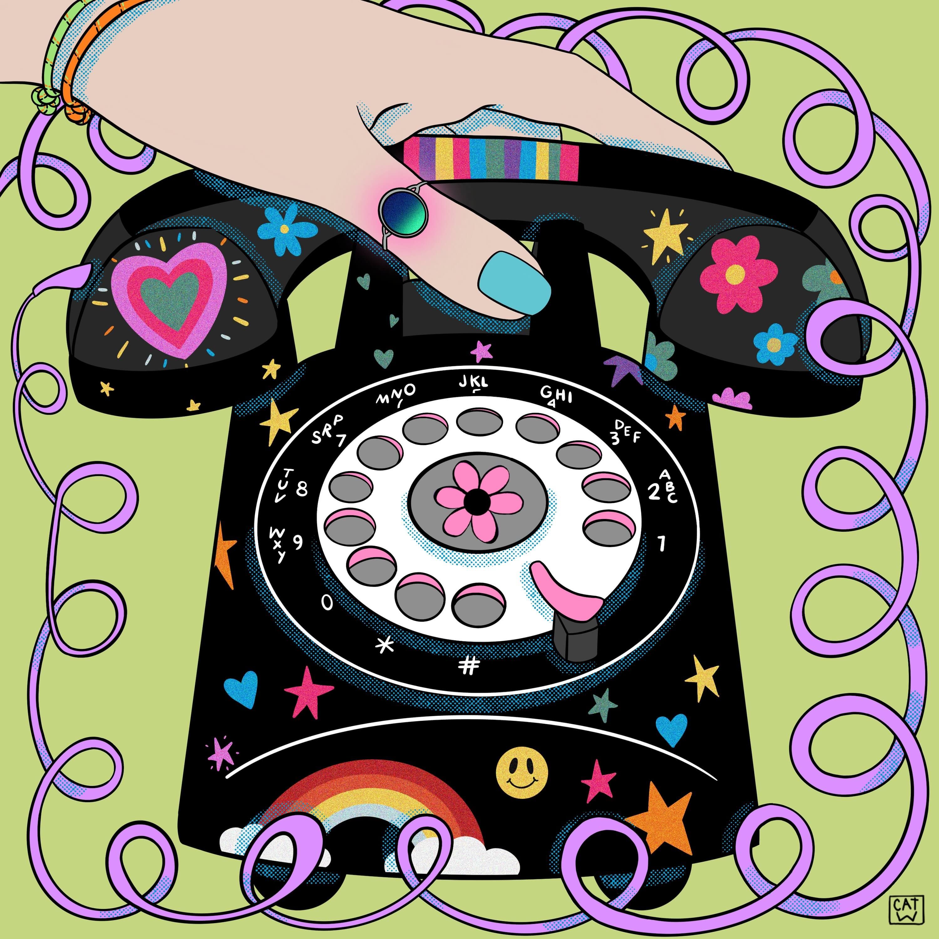
Black rotary phone with colorful stickers - How minimalism improves focus - Image

I do believe that minimalism and maximalism both serve very important and different purposes when it comes to design. As an illustrator, I tend to rely more on maximalism to convey my ideas. I find that when creating a narrative piece that invokes a particular time period or story, lots of color and form helps me to captivate the viewer. I tried to pick different colour that go well together to grab the eyes.


However, in my personal home space and studio space, minimalism is extremely important to my creative process. I focus much better while working if my living and working spaces are intentionally designed as minimally as possible. Without visual clutter, I can create artwork that tends to be more maximalist, and this dichotomy is valuable to me.


Website: www.catherinewillett.com

Social Media: www.instagram.com/catxwillett/

Mark Johnson

I am a minimalist, but that does not mean minimalism is more impactful than maximalism. Minimalism in UIX, executed professionally, will gain you the quickest click-through sales. This is backed by 2 (constantly evolving) decades of UIX research and human behavioral science.


At Bionic Egg, we design for the core demographic that our client's brand(s) want to impact. Musicians and artists have a greater impact when using maximalism to convey their brand messaging. However, in the beauty, medical, and B2B industries minimalism brings a higher authority and a smoother UIX; betting a higher ROI from your SEO spending.


Website: www.bionicegg.com

Social Media: www.instagram.com/bionicegg/

Emma Cleary

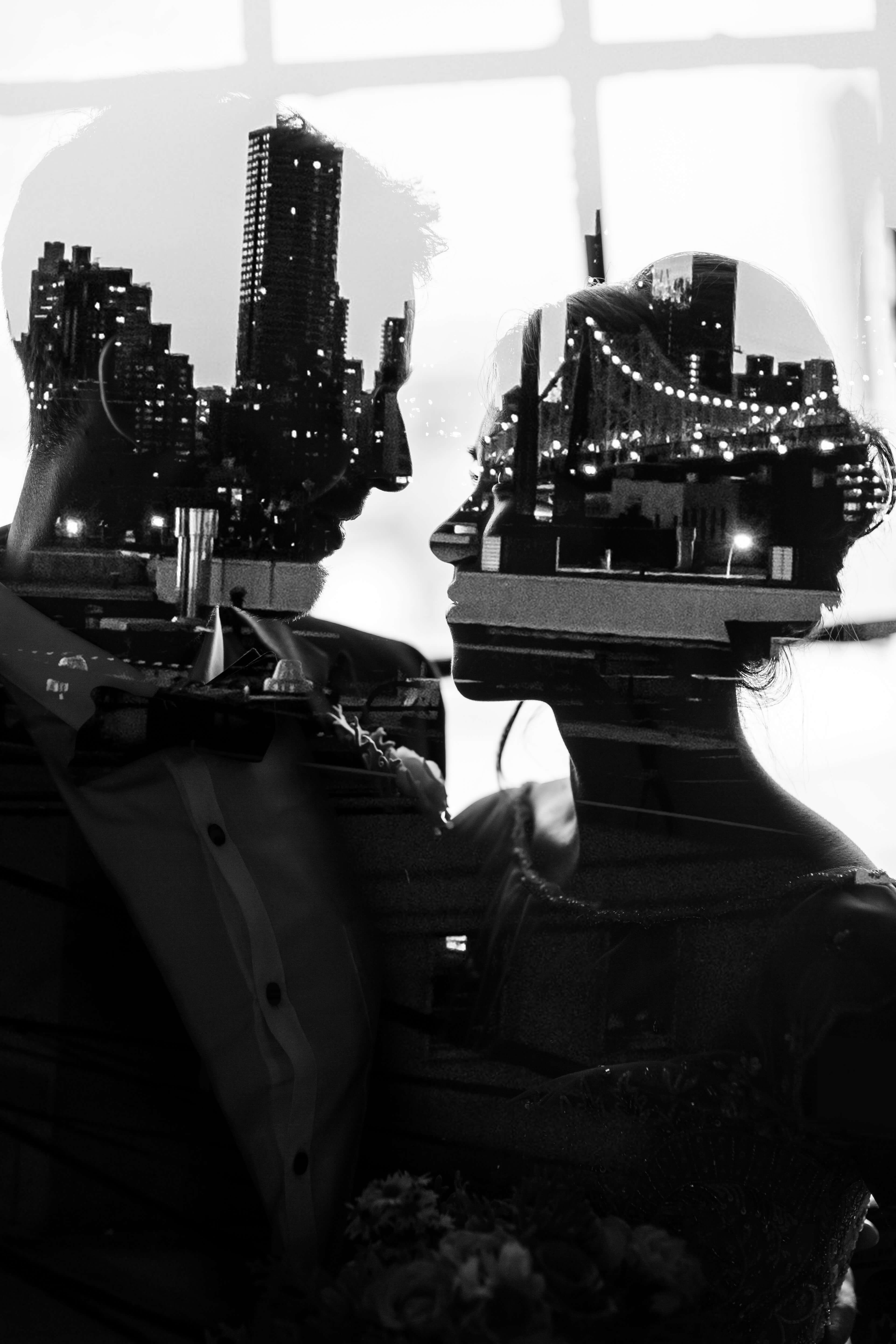
Black and white photograph of newlyweds looking at each other - Minimalism and maximalism in photography - Image

We have produced stock photos of many beautiful wedding in our 10+ years as a leading NYC wedding photography studio. While both minimal and maximal wedding photographs have their charm, we do not favor one over the other. 


The beauty of photojournalism is that you can capture a simple photograph of an extravagant wedding or an intricate photo of a simple wedding. Our mission is to capture each wedding standard photo sizes in a genuine way, whether it be simple or grandiose.


Website: www.emmacleary.com/

Nate Garrido

Both maximalism and minimalism are key components in design and are here to stay for a while, I think. When trying to decide on a direction, it heavily depends on the purpose of the project and the overall aesthetic the designer is trying to achieve. The best way to go about deciding if you want a maximalist or minimalist design is to refer to the branding of the end client or the final purpose of the project. 


For example, if you were commissioned to create a beautiful piece for a living room, you can use the established surroundings to decide on a direction. You could compliment a minimal room with minimal painting, continuing the continuity throughout the home. OR you can go the opposite route and create a large maximalist painting pulling the focus in the room. Both ideas work and both can feel impactful, so deciding between the two ultimately is determined by intention.


Website: www.nategarrido.com

Social Media: www.instagram.com/theshirtlessartist/

Ed Zorz Hafizov

Night shot of a house in a snowy forest, illuminated by moonlight - How minimalism and maximalism can complement each other - Image

What is more impactful - sleeping or an active lifestyle? :) Both are needed and there is time and a need for each. It’s the same with minimalism and maximalism in design and art. I adore the freshness and asceticism of minimalism but in many cases, a story isn't fully told without rich and diverse content.


Here's a night shot on my phone taken a week ago. The lines, the colors, the light sources - all are intertwined to create a rich fairy tale.


Website: www.zorzstudios.com/

Social Media: www.instagram.com/zorzstudios/

Karthikeyan Ganesh

It's more about how your brand or client wants it to be. As a designer, I would be inclined much more towards what my work would require me to create. But from a personal standpoint, I adore minimalism for I believe "less is more". Plus the challenge of coming up with something compelling with a few elements is just so satisfying.


Maximalism has caught on in recent years, and designers and artists have begun using grandeur textures, detailed illustrations, and more attractive visuals. A trend that clearly states "beauty in excess".


So, be more fluid in adapting to the changing tide so you don't get cast out to an island that's lost to the world. Happy creating! :)


Website: www.dribbble.com/onetwo27

Social Media: www.linkedin.com/in/karthikeyanganesh/

Yelle Belle

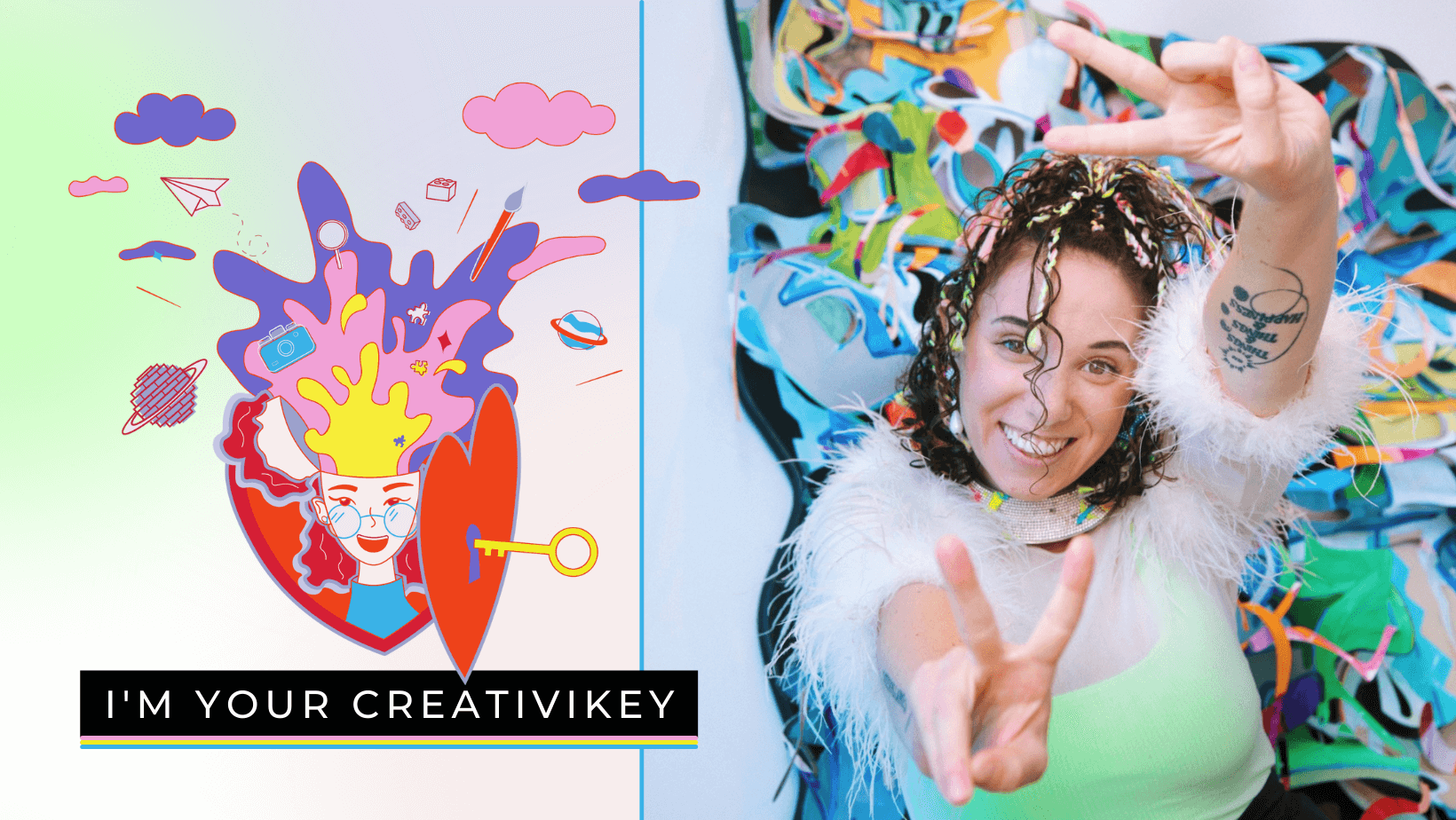
Photo of a smiling woman and 'I am your creativikey' as a title - What is maximal minimalism - Image

I think maximal minimalism is so hot right now!


Minimalism is needed for accessibility and legibility. Yet maximalism is really standing out as a bold design move.


Pile on those nostalgic 90's stickers, but keep a light touch to your lettering and layout.


Throw down that color blocking or gradient, but use high contrast type and black grid lines between sections.

I think this colours schemes for website are a very good idea


Website: www.increative.co/

Social Media: www.instagram.com/yelle_belle/

Isaac Rubio

In this age of social media, where people are scrolling fast from post to post, more than ever before it’s important to grab their attention as quickly as possible. Therefore, minimalism works perfectly by focusing all the essential information in the simplest way possible, making reading fast and captivating.


As a professional illustrator and animator, I recommend using minimalism in the general design and adding more intricate details such as textures or shapes to the essential elements of the work, so our audience remembers it longer in their minds.


Website: www.isaacrubioc.com/

Social Media: www.instagram.com/isaacrubioart/

Mike Blum

Funny cartoon beavers stand on stones by the river - When to choose minimalism and when to choose maximalism - Image

We always need to make sure that the viewer's eye goes where we want it. And while sometimes we achieve that with maximalist approaches, more often than not, simpler (or minimalist) makes that task easier and more effective. Our decision on an art direction approach takes a lot of factors into consideration including the age range our work is targeting. 


For instance, this original piece we recently completed for Sesame Street was obviously meant for tiny kids. And for that age, we find that simple shapes and colors help to engage them, so a minimalist approach was obviously preferable. And even when we take a more maximalist approach, say with very detailed backgrounds, we always make sure that compositions read clearly, even as thumbnails.


Website: www.pipsqueakanimation.com/

Social Media: www.linkedin.com/in/michaelsblum/

Andrew Broadbent

When you think about debating minimalist vs. maximalist design styles, core distinctions emerge. Minimalist designers attempt to communicate as much information as possible with as few visual elements as possible. Maximalist designers seek to cohesively implement a wide variety of graphic elements into their work. Our agency is not totally on one side of this argument. 


I would say we certainly have a minimalist approach to designing logos, keeping it more simple and clean, although we think using enough white space to make sure the user is focusing on exactly what you want them to focus on in the design or CTA. But we also like to use some modern maximalist elements on websites incorporating animation, video motion backgrounds, bright colors, and bold visuals sometimes. 


So I also think when picking an approach you have to think about who the target audience is. For example, if you’re trying to disrupt a certain market niche or designing for a youthful and bold audience, then a maximalist design can help catch and keep the attention of your viewers and set you apart from competitors. I think about it in terms of responsive web design. Minimalist designs can look expansive and beautiful on large screens. What’s more, they tend to be more user-friendly and legible on smaller ones.


Website: www.vabulous.com/

Social Media: www.facebook.com/vabmedia/

Veronika Persché

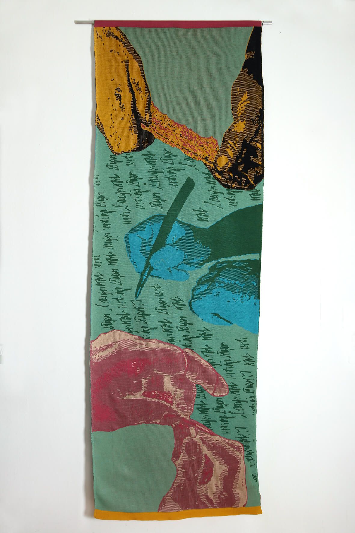
Painting in the form of a turquoise scroll - Maximalism is gradually gaining popularity - Image

In the past decades, minimalism was clearly dominant, hence more impactful. I think the slogan 'less is more' still holds a strong point today when we face global problems like climate change and the need to reduce fossil fuels is crucial. Nonetheless, I see a trend towards more playful, richer, and more luxurious designs. People simply like to let go of strict rules and go after their intuition.


Website: www.persche.com

Social Media: www.instagram.com/veronika_persche/

Lexie Fries

While I think there is a time and place for maximalism, minimalism is more impactful. You can build on any minimal design just by adding color and bold typography. Minimalism can be calming, clean, loud, bright, repurposed, and eye-catching without the chaotic feel maximalism can sometimes turn out to be.


Website: www.lexiefriesdesigns.com/

Social Media: www.instagram.com/lexiefries_/

Michelle VanTine

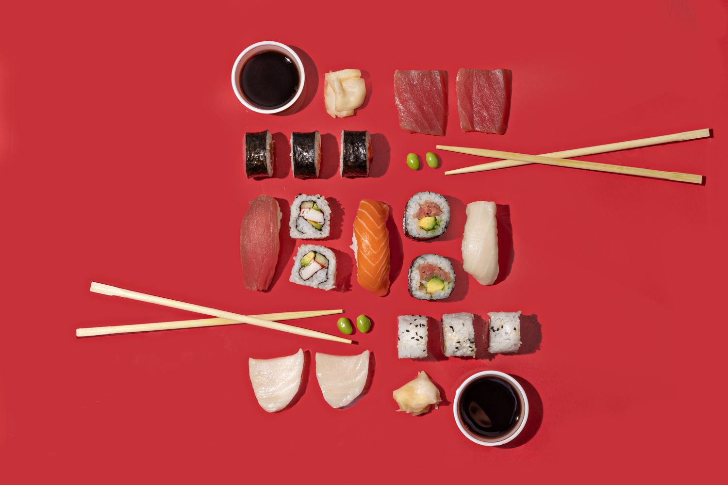
Sushi and chopsticks on a red background - There is no clear winner between minimalism and maximalism - Image

I don't believe there are hard rules in art such as 'minimalism is better or maximalism is better'. What would the art world be without the range of Klimt's overly busy but beautiful gold patterns and Picasso's effortlessly minimalistic line drawings? Both have merit and contribute to the beautiful range of people's perspectives. Having said that, as an artist I most definitely gravitate towards minimalism.


I tend to use bold colors, tons of negative space, then 'BAM' the focal point. Bold colors are shown to draw attention, create happiness and excitement, and creative compositions show viewers something photographed in a new and different way that creates interest.


Website: www.michellevantinephotography.com

Social Media: www.instagram.com/michellevantinephotography/ 

Ewan Leckie

This will totally depend on the research made into the market and it’s very much product specific. If the market and similar products have all gone minimal, it's well worth considering going in a different direction. Standing out and having a unique voice is important, but it really helps for this to be relevant. So there is no number 1 answer and there is never only one solution! 


Generally, minimalism can be cool and clean and focuses on one aspect: the core of a product or service. In reverse, it can be cold and less friendly or maybe feel too aloof.


Whereas maximalism (if you call it that) can be colorful, fun, and loud. Jumping out at you! But it can also fail to look like quality and could seem confused or childish. 


It's a case of balancing and matching the aesthetics with the brand attitude. 


Website: www.wearemycreative.com

Social Media: www.instagram.com/wearmycreative/ 

Shumaiya Khan

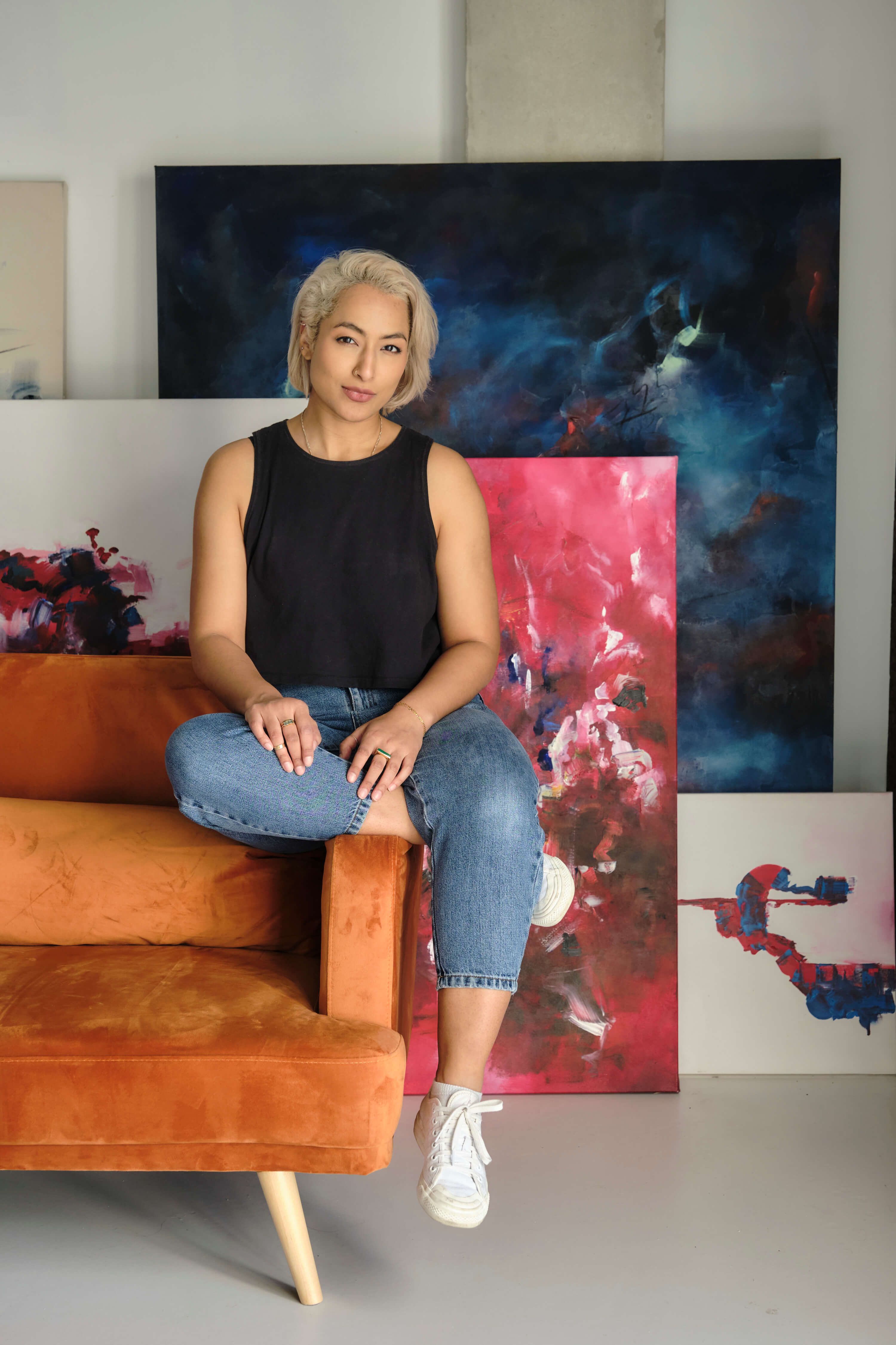
A woman artist sits on a sofa in front of her paintings - What does a maximalist design style give you that minimalism doesn't - Image

Honestly, I think it totally depends on the message. My work often flits between the two as both have their place. 


When it comes to minimalism, there's nowhere to hide when it comes to detail, position, and tact. We're often scared of leaving a huge space or pairing down which makes me feel there's a boldness in doing the absolute minimum. 


Through maximalism though, there's this confidence to really overwhelm the senses and go as far as you want. That's something incredible to celebrate, no?


Website: www.701.studio

Social Media: www.instagram.com/____shumii

Amel Afzal

The aesthetic battle of the ages, the perpetual debate, the yin to the yang: minimalism vs. maximalism. Less is more. More is more. But what makes more of an impact?


Truth is, neither will make an impact if there is no intention behind it. Minimalism and maximalism are two forces of the same cycle each with formidable strengths and weaknesses. This cycle however never stays the same and continues to spin because what humans pursue is often variety. In the end, contrast is what’s important like moving between a cold plunge and a hot sauna.


If I’m honest, I am someone who typically sits closer to the minimalist camp. I like to make an impact with fewer more deliberate choices, forcing me to be a more conscious consumer. Is every part of my life minimalist? No! My shoes are pretty maximalist if you ask me, it brings me joy and that’s perfectly okay. My point is, styles will change but what makes the impact is the intention behind it.


Website: www.amelllii.com/

Social Media: www.twitter.com/amelafzal

Kayte Demont

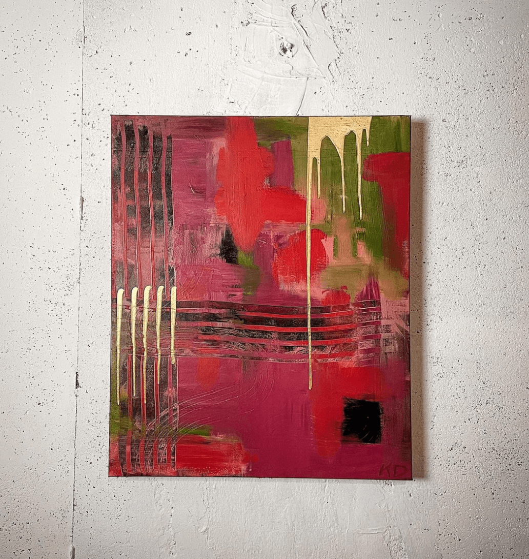
Red abstract painting in minimalist style - Minimalism and maximalism evoke different feelings - Image

I think it depends on your taste and the atmosphere. For example, a blank wall with a minimalist piece of art would be equally as impactful as an overwhelming, immersive, maximalist art installation. However, both would evoke different feelings and reactions.


Website: www.wckdcollective.com

Social Media: www.instagram.com/kaytedemont

Prathamesh D.

The phrase “Less is More” is a reflection of the theory of minimalism and it’s becoming the new method of thinking to market simple, elegant and functional designs. The main principle of minimalism is to provide only the essential part of the feature to the viewer or user. In minimalist web design, there is no extra text, unnecessary animation, or effect in the design. On the other hand, everything that is presented on the page is deliberate and useful.


Minimalism is based on the concept that lies behind “Hicks Law”, which states that the more choices a person is presented with, the more time she or he will need to make a decision. Reducing the number of functions offered on a website page can optimize the user’s approach to decision making. Too many options might cause a user to become overwhelmed and ultimately quit the task they are attempting to accomplish. 


As a result, applying a minimalist take on design can actually help to improve a user’s overall experience by reducing the distractions surrounding their ability to complete a task or make a decision. Reducing steps in the process to make the task simpler or faster goes a long way in creating a positive experience, while also being more cost-effective to only keep the features that the users need.


Social Media: www.behance.net/Prathameshdesigns

Debbie O'Connor

I typically prefer minimalism, sometimes with a bit of flair to keep it interesting. I find minimalism more impactful from both a practical and aesthetical standpoint. 


From a practical standpoint, it usually requires less to manage, at least once the final piece is done. 


From an aesthetic viewpoint, I often find it more challenging to reduce elements down to the essentials in a pleasing way. Once that is achieved, I like the lack of visual clutter and focus minimalism presents.


Website: www.behance.net/debbiemarieoconnor

Social Media: www.instagram.com/debbiemarieoconnor

Stefan Sagmeister

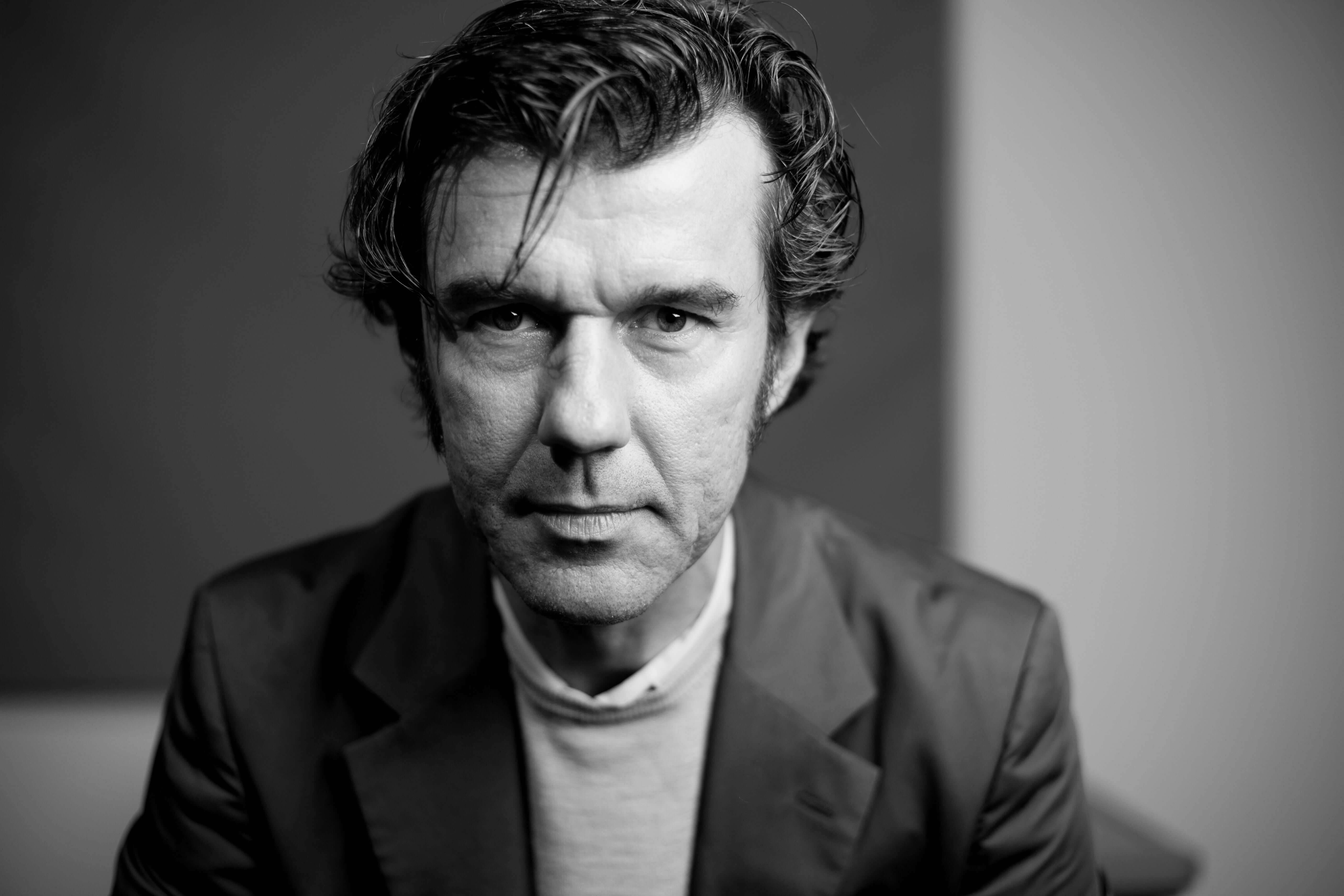
I do not believe that aesthetics are a question of minimalism or maximalism, both strategies have garnered gorgeous and horrendous examples. The quality of aesthetics largely depends on the love and care that went into a piece of design, architecture, or plan.


And: Beauty will always need to be part of the goal. Things usually don't become beautiful by themselves.


Website: www.sagmeister.com

Social Media: www.instagram.com/stefansagmeister/

Anna Mischke

Personally, maximalism speaks to me more (and more loudly!) - but both have different strong impacts.


Website: www.peachbabystudio.com

Social Media: www.instagram.com/peachbaby/

Dmitry Zmiy

It very much depends on the subject and aim. In brand and logo design you have very clear tasks and expectations from business owners. So I'd say for these kinds of designs, it’s best to stick to the brief to achieve your goal.


But if we’re talking about minimalism and maximalism in an absolute vacuum - minimalism will be much more powerful. As a brand identity designer, I could say that making a unique minimal logo is ten times harder than just mixing a bunch of elements together.


To create a minimal logo, you need to place all aesthetics, meanings, and styles into one simple shape. It's basically developing a symbol that will represent but not illustrate the thing, like a heart, biohazard symbol, or medical cross. That's why all these well-known icons are so powerful. They contain many associations, emotions, and meanings in one simple shape. That's why minimalism is unbeatable.


Website: www.dribbble.com/zzzmeysss

Social Media: www.instagram.com/zzzmeysss/