The right website effects of color schemes on graphic design give your brand and design energy and life. No matter what products or services you’re offering, colors drive your message home and make your brand more memorable. To make the best impression, choose the right color scheme for your website.
Table of contents:
- ● What Is a Color Scheme?
- ● Why Are Color Schemes Important For Your Website?
- ● Your Website Color Scheme Defines Your Aesthetic
- ● Brand Perception
- ● A Good Color Palette Increases Conversions
- ● How to Choose Your Website Color Schemes
- ● Color Psychology
- ● Visual Hierarchy
- ● Responsive Design
- ● Color Theory
- ● The Color Wheel
- ● How Color Schemes Work
- ● Analogous Colors
- ● Triadic Colors
- ● Tetradic Colors
- ● The Popular Color Schemes
- ● The Importance of Color Consistency in Design
- ● Create a Design For Your Website
What Is a Color Scheme?
Your color scheme is the combination of colors that go well together that you use on your website and in other places. It’s a simple concept, but successful brands put a lot of thought into it. The psychology of colors plays an important role if you want your brand to succeed, and your color scheme should align with the mood and themes of your business.
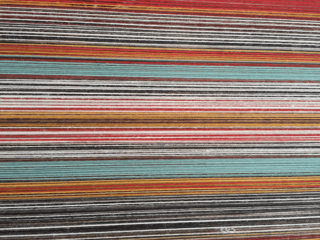
A color scheme includes multiple layers. The most important are your primary colors, which are the most dominant on your website and your brand’s designs. Then your color scheme covers your background, logo, and menu colors.
Why Are Color Schemes Important For Your Website?
There are several quiet but very important roles your color scheme plays. Your color scheme will influence the way people mentally perceive your business.
Your Website Color Scheme Defines Your Aesthetic
Color is the first layer that covers the aesthetic of your website. It’s the overarching theme of your design. People are visual creatures, after all, so your color scheme will make the fastest and hardest impression on website visitors. If your color palette is sore on your visitors’ eyes, they feel compelled to exit your website.
It’s not necessarily about whether your business looks good. People just have an intuitive reaction to unattractive color schemes. On the other hand, attractive color schemes that align with your other designs will keep peoples’ eyes on your page and improve your chances of them staying and taking the actions you want them to.
Brand Perception
For people who don’t specialize in web design, UX, or similar fields “color schemes” might not sound important. But colors are the visual elements that people’s minds gravitate towards. They also affect people’s emotions, hormonal responses, and brain waves. For anyone whose job involves making an emotional impact, colors make or break your success.
As a web designer or marketer, you need to consider the effects that color schemes have on your target audiences. The way your brand is perceived is mostly an automatic response based on psychological principles that your viewers are subconsciously considering at all times. For example, yellow is a fun, welcoming color, and red is a strong, confident color.
We will delve into the psychology of all the primary and secondary colors under “Color Psychology”.
A Good Color Palette Increases Conversions
Finally, at this point, it’s no surprise that color choices have a direct effect on conversions. Yes, your website’s color palette determines whether many visitors make a purchase.

Web designers have enough information to know that certain colors will have certain effects. For example, a red CTA button on your sales page gains more sales than a blue or purple one. Another example you’re probably aware of is that making one button grey and the other green on a pop-up is a sure way to prompt more visitors to choose the green option. No one wants to click the dull, grey button until they’ve actually read the text on it and considered its implications. That’s why a good website designer will always leave the non-desirable option in the grey box.
How to Choose Your Website Color Schemes
The two important things to keep in mind when deciding on the colors you’re going to use are:
- Appealing to your customer base
- Brand consistency
The first step to any important aspect of your branding is brainstorming. So, how do you brainstorm the colors you want to use?
First, you have to understand the color wheel, color theory, and color psychology. This will help you understand each colors:
- Meaning
- Emotions
- Associations
Of all the psychological messages to send which one best represents your brand?
Are the main products or services being sold happy and welcoming? Or are you selling serious products that carry heavy implications for your customers?
Are you selling to the everyday person? Or are you trying to add a feeling of luxury or exclusivity to your brand?
Keep these kinds of questions in mind while considering the color scheme you will use on your website.
Then, there are specific considerations you need to make based on your audience. Are you selling to an audience that has a certain preferred aesthetic? Are you selling to bikers, skateboarders, or any other group with unique preferences?
Lastly, when you’re developing a website, you always need to keep the visual hierarchy in mind. If one layer of your color scheme makes it hard to read the text or distracts from important calls to action, your whole plan will fall apart. UX design needs to play a part in the construction of your website, including its colors..
Color Psychology
Primary and secondary colors have well-understood psychological implications. They form the base of any color scheme you make, so they’re a good place to start.
Red
Red is the color that captures the most attention. Red is associated with passion, excitement, danger, and action. It’s an energetic color that is used strategically in marketing. It’s the preferred color for “ORDER NOW” buttons and similar calls to action.

YouTube and Coca Cola are among the largest examples of red color schemes. Coca Cola’s brand surrounds global happiness and red is used to build excitement around that idea.
YouTube’s logo is also more brilliant than it gets credit for. The red portion surrounds the play button, which triggers a feeling of excitement surrounding the action of playing a video.
What you need to remember is that red is the most intense color on the eyes. It is used to spur action but use it strategically and sparingly. There’s a reason why calls to action are usually red, while stop signs and other danger warnings are also often red. The intensity and immediate attention are the overarching themes.
Orange
Orange is a close cousin of red. It represents adventure and creativity. To a balanced extent, it also adds a sense of passion. In any case, it’s used to add fun and relief to any website or graphic design tips it’s used on. While orange attracts attention and evokes some passion, it’s not as intense or commanding as red.

One great example of orange in branding is The Home Depot. The Home Depot sells products used in home improvement, and the color is used to evoke creative and light energy.
Yellow
Yellow is a warm color that represents sunshine. Yellow represents happiness, optimism, and positive emotions. However, it’s also an energetic color that can be used as a warning sign.

In branding, yellow is normally used to create cheerfulness and optimism. It’s a color of hope. Common examples of this are promotions, such as discounts and free shipping options online. As for companies, yellow is prominently used by Ikea. This could be in order to build optimism around the idea of furniture shopping. Many of the company’s best customers are people, who recently built or bought a new home, or those looking to furnish their new apartments.
Yellow is a great color to associate with a brand, but it must be used wisely. It’s a color that can easily turn a design ugly if used improperly.
Green
Green sparks thoughts surrounding two things dear to most peoples’ hearts: nature and money. Psychologically, green is the color of renewal, health, growth, and fertility. It can also have negative connotations, as you’ve likely heard the term “green with envy”.

Brands that offer products or services revolving around nature often feature the color green. Roots is one of the more recognizable examples. Roots models are often displayed outdoors, and green is used to attract customers who enjoy the outdoors.
Remember, even if you’re not offering natural products, green can be used to tie your brand to an outdoor niche. This can be true of fashion and machinery design companies.
Blue
Blue is linked to the sea and the sky. Psychologically, it represents peace, trust, and calmness. But like the sea and sky, it can also represent emotional distance, coldness and depression.

In marketing, you see blue placed beside some elements where instilling a feeling of stability and trust is important. Examples include warranty accept buttons and free shipping buttons. When you’re asked whether you accept terms and conditions, “Accept” is usually a strong blue, and “Do Not Accept” is normally a dull grey.
The most prominent uses of blue by big brands are in big tech. Facebook, Twitter, and Skype feature blue visuals. But you can also see blue in Ikea and Walmart, who try to communicate trustworthiness and positivity in their branding. In Ikea’s logo and design, blue is combined with yellow to communicate each color’s respective values simultaneously.
Pink
Pink is a color that psychologically represents playfulness, love, and femininity. It’s often used on products and services dedicated to female audiences.

Pink is featured by some of the biggest brands selling to female audiences. Examples include Victoria’s Secret and Barbie. But Pink is seldom used alone, as it is best accompanied with another color that completes its message. Sites for brands like these will often use pink in their CTAs, as it’s a positive color that is associated with positive actions.
Purple
Purple has long been considered the color of royalty. It psychologically represents luxury, nobility, and power. But it has to be used sparingly in most cases. The negative psychological implications of purple include arrogance and anger.

Purple is often used alongside other colors in logos and other branding designs. For example, Hallmark features purple prominently, but not overwhelmingly.
Brown
Brown is a color that’s associated with simplicity and trust. It’s the literal “down-to-earth” color that your brain automatically associates with nature. It’s no surprise that brown is most often used in natural products’ designs.

Brown is not necessarily an unattractive color, but depending on its purpose, it’s best coupled with other colors. You often see it featured alongside green or dark yellows, which helps it avoid appearing dull while completing its mission in branding. Take the example of UPS, which always works to represent itself as the grounded, down-to-earth delivery company.
Black
Black is a prominent color in branding. Psychologically, black represents strength, luxury, and sophistication. But it can also be used to represent sadness. That’s why it’s both the funeral color and the color featured by Nike and luxury car and fashion companies.

Black is used in marketing for CTAs when it’s the prominent color in the company’s branding. It’s generally a good color to use as it’s strong, demands attention, and makes the text easy to read.
White
White is associated with cleanliness and humility. Psychologically, it means different things in different cultures. In North America, white represents peace, while elsewhere it represents death, so you’ll need to keep these differences in mind depending on your target audience. We have to know that white is one of the most popular colours.

In marketing, white is most prominently featured on eCommerce platforms, particularly in retail. It’s used as a background for product photos to make most other colors easier to see and investigate.
White is normally best used as a background color, but it can be paired with logos and other brand designs alongside a dark color. In text design, black text on a white background is the most readable. To conclude, white is an major colours to creating a good website.
Visual Hierarchy
Your color palette must have a coherent visual hierarchy to work. Your choice must cover your background, each prominent color, and the colors you use for CTAs and drop-down menus. This leads to a layered emphasis on certain elements of your website design.

First, your choice of font color is critical. Then, your background color must allow your text to be readable and attractive. Titles must draw attention so you can address visitors’ questions immediately. Then, your CTA must stand out with a color choice that is noticeable and spurs action, while staying in sync with the color palette of the rest of the website.
Remember, the point of visual hierarchy is to find the answer to: “WHICH INFORMATION DO WE WANT VIEWERS TO NOTICE FIRST?” So, you want your layers to emphasize the importance of a specific button. Emphasizing that button can only be achieved by choosing a color that draws the most attention and leads to more clicks.
This is most often achieved through:
- Bright buttons against dark backgrounds
- Dark but colorful buttons (except black) against bright (normally white) backgrounds
- Contrast between strong text and background colors
Color isn’t the most important part of website design, but it enables the highest level of success. In that way, it should work alongside other UX components to foster actionability.
Responsive Design
While you’re creating a color palette, keep responsive design in mind. Mobile devices are becoming increasingly popular for browsing. But mobile screens are smaller, making it necessary to use fewer colors to avoid overwhelming mobile visitors. When accounting for the user interface of mobile vs desktop users, you can make your mobile-friendly website and forms plainer than your desktop version.
For mobile viewers, flashier colors should be central and surround the most important information and buttons.
Desktop viewers should also see colors centered on the most important buttons. But you can use those colors more generously, such as, when highlighting menu options and less important actions.
Color Theory
Color theory is a set of rules that provide guidelines for color combinations. Web design and UX professionals rely on color theory to make correct choices for each project. Understanding color theory can help you make better choices in an artistic profession and your personal life (interior decoration, clothing, etc).
The Color Wheel
The color wheel provides the foundation for color theory. Based on Isaac Newton’s color disk, the color wheel separates warm and cool colors.
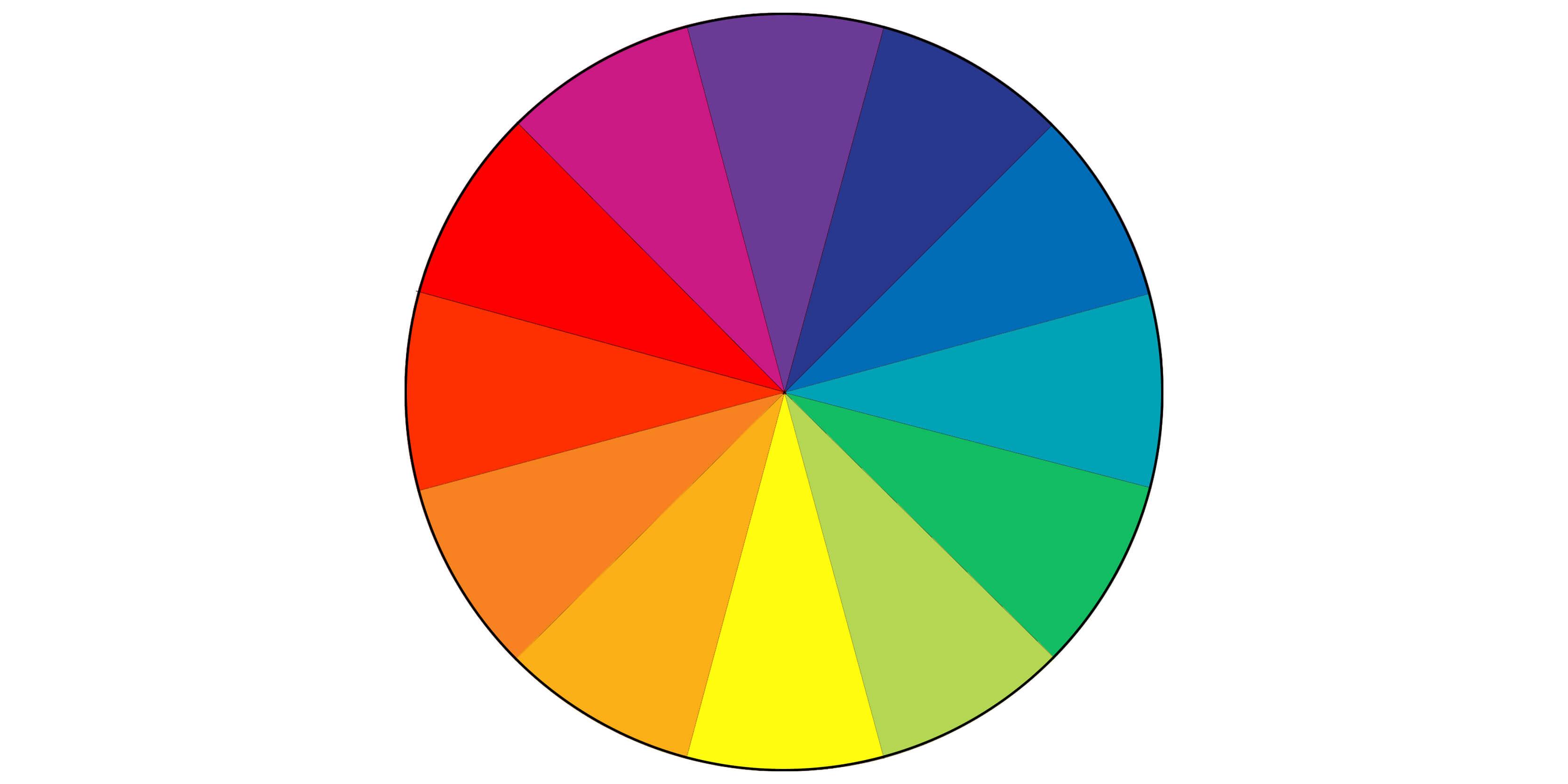
It also represents the primary colors with the secondary colors that separate them. Become familiar with this wheel because it will determine which colors are good to use in combination with others.
Primary Colors
The primary colors are yellow, red, and blue. If you’ve ever tried painting, you’ll notice that combinations of these three colors lead to the creation of secondary and tertiary colors. Mixing red and yellow creates orange, blue and red make violet, and so forth.

Primary colors are the color wheel’s base colors.
Secondary Colors
Mix any two of the primary colors, and you’ll get your secondary colors. Those are green, purple, and orange.
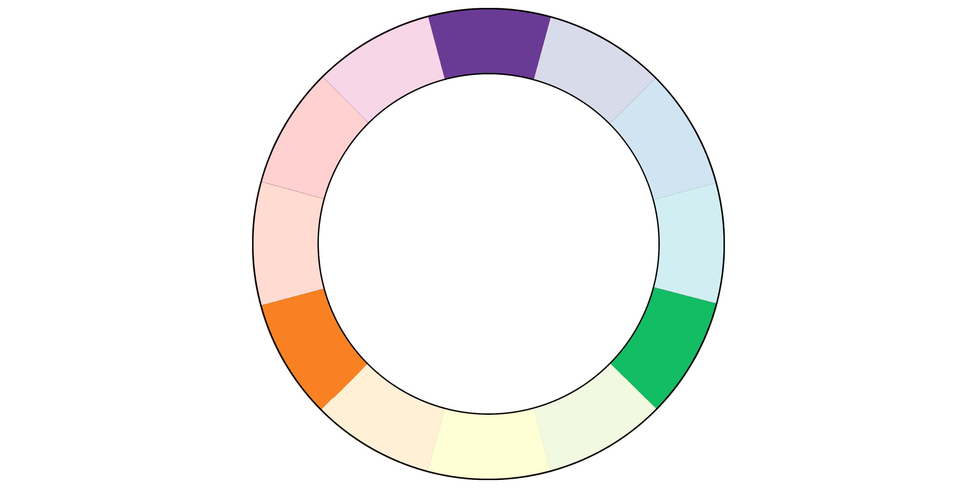
After that, you can mix them some more and you’ll get the “middle colors” as you would see them on the color wheel. All of those middle colors are the tertiary colors.
Tertiary Colors
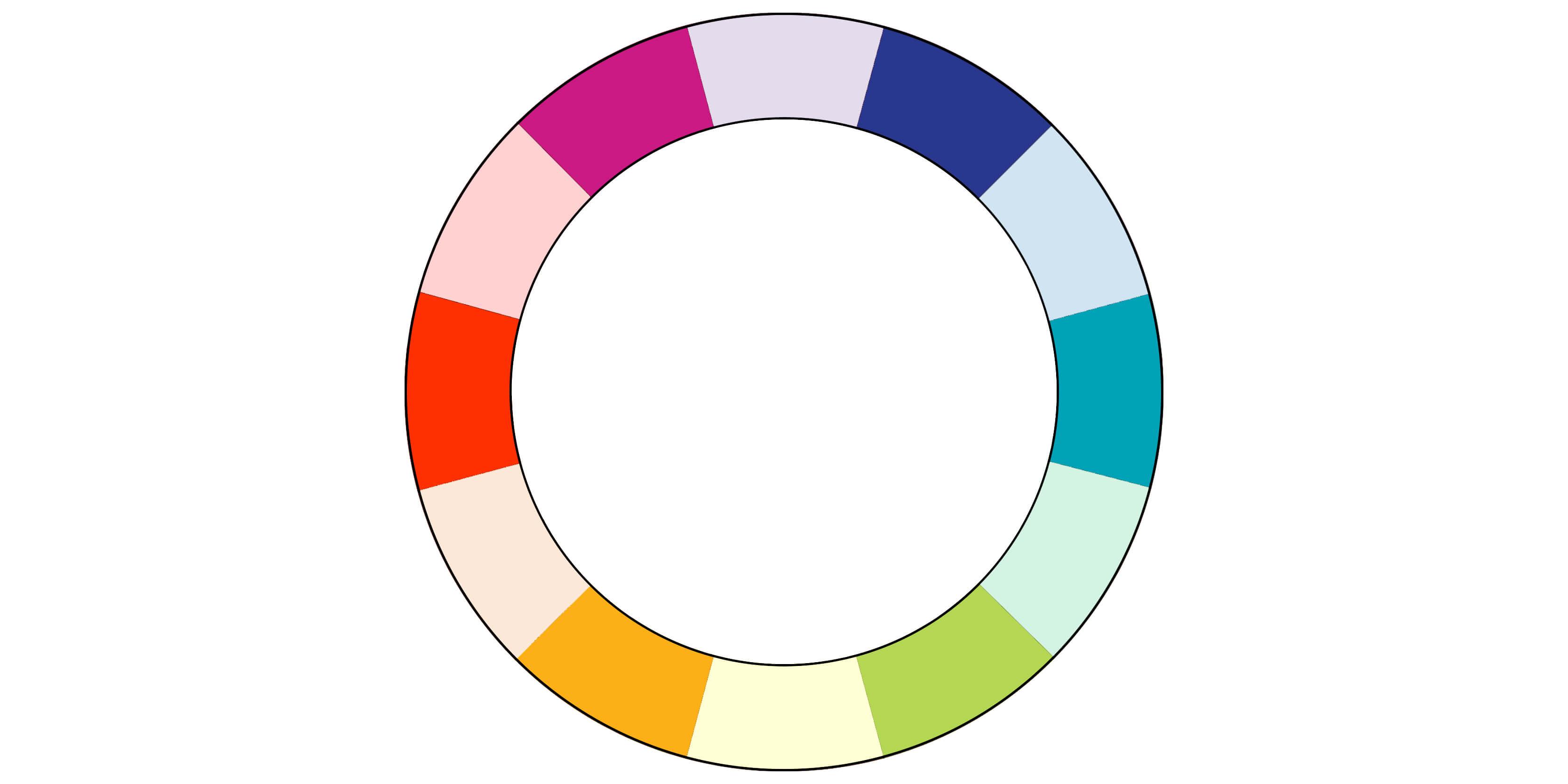
Tertiary colors are the more distinct colors and shades found in the middle of the primary colors on the color wheel.
How Color Schemes Work
Now that you understand the color hierarchy and the color wheel, what can you do?
Good design is based on knowing which color scheme works. Every two colors have a definitive relationship with one another. There are three relationship categories that are the most popular, but there are also many other possible combinations that can come into play.
All of these categories can be visualized on the color wheel.
Analogous Colors
Analogous colors are a combination of colors that are located the closest on the color wheel. They are side-by-side and do not skip over any adjacent step on the wheel.
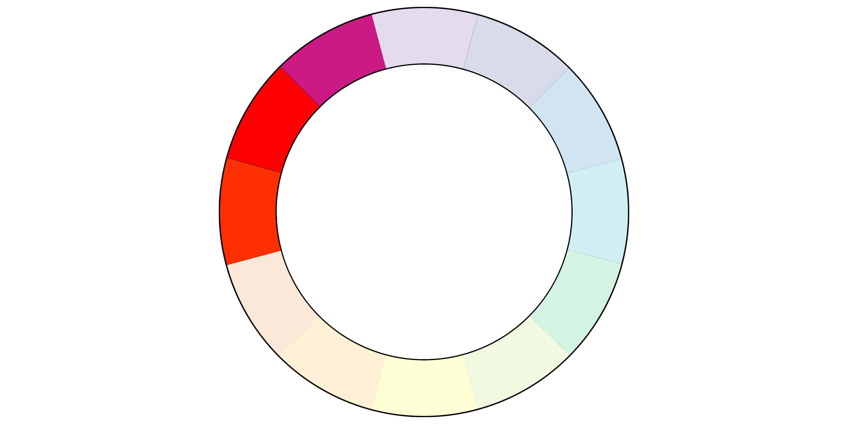
You can create a combination of warm or cold analogous colors. A warm example would be red, orange-red, and orange. A cold example would be blue, blue-green, and green.
Triadic Colors
A triadic combination is a combination of three colors of the color wheel located on an evenly-spaced triangle.
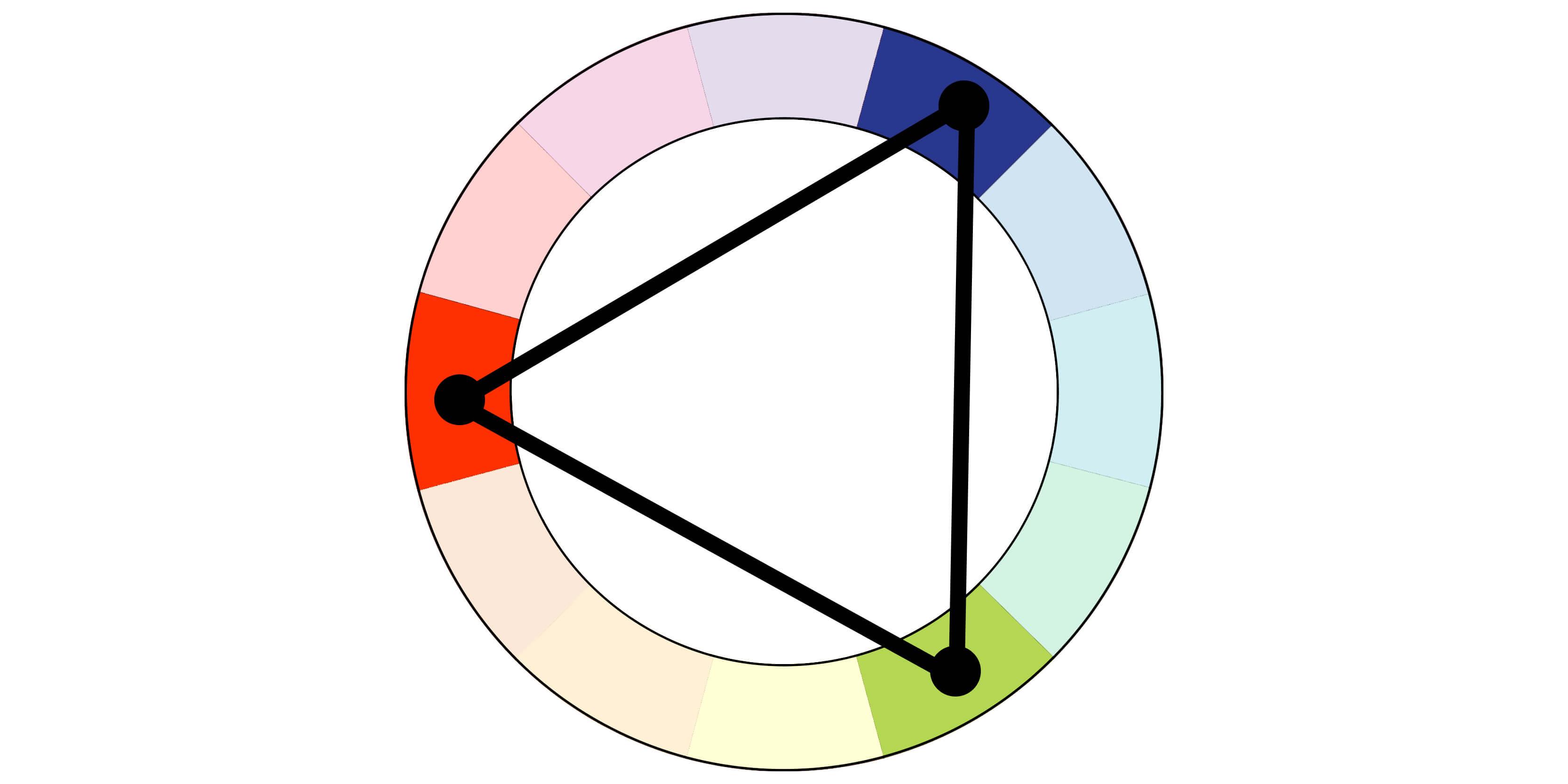
Each color in the combination must have three colors of the wheel separating them. For example, red, yellow, and blue, the primary colors, would constitute a triadic combination.
Tetradic Colors
Tetradic color schemes are composed of complementary colors. They are also known as “double complementary”.
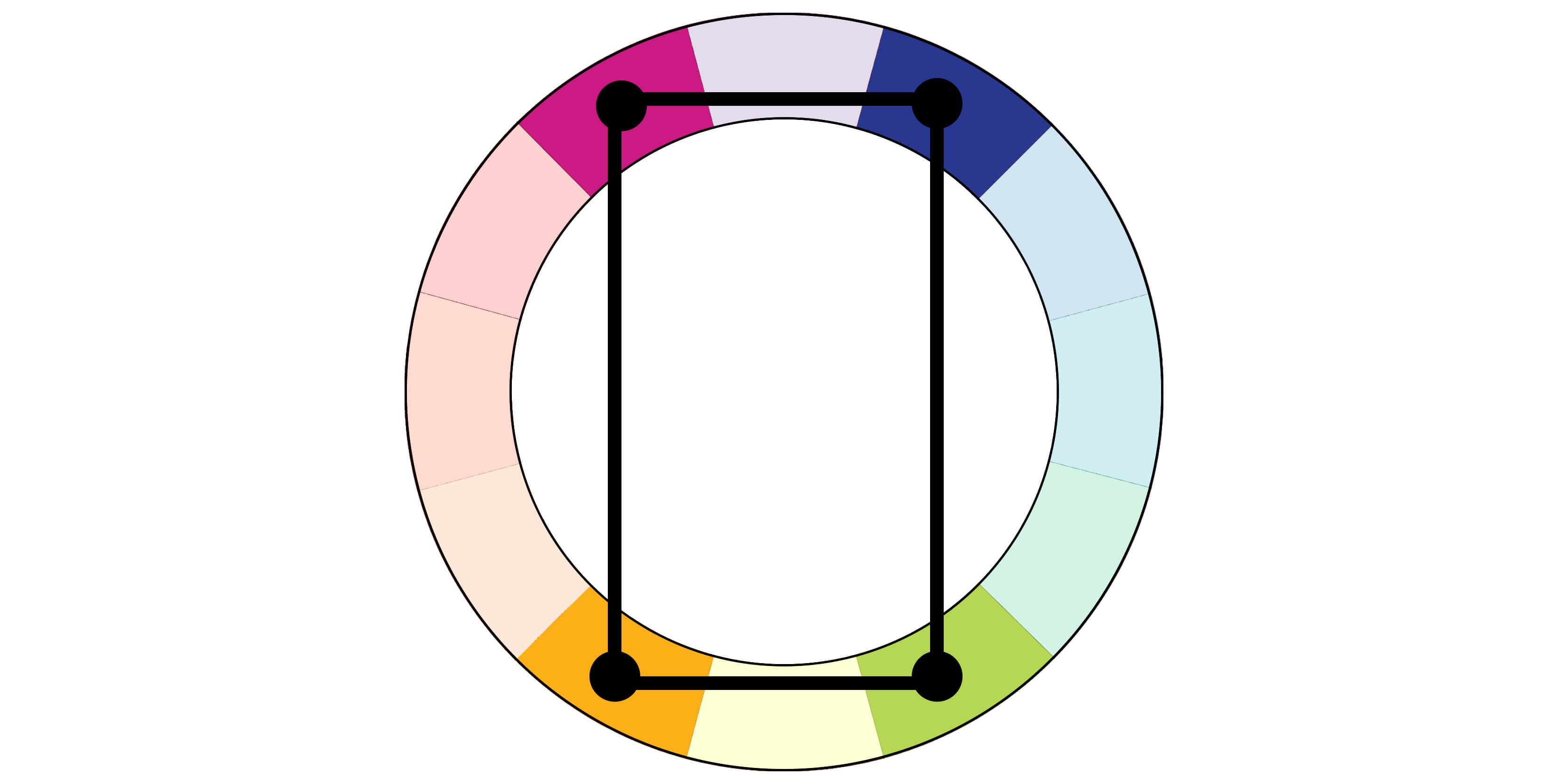
Any two sets of colors that are equidistant apart can form a tetradic combination. This method helps ensure pairings of colors that are both fun and complementary. The challenge is finding the right balance for how you use each color in the tetradic scheme.
The Popular Color Schemes
So, what do all of these ideas actually look like? Let’s go over some of the most prominent and effective uses of color schemes.
Dark Mode
Black is used on a huge portion of the websites you will ever visit. It’s rarely used just on its own. Usually, it’s used for text, but not often as a background color. That doesn’t mean you can’t use it for a background, though.

Dark mode color schemes come with dark shades, but warmer colors can complete the picture.
Heavy blacks are used to represent luxury and class. As you can see in this example from Apple, “dark mode” color schemes can communicate those themes very well. You can just combine them with other dark colors/shades to layer your design.
Earth Tones
Some brands try to create a more soothing and “grounded” emotion. The earth tone color scheme uses light browns, greens, and greys to inject nature.

Nature-themed products and plant stores’ sites feature similar inviting earth tones.
Olymp’s color scheme communicates an earthy and natural theme that reflects their selling point.
Minimalistic White with Green
Educational websites love minimalism. White is the most minimalistic color, and green offers a clear but light and relaxing contrast with it.

Simple, minimalistic designs can use a light touch of green to gently focus attention.
Adding any color on top of a white background draws attention. Studious companies like Evernote work to provide a relaxing aesthetic for their busy and stressed users. Sites like Khan Academy’s also make use of minimalist white backgrounds with a lot of green. Inspired by Khan Academy, you can try bright shades of colors like blue to add some more happiness and coolness to your design.
Lush Pink
The playfulness and passion of pink can be combined to create a vibrant design for many makeup websites. The pink color palette offers many shades you can tweak to add or remove playfulness and delicateness from a design.

Layered pink color schemes offer consistency for your designs.
Benefit uses a floral pink, adding white and black text to emphasize the text they want you to read first.
While pink is traditionally considered a feminine color, designers are breaking stereotypes and using pink palettes for a wider range of products directed at men and women. Experimenting with pinks can create a fun feeling, and pink backgrounds look great behind a black text.
Purple Shades
Rich and noble, purple is conquering much of the internet. By combining purple with brighter shades that border pink, you can remove the overbearing look of solid dark purple backgrounds.

Create the sparkle of your choice by experimenting with purple shade palettes.
Urban Decay uses neon purples, with darker shades for banners and menus. White text offers a striking contrast while maintaining an extravagant appearance.
Purple shade color schemes are used by social media companies, fashion companies, and other modern trend-driven businesses. You will also often see neon shades combining retro nostalgia with modernity.
Shades of Pink and Jet Black
Pink and jet black offer one of the most modern appearances a color scheme will create for you.

Pink and jet black can combine for great effects for any kind of design.
As you can see in this example from Cowboy, touches of mildly transparent pink add playfulness to your design while black provides a sophisticated and comfortable element.
Retro Orange & Yellow
Retro orange and yellow color schemes are making a comeback in the fashion industry. Think of the mustard yellows and bright oranges featured in retro diners.

Retro orange and yellow is a popular combo for fashion/apparel businesses.
Normal New sells electric cars, a very modern product. But they use this retro style in design to emphasize the growth of technology.
This dated color scheme combines two of the most exciting and playful colors. The goal is to create inviting and fun emotions while incorporating the best of old design with modern tastes. Designers are combining colors that lie close on the color wheel, taking advantage of the most playful and passionate analogous combinations.
Red and Orange
Red and orange aren’t as playful as red and yellow, but it offers a similar retro and inviting feel. It’s the slightly more mature older cousin of red and yellow.

Red and orange effects add warmth and excitement to any design.
Red and orange color schemes have a retro, throwback feeling to them. But they will evoke feelings of excitement and welcome in viewers of any age. Think of Spotify’s color scheme, which is aptly accompanied by a welcoming headline and slogan.
Pop Of Red
Red, when used generously, is a zestful and commanding color. Brands like Kit-Kat use it generously while placing shades of grey and the occasional primary color to cool off the viewer’s eyes. These “pop of red” color palettes are simple and strong.

A pop of red offers a loud and proud background. But it can also be used to strategically redirect viewers’ attention.
Your chosen shade of red will make the background of any design. Then, use others colors to draw attention. Getting the right balance may be tricky at first. But once you find the right balance, a minimalist UI can be made vibrant.
The Importance of Color Consistency in Design
Your website color scheme should match your brand’s designs. With the right color palette, you can make your website exciting and easy on the eyes. This is important for engagement and encouraging the most desired actions. But it’s also important that your website color schemes remain consistent throughout your website.
Drop-down menus should use the same colors. CTAs should also use the same color. While each website has a different hierarchy, users need to feel confident in their actions while interacting with your website. Browsing, clicking on CTAs, and reading should all feel consistent from your home page to your landing pages.
Create a Design For Your Website
The color scheme of your website has a big impact on your bounce rate and sales. It’s important to get it right. Consider your business’s aesthetic audience, products, and services. What’s the best way to communicate your brand’s values through your choice of colors?
PikWizard has a huge variety of stock images for web desiging available to support any choice of color scheme. You can find complementary imagery for all the schemes we’ve gone over and more. Edit any image you find by clicking on it and opening it in Design Wizard application where you also find the hex values of any image.
Also on Pikwizard you can find useful content on usage of color schemes in different areas like Wedding color schemes, etc.
Explore the images available on PikWizard. You can create your own color scheme using PikWizard imagery. It’s easy to choose from any of the color schemes we’ve gone over and many others. Once you find the one you like the most, edit your designs on Design Wizard, where you can create your own list of hex values. To help you further in this crucial task of choosing the right colors, you can check Geneviève Fournier Design's 3 steps to choose your color palette's post. You'll find some more information and concrete examples of existing websites color schemes to help you choose the one for your web design and branding. If you need an affordable, high-quality website, hire WordPress experts to create a personalized website for you.

While you’re looking, make sure you keep the above information in mind. Colors are powerful tools that have been used to shape peoples’ emotions throughout history. They make powerful impressions, so start looking for the color scheme that best represents your brand!


